If you have been following Windows 8 for any amount of time, you must have run across the Building Windows 8 Blog, the official organ of the Windows team. It is not for massive, Internet-bending pieces of non-fiction that pack in enough context that by the time you emerge from them, you don’t know your middle name.
Today, another installment was delivered. In a stunningly large entry, Microsoft wrote much on Windows, its UI, and what Windows 8 will look like. The important parts of it relate to tweaks coming to the Windows 8 desktop UI. The desktop UI is what you currently use in Windows 7, if you were confused.
We’re going to quote extensively in this post, as there isn’t much of a better way to convey what Microsoft is up to, and not muddle it. To wit, here is the issue that needed to be solved, as stated by Microsoft:
We spent a lot of energy carefully considering how substantially to update the appearance of the desktop in Windows 8. We looked at many, many pictures, and considered hundreds of designs. Our primary goal was to bring visual harmony to Windows, while still preserving much of the familiar feel of the Windows 7 desktop and not sacrificing the compatibility of existing apps.
That seems reasonable enough. Here’s Microsoft’s solution:
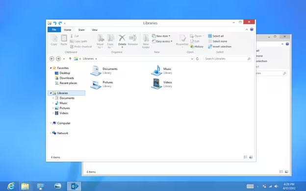
[W]e decided to bring the desktop closer to the Metro aesthetic, while preserving the compatibility afforded by not changing the size of window chrome, controls, or system UI. We have moved beyond Aero Glass—flattening surfaces, removing reflections, and scaling back distracting gradients.
So, Glass is out, and flat is in. That’s roughly what we expected. Here’s the shot that Microsoft shared from its blog post, that is well worth looking at:
Frankly, I love it. But I’m a Windows fan, so my take is probably pretty tinted. Microsoft calls the final product the application of the “principles of ‘clean and crisp,'” when it came to “updating window and taskbar chrome.” Microsoft promised more in the coming release candidate Release Preview of Windows 8, which will drop in early June.
Windows 8 continues apace, and as it comes more and more into the fore, I have to admit that I like its visual design more and more.
Get the TNW newsletter
Get the most important tech news in your inbox each week.

