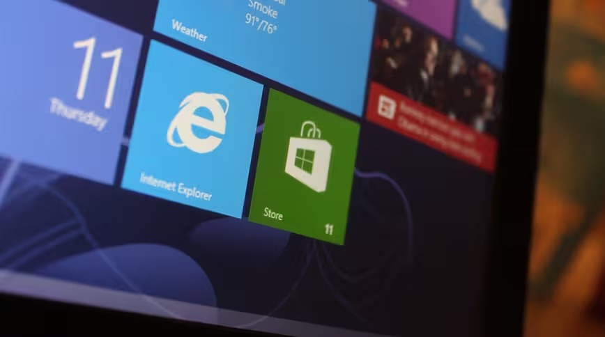
It has been a long time coming, but Microsoft’s omnipresent operating system is getting a major lick of paint and rolling out to the masses on October 26. That’s tomorrow, in case you didn’t realize.
However, Windows 8 has already been available in various pre-launch guises, with the Developer Preview version rolling out in September last year, followed by the Consumer Preview (February 2012), and Release Preview (May 2012). Then, on August 1, Windows 8 was released to manufacturing (RTM), with all the major creases ironed out. In theory, at least.
The upshot of all this is, well, opinions have already been formed in many circles. I’ll hazard a guess and say that if you’re reading this, you’ve probably read in more than one place that Windows 8 leaves a lot to be desired. What Microsoft is attempting to do is rethink Windows for the 21st century, touchscreen generation, reeling in big changes to the interface and navigation.
With D-Day a matter of hours away, the Microsoft obituaries will echo across the blogosphere, Twittersphere and all the other spheres. But having used Windows 8 on-and-off for the past few months, I have grown to really, really love certain elements of it – but, admittedly, there are some areas that are unfathomably frustrating too.
Here, I sidestep the inner workings of the operating system and just get down to the pure subjective brass tacks of Microsoft’s latest offering: The thing I love, and the thing I hate in Windows 8.
The thing I love: Hybrid
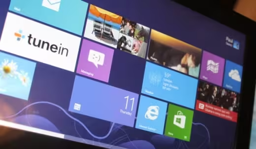
If you’ve been paying attention, you’ll note that the ‘thing’ I love is written in singular form. That’s not a mistake. But the thing I love is quite a big thing.
Windows 8 is all about the hybrid – the same operating system will be used regardless of whether you’re using a good old-fashioned mouse and keyboard, or screen-tapping one of the new-fangled Windows 8 touchscreen slates. The device I’ve been using Windows 8 on is the latter of these, but I’ve been using a mouse and keyboard too…and this is what I love.
This blending of traditional peripherals and the more contemporary touch-based interface? I really, really like it. I wasn’t sure at all at first, but it works, for me at least.
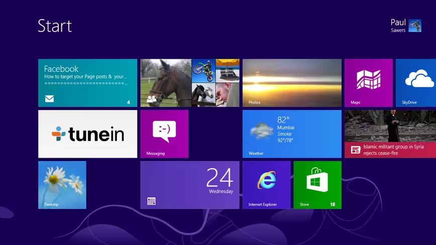
I still use the mouse for a lot of stuff, like highlighting words to copy/paste for example, and clicking on links. But as soon as I hit a page that requires scrolling, or even in the main Start screen where the Windows Store and all the apps are housed, the mouse is dropped and that trusty old forefinger really comes into its own.
What Microsoft is betting on – nay, what Microsoft is enabling – is a much broader range of devices built with touch in mind. With Microsoft going down this route, it opens up a whole range of possibilities for manufacturers – it could be a slate, a dual laptop/tablet style device, or a rigid desktop machine that never moves from its position in your office. We’ll start seeing touch in many more machines in the coming years.
I think Windows 8 is definitely on to a winner with this approach, but it certainly isn’t without its flaws. The major shorter-term flaw, for me, is that a tonne of machines will be shipping with Windows 8 installed…machines that aren’t touchscreen-enabled. Given that the core appeal of Windows 8 is being able to use my fingers AND peripherals, I really wouldn’t want to use this new OS on just a bog-standard laptop. Without the touchscreen interface, this key benefit will be completely lost.
I’m actually in the process of shopping for a new ultra-portable, powerful laptop with excellent battery life (let’s call it an Ultrabook, for argument’s sake). I rushed out last weekend to snap up a Windows 7 bargain, and I did actually have a few options – I almost parted with hard cash too, but decided not to for spec-based reasons that I shan’t bore you with here.
Each of the sales assistants, in all the shops I went to, thought they’d try and get my money by offering to upgrade me for free to Windows 8. It was at this point I sprinted from the shop and dived for cover.
Windows 8 is only worthwhile if you have a hybrid machine. For the millions of folk who don’t, I really don’t see the point in upgrading purely for apps in the Windows Store. More on that below.
The thing I hate: Counterintuitive
I have been a Windows user my whole life, bar a year at university when I was shoehorned onto Macs (I actually grew to like them). And I must be fairly technologically savvy, otherwise I wouldn’t be doing this job. But a fundamental problem with Windows 8 is that it just isn’t intuitive enough.
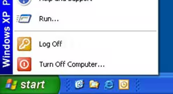 One of the minor quirks about Windows of yore, was that to close the system down you had to click on the Start menu in the bottom left, then select ‘Turn Off Computer’, or variances of that.
If you think about it, this was completely counterintuitive – why would you click ‘Start’, to close it down?
Of course, over time it became so second-nature that it really wasn’t a problem. People knew that to power off, you hit that little button in the bottom left-hand corner. Few ever questioned this way of doing things.
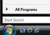 With Vista, the start menu morphed into a generic button with a Windows icon on it, thus removing any confusion that lingered among the Microsoft masses. This carried on into Windows 7 too.
When I first booted Windows 8 on my Samsung Series 7 slate, I was completely stumped as to how to close it down. No start menu, no Windows icon in the bottom left. Huh?
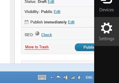 Well, now you have to swipe left from the right-hand side of the screen, or push your cursor to the bottom right-hand corner with the mouse, hit the Settings option, then hit ‘Power’. Really? You have to go to settings to turn it off? I don’t class power-off as a setting, I really don’t.
And because this Slate can be left on standby for a long time, I often don’t turn it off at all. This meant that at the beginning, I would sometimes forget how to switch it off on the odd occasion I would need to. That doesn’t bode well for the millions of users out there who will be shoehorned onto Windows 8.
You’re probably thinking now, ‘but that’s a minor issue, once you learn it, you learn it’. And you do have a point, but this is indicative of the usability and navigation across the platform. Particularly with the new dual desktop/Windows UI (Metro) app approach Microsoft is taking.
Two apps, same machine.
While some have criticized the Windows Store for not having enough apps for the Windows 8 launch, I don’t think that’ll be too much of a problem for long. Google has launched a Search app, Microsoft is launching a Skype app, and I’m being inundated with pitches for Windows 8 apps.
Microsoft’s new Windows Store is absolutely fine in itself, but the duality of the desktop and Windows UI (Metro) apps could get really confusing. You simply cannot have two incarnations of the same app on a computer, that don’t talk to each other, and not expect this to cause problems.
As you can see here, a search for Evernote brings up both the desktop version and the Metro-style app in Windows 8. When I log-in to one, the other one doesn’t know about it.
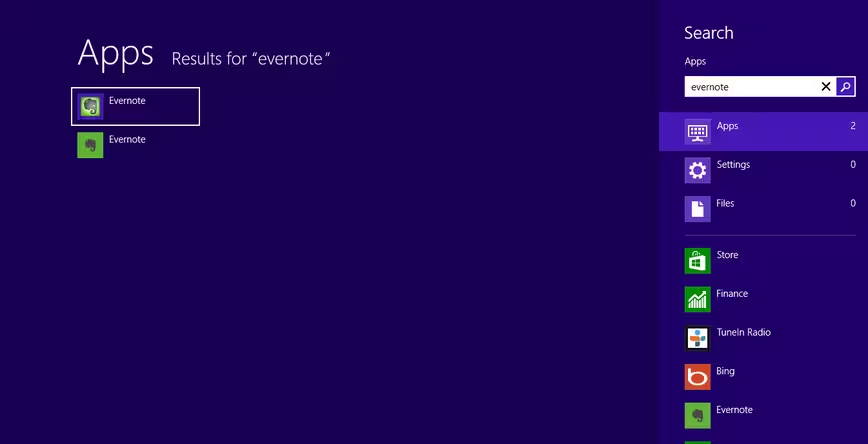
This helps to illustrate that the new touch-based Start screen is a bit of a closed silo. It’s a walled-garden with a lot of nice stuff going on inside, but it must be able to talk to the outside world…by which I mean the desktop.
Furthermore, I have countless desktop apps that require pop-up notifications – for example I use Convo, Tweetdeck and Skype, each of which talk to me while I work away. But in the Start screen, whether an app is open or not, these are all hidden from view.
Early on in my Windows 8 tenure, I opened a PDF which I had assumed was using the desktop version of Adobe Reader. It transpires that this wasn’t installed, and the default Reader (Metro) app from Microsoft was used. Given I was in a rush, trying to read the contents of this PDF, while also wishing to see the pop-up messages from the desktop, things got a little frustrating.
Of course I later installed the desktop version of Adobe Reader and all was well again. However, I couldn’t help but think this is all an unnecessary hurdle. These two worlds live side-by-side, yet they’re not on good terms at all.
It’s worth stressing here that I’ve only touched on what I feel are the fundamental pro(s) and con(s) of Windows 8. I deliberately didn’t touch on a whole range of issues that will simply require a user to learn the new world order.
For example, how do you right-click an icon without a mouse? How do you stop the on-screen keyboard covering what you’re typing within a desktop app? And how the hell do you actually close a Metro-style app down? The answer to these questions runs roughly like this: Far from impossible, but not exactly intuitive.
It’s 2012. Things should be easy, not difficult.
However…
But here’s the thing for me. Windows has never really been about intuition, certainly not in my lifetime. It’s about learning where things are and how to get to them. The issue just hasn’t really reared its head for a long time because with each iteration of Windows, the general layout has been consistent.
I’m not saying that this is a good or bad thing, I’m merely saying that’s the way it is. I’ve circumvented the initial navigation problems with Windows 8 – that’s not to say I’m any the wiser as to why they have been implemented in this way – and I now know how they work. I can live with this, as long as I am working on a hybrid machine. But for the hundreds of millions of general Windows users around the globe, I suspect this won’t be fine.
Windows 8 will get there, eventually, because more than 85% of Earth’s PC-using population use Windows. But I think Microsoft could be in for a torrid time over these next couple of years.
Until the PC manufacturers have really caught up with with this hybrid approach and are rolling out touchscreen desktops and laptops left, right and center, I think the inherent qualities of Windows 8 will be lost on a lot of people.
Get the TNW newsletter
Get the most important tech news in your inbox each week.

