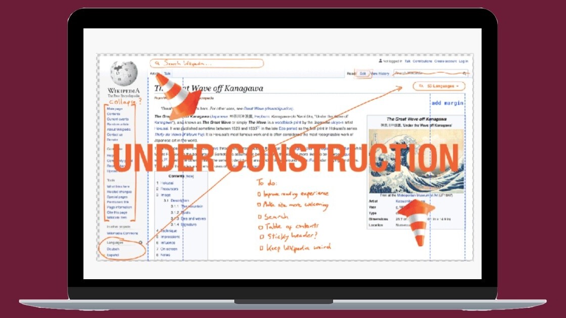
Wikipedia is one of the most visited sites in the world. And for over a decade, its desktop site’s design has remained consistent. However, that’s going to change soon, as the organization is redesigning some elements of it.
Wikimedia, the organization managing Wikipedia, said that it had kept the site stuck with the current site design all this while to avoid overwhelming users with features. Now, it wants to modernize the interface while “keeping its core identity.”
New features will include a reconfigurable logo, a collapsible sidebar, search improvements, language switching links, and a redesigned table of contents for each article. Wikimedia is rolling out the collapsible sidebar the first; this usually hosts links to random articles, language switching, and canonical translation.
The second feature in focus is the maximum line width to allow concentrated reading. I find a wide format useful when I’m reading a long-form article; you can see what might look like on the site below.
The organization has already started testing these features with early adopter Wikis such as Hebrew Wikipedia, Farsi Wikipedia, and French Wikipedia.
This project is not straightforward and Wikimedia expects it to be completed and rolled out across different Wikis by the end of 2021. The reason for the slow rollout is to allow people to get used to some of these features gradually.
You can check out all expected features here.
Did you know we have an online event about product design coming up? Join the Sprint track at TNW2020 to explore the latest trends and emerging best practices in product development.
Get the TNW newsletter
Get the most important tech news in your inbox each week.


