As one of the biggest brands on the Web, Wikipedia needs little introduction.
The world’s biggest online encyclopedia is available across a multitude of platforms, including desktop and mobile. However, on mobile, it has hitherto largely relied on HTML5 wrappers on iOS and Android – in other words, not exactly coded ‘natively’ for each platform. Things are changing though.
Hot on the heels of the overhauled Android incarnation that arrived on Google Play a little more than a month ago, which brought native coding and in-app editing, Wikipedia for iOS has been completely rebuilt from the ground up. And ‘native’ is very much the name of the game, with Objective C used all the way. The previous Wikipedia app had been built using PhoneGap, an open source framework that lets developers easily create mobile apps using HTML, Javascript and CSS.
This approach has generally worked fine for Wikipedia, given that its content is largely HTML-based. But with native apps, they’re looking to bring a little more smoothness and speed to the table. We’re told that “next to no code” remains from the old app, which hadn’t been given an update in more than year before now. So today has been a long time coming.
How it looks
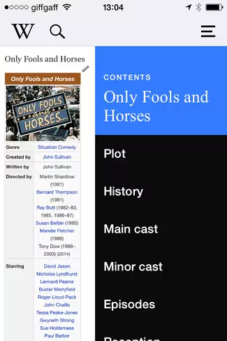
As you can see from the old app on the left, and the upgraded version on the right, the permanent search box along the top has been removed.
Now you’ll see an expandable search box that’s exposed by tapping on the magnifying glass. You’ll also now see a neat little slide-out menu that lets you easily navigate to a specific section (as with the Android app). Though instinctively, I still think it feels more intuitive coming in from the left, similar to where the main ‘Contents’ menu is found on the Web.
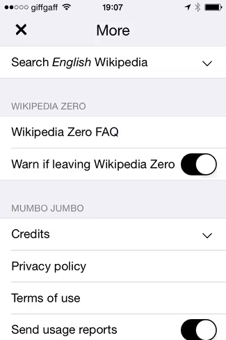
To share an article, you hit the little share icon at the bottom right, and you’ll be given the choice of the usual sharing options. You can also ‘star’ it for offline perusal. For those in countries where Wikipedia Zero is available, there’s more information on this contained within the main settings menu, and you can also opt to receive a warning when leaving the app to remind you that browsing is no longer free.
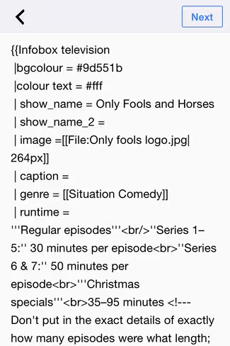
One of the key features of the new app is that you can edit directly within the iOS app now – the previous version was more geared towards reading than editing,though you could carry out edits in the mobile Web incarnation.
You can also make edits without being logged-in (you are asked to log in when you first open the app, but you can skip this). Just hit the little pencil icon on each page, and you’re good to go. Though we must note here it is a little fiddly on mobile – it’s definitely much easier to do on a computer.
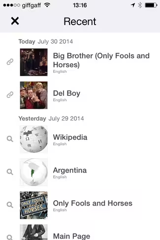
Based on our brief tests, the app is certainly a bit faster to load. And in addition to the new features outlined here, there are a few more ‘Easter Eggs’ worth discovering that you don’t immediately realize are there. For example, in addition to serving up easy access to your ‘Saved’ favorites, there’s now a ‘Recent’ option which delivers easy access to all your recent reads on Wikipedia. This is accessible through tapping the ‘W’ icon at the top left of the app.
While the previous Wikipedia app for iOS worked fine and was more than acceptable, it had long grown stagnant and stale. Today’s update goes some way towards modernization, and we’re told that a number of new features are on the roadmap for the future.
Get the TNW newsletter
Get the most important tech news in your inbox each week.


