During these uncertain times of coronavirus lockdown, we are expected to look towards our leaders for advice and guidance. Critically, the instructions should be as simple and accurate as possible, to ensure that people follow the advice. Unfortunately, on May 10, Prime Minister Boris Johnson’s Twitter account released a number of “infographics” which are, quite frankly, baffling.
At the time of writing, the infographics are still available and no further explanation has been offered. The goal of the infographics was primarily to introduce the idea of the “COVID alert levels,” which go from one (COVID no longer present in the UK) to five (material risk of overwhelming the healthcare system). It’s a nice idea but, unfortunately, it’s practically useless.
For starters, the choice of one to five scale is quite arbitrary. To see why, consider the joke in the movie This is Spinal Tap that some amplifiers are better because they go all the way to 11 instead of 10, even though this is really just a random number.
Read: [Using ‘personalized AI’ to end coronavirus lockdown is a stupid, cruel idea]
Of course, the choice of scale is a subjective and an aesthetic one – not an actual problem. It is when you analyze the graphs and equation behind it that things get murky.
Bewildering equation
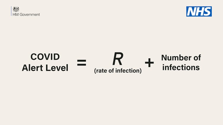
The alert level was explained by an equation: “COVID alert level = R (rate of infection) + number of infections.” Sadly, the equation is nonsense for a number of reasons. To understand why, let’s consider something we call units.
You may have been asked by your maths teacher to put units on your answers. For example, an answer to a problem may be “three apples,” “three metres,” or “three years.” Although you may have thought your teacher was simply being picky, they were actually trying to teach you the importance of understanding units. Namely, you cannot add values that do not have the same units, for example, “three apples + three metres” makes no sense.
This underlines the fundamental mistake of the government’s equation, which links the following three parameters.
- The alert level, which is a unitless number between one and five.
- R, which is described as “the rate of infection” in the equation. Depending on the definition that is being used (this is not clear from the context) it could show how many people someone infects over a given timescale. Critically, since this is supposed to be a rate, it should be in units of “people per day”, or just “per day” – this isn’t clear either. In science, however, R is usually not a rate but a unitless numbering representing the average number of people infected by each patient.
- The number of new infections, which should be measured in units of people.
This sounds sensible. You would want such an alert level to be based on these factors. However, you cannot simply add them up. You can’t add units of people per day plus people and get a unitless number between one and five.
Depending on what R means, it is going to be small, probably somewhere in the region of one, while the number of infections is going to be somewhere in the thousands. Not only does this mean that adding R is irrelevant to the sum, but it also means that the alert level is going to be off the one-to-five scale – it is going to be in the thousands.
Mysterious graph
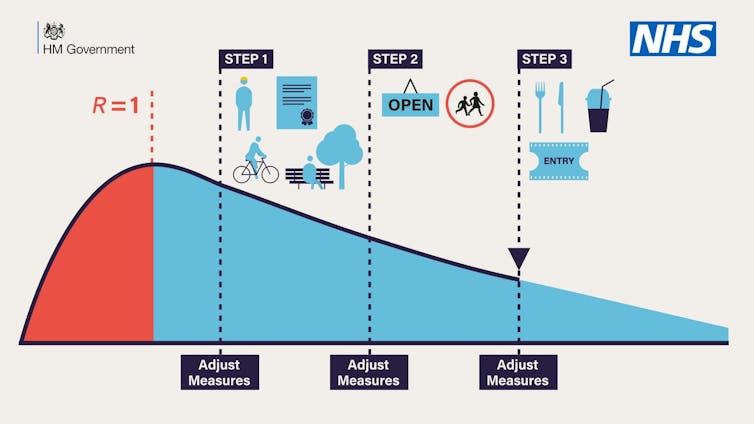
Now let’s move on to the graph below, presenting information about the lockdown steps. Here, we see a humped curve that slowly decreases and suggests steps to ease lockdown along the way. Critically, there is no relation between the steps in the graph and the alert level, so we have to question what the equation is even for.
What’s more, the vertical (y-axis) and horizontal (x-axis) components of the graph are not labelled. So what information is the graph presenting?
It seems a safe assumption that the x-axis is time. But is it days, months, or years? This is important because if we assume that the red part indicates January to May then the blue part of the curve would cover nearly two years. Since there is no key, interpretation of what the red and blue mean is fraught with problems.
And what is the y-axis? We might assume it is R given that a value of R is given at the peak of the curve. But why choose to plot R and not something more understandable, say the number of cases? Equally, the lockdown was enforced due to R becoming larger than one. However, the infographic shows R being capped at one, even though R was larger than one in the past. Again this confuses the audience as to what R means.
Of course, we should expect infographics to be illustrative, conveying general and simple ideas, rather than exact data. However, at a time when the government wants to instil confidence in their information and expertise, these figures simply make the situation worse by adding to the confusion and inconsistency of their “led by science” messages.![]()
This article is republished from The Conversation by Thomas Woolley, Lecturer in Applied Mathematics, Cardiff University under a Creative Commons license. Read the original article.
Get the TNW newsletter
Get the most important tech news in your inbox each week.


