There are times when you want to put your user in pain. Yes, pain. Most user experience people talk about the importance of making things simple. Even I talk about how we’re all trained monkeys and we don’t want to be making decisions. Don’t make me think. Don’t put me in any pain. Yet greater pain leads to greater appreciation, and the feeling of accomplishment. It all depends on the motivation of the user and your end goal.
Example 1: LinkedIn – Who’s Viewed Your Profile
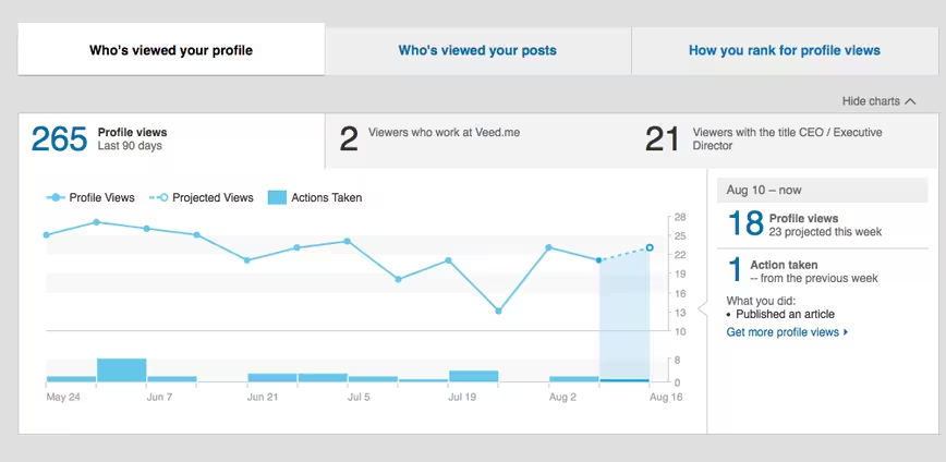
My friend Itamar and I were talking about LinkedIn, making things simple, and user experience. Specifically, we were discussing Who’s Viewed Your Profile. Itamar couldn’t understand why LinkedIn would make you work and do an extra click to be able to view this. Why wasn’t it on the homepage?
I don’t work at LinkedIn and I haven’t asked this to anyone I know who works at or worked at LinkedIn – but I have a good idea why LinkedIn doesn’t have the Who’s Viewed Your Profile list on the homepage. They want you to experience a bit of pain to see it. It primes you to go deeper into the site.

BJ Fogg’s Model
Let’s think about BJ Fogg’s Tiny Habits:
B= MAT or Behavior = Motivation * Ability * Trigger
The behavior is you going to see who’s viewed your profile. Your motivation is high. I look almost daily so I can see if there are potential leads there or anyone interesting that I should know is checking up on my profile. It’s a mixture of desire for more clients and vanity, which means that the pain to play can be higher (i.e. a click in instead of on the homepage). My ability is still there – I can click from the homepage. My trigger started with an email informing me that people have looked at my profile.
Hooked Model
We can also look at it from Nir Eyal’s Hooked Model:
It started with an External Trigger – the email of People Have Viewed Your Profile. That would lead me to the site. However I would also go to LinkedIn for the groups and would go through the link on the homepage. Originally this link was on the right side, below something – but its since moved to be top and center of the page.

The Action was me clicking through to see who’s viewed my profile. The Variable Reward? Some people were really cool and some were important. But not all were, and as such the reward was variable. My body rewarded me with a dopamine rush whenever I saw someone who impressed me viewed my profile.
Some of the viewers were anonymous, which leaves you dissatisfied. The Investment is my time looking. Eventually I would keep going back until the external trigger became an internal one, where I check it daily when I take a writing break.
Example 2: Cluster Learns to Make Users Ask For It
In the Medium post, The Right Way to Ask Users for Mobile Permissions, Brenden Mulligan, the Co-founder of Cluster talks about how his team has learned, “…to ask our users for permission when, and only when, we absolutely need it…” Brenden later mentions, “Asking users for photos access after they tapped a camera and “Choose Photos” increased the acceptance rate from 67 percent to 89 percent.”
Again, users are put into pain before being given the option to do a behavior. Here the pain is that they have to actually ask to use something before being given the prompt for permission. Why? Because without that pain many users will say no to the permission. I realize this makes no sense since that person downloaded the app to begin with, so by that logic permission should be given, but people aren’t always logical.

BJ Foggs Model
The Behavior we want is a user to say Yes to permission to access something on the phone. The motivation when people first download an app is low. They don’t understand why certain permissions are being asked. They don’t know whether your app sucks and they haven’t decided whether your app is being deleted tomorrow. (80 percent of all apps are deleted after one use). As such we have to wait until motivation is high.
Behavior (Yes to permissions) = Motivation (They have tried to use this feature in the app or product) * Ability (If they don’t say Yes to permissions they won’t have the ability) * Trigger (They have gone into the app for whatever reason to do an action).
Moral of Cluster’s Story
Wait to ask till you know the other person will say yes. That’s actually a pretty good guide to life.
Example 3: Making Things Harder Helps You Learn
Researchers from Princeton and Indiana University tested the idea that simplifying things for optimal learning was better – and found out that it wasn’t. In fact, making things harder to read actually made the students work harder to study it, and as such they retained more information.
In other words, make things harder to read if you want people to remember it. Keep in mind, this only works if the persons motivation is high, so that has to be determined before making things more difficult. This is why most people don’t read your Terms and Conditions, their motivation is low (it’s boring, long, and probably says the same thing of a million other sites).

BUT those who do will find that needle you might have hidden in the haystack. Think of all the sites that focus on Facebook’s change in policies – their motivation is high, so they will comb through that thing to find anything amiss. And they will remember their findings for years, because they worked so hard to get them.
Why create the pain? A few reasons:
Because by clicking through you are now primed. Priming is “Priming is an implicit memory effect in which exposure to one stimulus influences a response to another stimulus.” Which basically means once you’ve clicked on a link to go deeper inside the site you are more likely to dive deep and click on more links inside said site. More pages viewed means more ads viewed and more money for LinkedIn.
Working harder for something means we appreciate it more. Ever hear the phrase, “Why buy the cow when you get the milk for free?” This is the internet business version of that. By working harder to see the stuff you’re interested in you actually end up liking the site more and taking it more seriously.
It increases your commitment to the product. The fact that you are willing to work for something inside a product gives your subconscious a signal that this product is importance and by working inside it your commitment is now higher – that raises Customer Lifetime Value and raises switching costs.
The important thing is to make sure whatever feature you’re putting a level of pain behind is something that the user actually wants. Don’t worry, their actions will make it clear on whether they find it important or not, watch your analytics.
Read Next: How to conquer designer’s block
Image credit: Shutterstock
Get the TNW newsletter
Get the most important tech news in your inbox each week.


