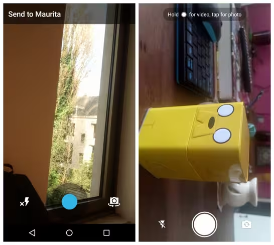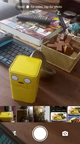
The look of WhatsApp was overhauled last year when it finally got a Material Design update but the camera interface remained stuck in the past. Well, the company has finally listened and have given the in-app camera screen a much needed makeover on Android.

The new camera interface looks much more sleek and minimal and fits in better with the app’s design. It no longer has the intrusive blue shutter button, there’s a neat white button that fits in with the screen’s color scheme.

The flash and camera icon have also had a makeover to make them look less basic. To record video in the latest version, all you have to do is hold on the new shutter button – the same as you do on Snapchat – and just lift your finger to stop.
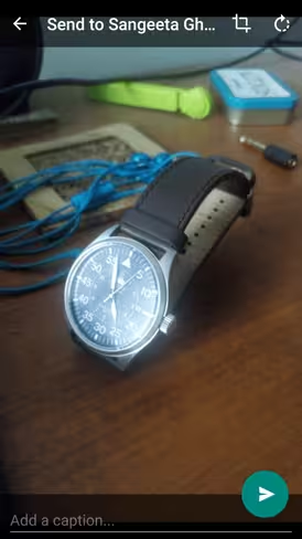
After you’ve taken a snap, you’ll see the display is more minimal too, with a floating ‘send’ button and the caption box at the bottom of the screen.

Overall, these are pretty minor changes but together, they add to WhatsApp’s Material Design and make the app appear much more cohesive. The latest version of WhatsApp is still in Beta so you’ll need to download the APK to give it a whirl.
Via Android Police
Get the TNW newsletter
Get the most important tech news in your inbox each week.


