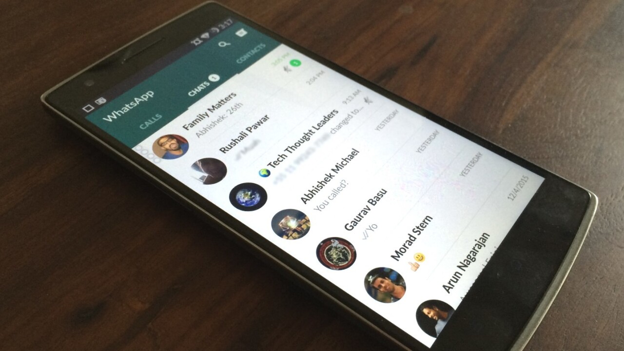
At long last, WhatsApp has received a Material Design overhaul on Android, and it now looks a whole lot better than the last version.
The update isn’t yet available on Google Play, so you’ll need to install the latest version off WhatsApp’s site to see the changes.
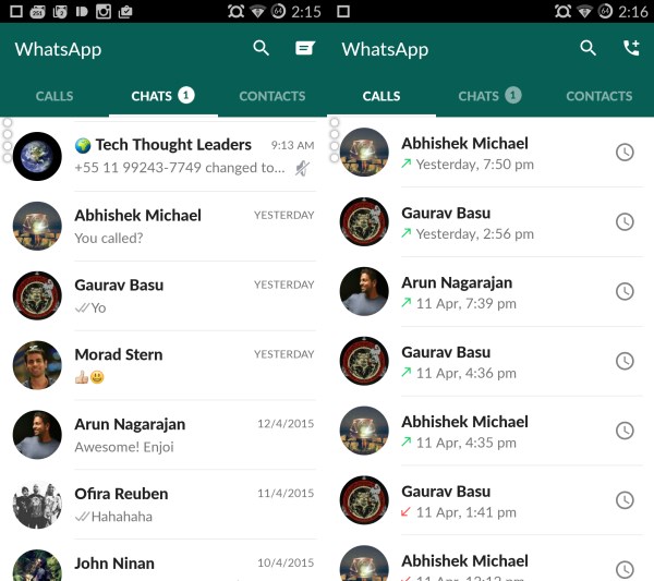
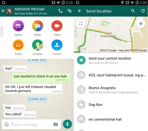
WhatsApp version 2.12.38 now features a deep green title bar that blends into the three tabs for calls, chats and contacts. You’ll notice new buttons in the chat window to record voice messages, as well as in the attachment option pop-up.
Group chat info and profiles now look a lot nicer, with a clean layout and a large cover image that shrinks to a titlebar with the dominant color from said image.
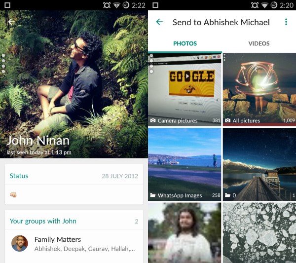
The media selection screen for sharing photos and video, as well as the Settings menu now look clean and bright.
I noticed that a few design changes and animations aren’t the same on my device as in this AndroidPolice post — so it’s likely that WhatsApp is still working on rolling out all of its visual updates.
Still, the improved layouts and neater iconography are a breath of fresh air. If you want to see what the Material Design update looks like right now, grab the latest version from WhatsApp’s site.
➤ WhatsApp [iOS | Android | Windows Phone | BlackBerry]
Get the TNW newsletter
Get the most important tech news in your inbox each week.

