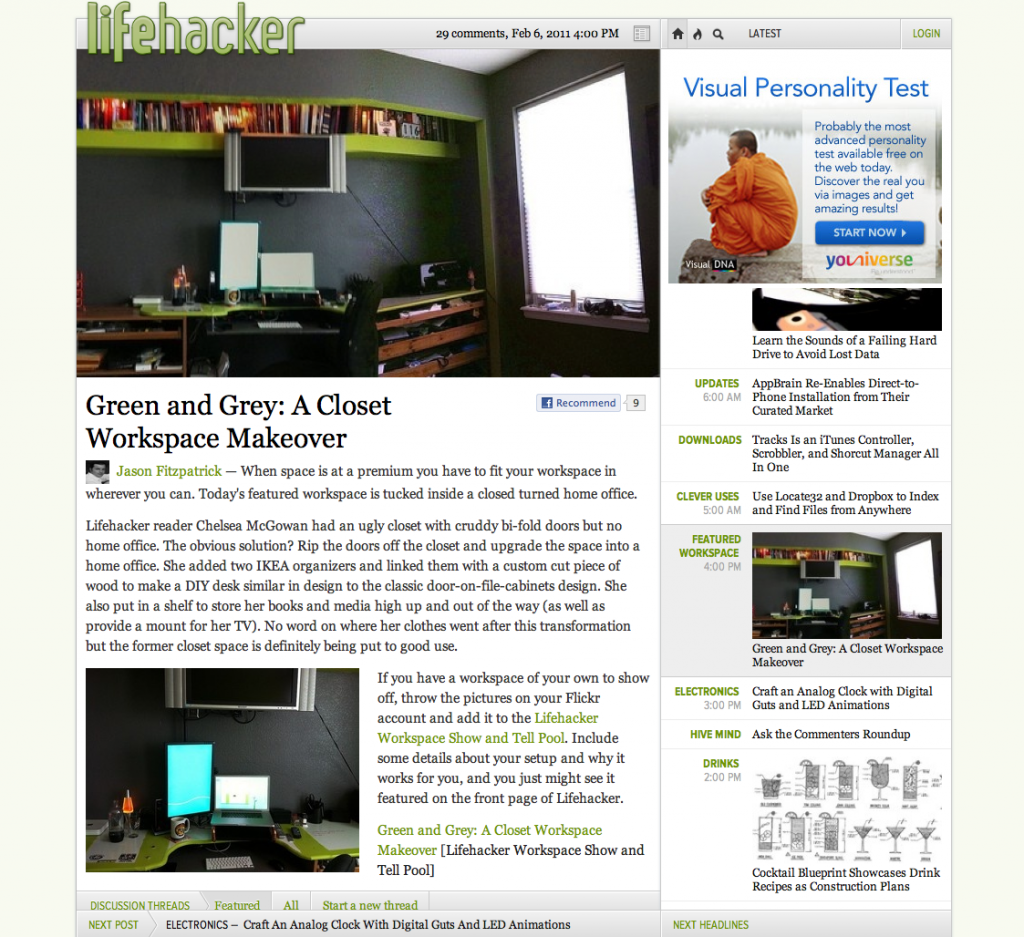
 A few years ago, the popular conservative blogger Michelle Malkin rolled out a redesign of her website. Instead of employing a simple reverse chronological blog, the new site featured one large “lead story” on the left, with a blog-like list of headlines on the right. The reason for this is quite obvious: Malkin wanted the ability to feature what she considered her most important post of the day while also making it easy to navigate her less noteworthy posts. This way, an influential piece of writing wouldn’t be pushed off the page by the downward churn commonly found on your average blog.
Those who follow the insider-minutia of blogosphere news will recognize this same concept in Gawker Media’s new redesign. In numerous interviews, Gawker founder Nick Denton has highlighted the importance of the large splash post, often telling the anecdote of how Gizmodo had to stop publishing the day of the prototype iPhone scoop so that the article would stay at the top of the page (apparently he hasn’t heard of the WordPress plugin that allows you to keep a post at the top). Like Malkin, he and other Gawker editors will now choose a day’s most attention-worthy post while permitting users to scroll through the leftover junk on the right.
But while Malkin’s approach to this idea is clean and simple, the Gawker design is a mess. A pretty mess, but still a mess.
Let’s start with the sidebar. With Malkin’s blog, the side posts scroll down with the rest of the page. Gawker’s side posts can scroll independently from the rest of the site. This concept works in theory, but over the last few days I’ve found myself reading one post and accidentally moving my cursor slightly and finding myself in a completely different post. The same goes for the arrow keys on your keyboard; if you push up or down, the page scrolls with it, but god forbid you accidentally push the right or left arrow keys, both of which will automatically launch you to a new article. Not to keep comparing Gawker to Malkin, but her side posts also allow her to publish small thumbnail pictures and even subheaders, which are much better than simple headlines at pulling the reader’s eye toward the right of the blog. Gawker has the ability to publish pictures on its sidebar, but doesn’t for the vast majority of its posts.

The Gawker posts themselves aren’t particularly easy to read. You have to scroll past a large picture before even reaching the text of the article. Worst of all, Gawker’s comment section — long cherished for its witty contributions — is not intuitive. For at least a year now Gawker has tried to place emphasis on the best comments, but with the redesign it may not be immediately clear to a new reader that you have to click on “All” to read all of them. In the end, it just simply looks at first glance as if most posts only have one or two comments.
Many media critics note that Denton has history on his side, and I certainly agree. His staff memos, often leaked to Romensko, offer more insight on digital media and the future of news than 90% of Mashable articles. He has grown Gawker Media into a powerhouse that has left most of its blog brethren in its dust. But over the last few months he has issued several quotes about Gawker’s strategy that seem suspect. Recently, for instance, he claimed that Facebook is the only social media traffic driver of any worth and that Twitter is all but useless. True to form, the new design does not feature any social media sharing buttons other than Facebook’s. Whatever metrics Denton was using to make that calculation, he’s wrong. If you look at bit.ly click metrics, a piece published on a site like The Oatmeal or The Onion can get upwards of 50,000 clicks. And that only includes the Twitter users who use Bit.ly and not other shortening services. Gawker Media may be big, but it’s not so big that it can disregard 50,000 pageviews on a single article as useless. Yes, I agree that news sites can get a little too enthusiastic about including every social media icon, no matter how inconsequential, but you can’t deny Twitter’s ability to quickly and effectively spread content.
Speaking of Facebook, you would think a guy who considers it to be so important would design his site so you can actually link to its posts from your Facebook profile. I don’t know if this is a temporary glitch, but for the past few days I have literally not been able to post Gawker URLs into my Facebook news feed. Not only does Facebook not call up any headlines or images when you try to post a link, it doesn’t even recognize it as a proper URL. I currently get the below error message every time I try to post a Gawker link into my news feed:
In terms of traffic, we’ve already seen a downward trend in page views just in the few days since the redesign launched (though to be fair, Denton predicted an initial decrease as readers adjust to the site). For years, all Gawker Media blogs included their Sitemeter statistics for anyone who wanted to peruse them, but if they’re still available, I can’t find them. If they are actually gone, I can’t help but wonder if part of the reason is so that nosy media writers like me can’t constantly scrutinize them over the next few months.
Reading interviews with Nick Denton over the last year as he slowly released details about his guiding philosophy, I couldn’t help but feel ambivalent about the mogul’s prognosis for the economics of blogging. The reverse-chronological website belongs in the kiddie pool, he seems to be saying. The users can’t be trusted to pick the most important posts; an editor must instead. But isn’t this simply the philosophy of every major print newspaper? Isn’t this the kind of thinking from which we’ve been moving away? Whatever happened to the idea that the front page is dead?
The other day former Gawker editor Gabriel Snyder said he was “on the record that I think the redesigns will fail. And I’m now officially opening the betting pool. I think Denton is going to be forced to pull back on this. If anyone wants to wager that the redesign don’t get yanked back (or greatly modified) by, let’s say, June 1… I’ll take your bet.” Well, Denton actually took that bet, and will base Gawker Media’s success or failure on this October’s traffic numbers.
In the past, I would have bet on Denton over any internet media mogul out there, but this time I’m not so sure. I remember reading in a few places that the Gawker redesign will negate the need for it to release any mobile apps. The site is supposed to look its slickest on a tablet computer. But while the redesign may be absolutely beautiful for your iPad, for the open web it’s a total, utter mess.
Get the TNW newsletter
Get the most important tech news in your inbox each week.


