Did you know TNW Conference has a track fully dedicated to exploring new design trends this year? Check out the full ‘Sprint‘ program here.
Let me take you back to a time before iPhones, Game of Thrones, and Netflix. The year is 1989. The hairstyles are big and curly. The earrings are huge. George H. W. Bush is sworn in as the 41st president of the United States. A Chinese man stands alone to block a line of tanks heading east in Beijing’s Tiananmen Square. Berlin Wall comes down. Madonna is singing “Like a Prayer” and movies like “Good morning, Vietnam” and “Die hard” have been released.
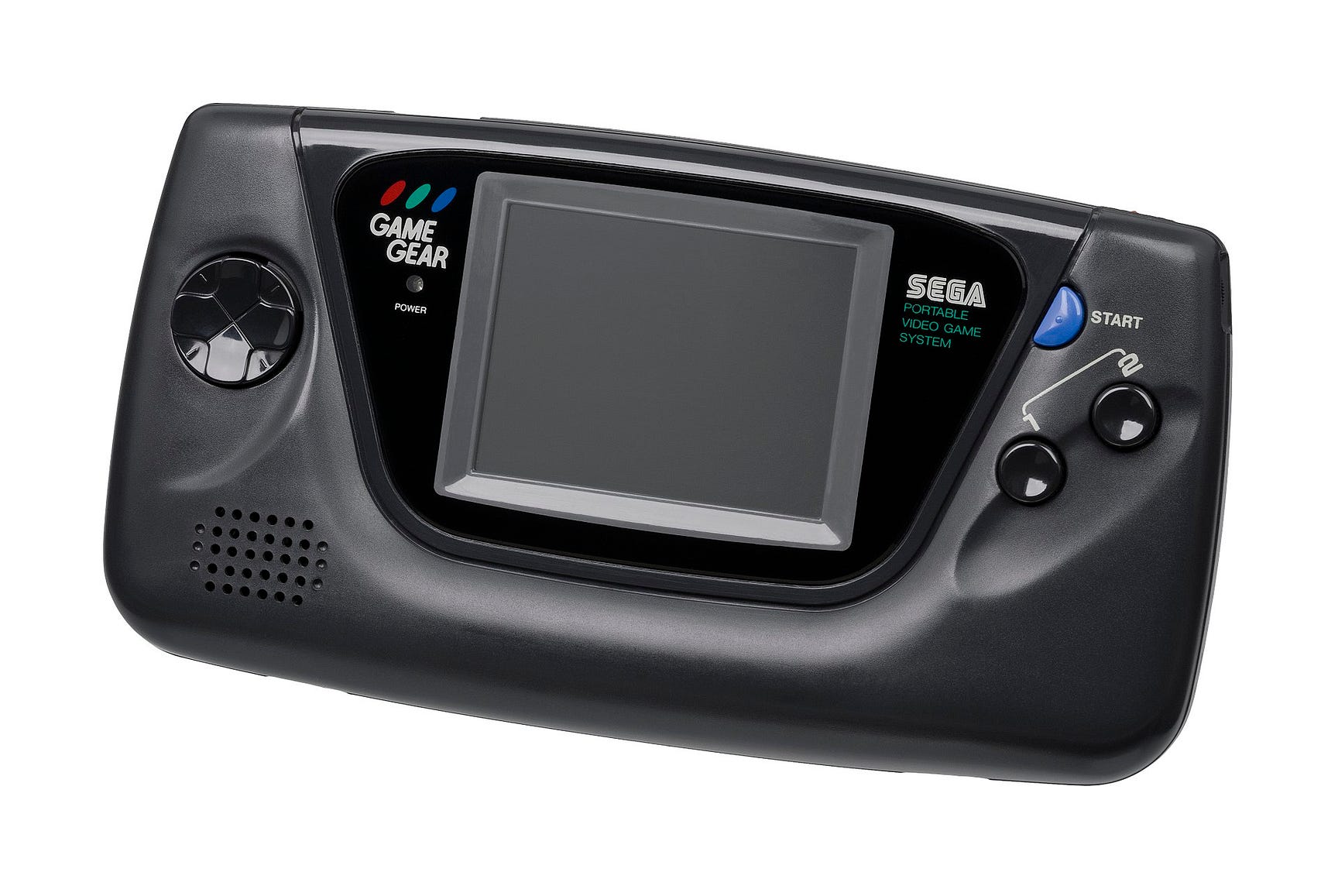
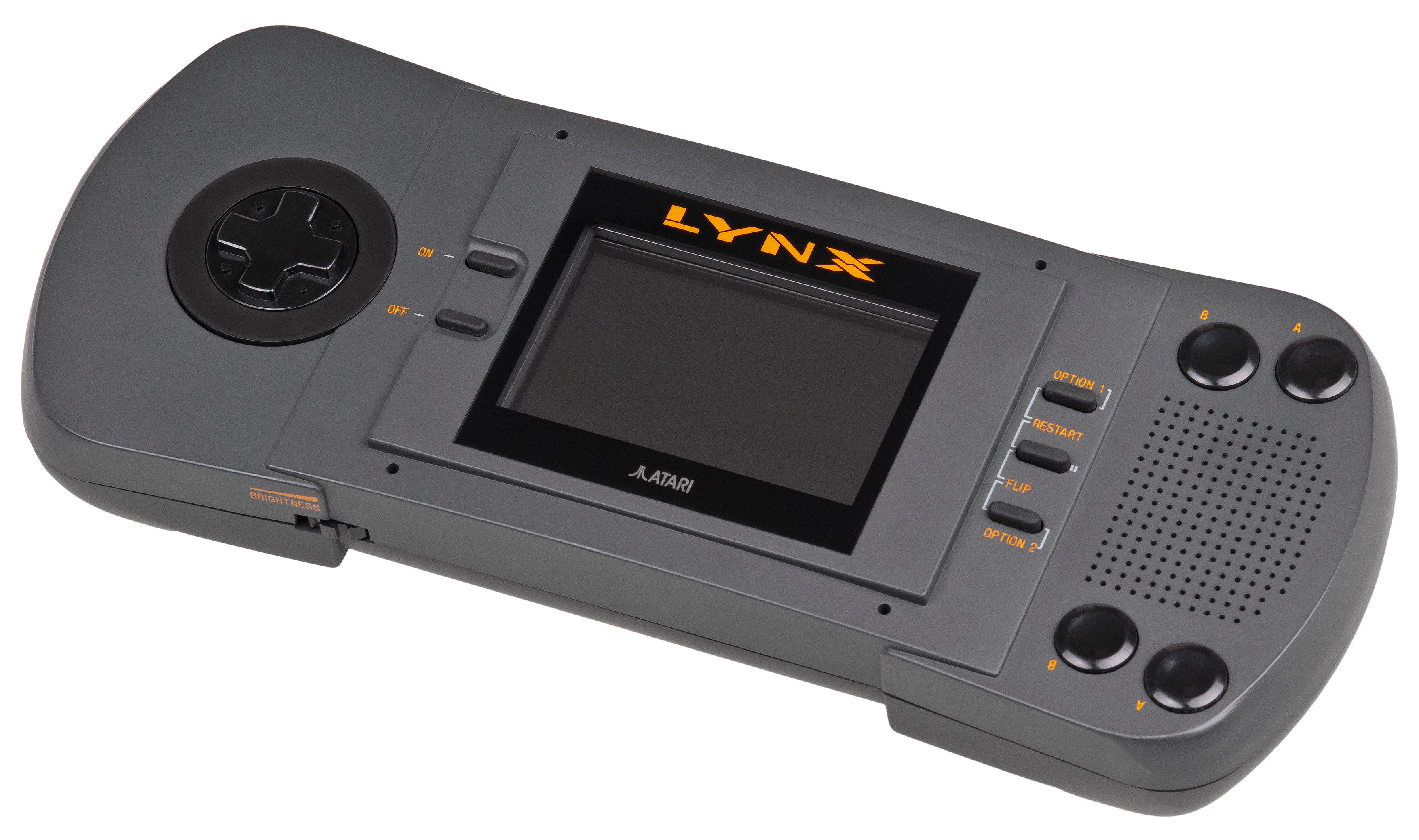
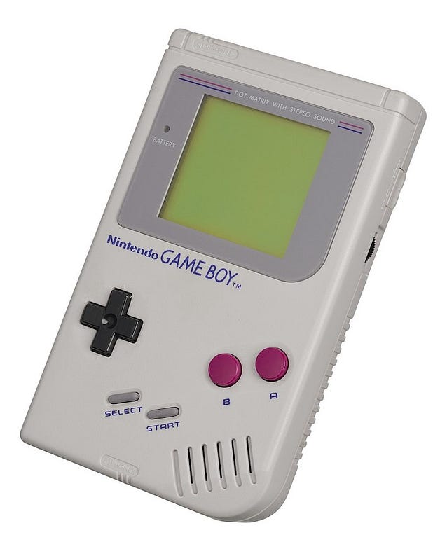
Around that time, three company’s, Nintendo, Sega , and Atari, released handheld game consoles. The first of their kind. Before that, kids had to go outside and play, and adults commuting had to read books or talk to the person sitting next to them. Crazy stuff.
Nintendo released the Game Boy, Sega the Game Gear, and Atari released Lynx. Both the Game Gear and the Lynx had full-color backlit screens, a total of 4096 colors. The Game Boy had 4 shades of gray on a greenish screen and it was not backlit. The Game Gear and Lynx had nice handles where the user could hold the console and control the buttons. The Game Boy was unergonomic and tiny.
Read: [A brief history of UX design and its evolution]
Based on this information, which game console would you buy? Hint. One of the consoles sold 180,7 million copies while the other ones sold 3 and 10,67 million copies.
While the Game Gear and Lynx were technologically superior in every way, the Game Boy was the one that sold 180,7 million units. It was the best selling console in the 20th century.
Why? The User Experience
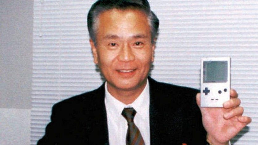
The team at Nintendo under the lead of Gunpei Yokoi had no professional training in design or user experience. Gunpei Yokoi barely had a degree in electronics, but he was very creative, finding new ways to use old technology. In his book Range: Why Generalists Triumph in a Specialized World, David Epstein writes that Yokoi called his philosophy “lateral thinking of withered technology.” Lateral thinking was coined in the 1960s for the reimagining information in new contexts. Yokoi was finding new radical ways of using mature technology which was cheap and well understood.
Yokoi argued that cutting edge technology can get in the way of developing a new product. According to David Sheff, the author of Game Over: How Nintendo Zapped an American Industry, Captured Your Dollars, and Enslaved Your Children, Yokoi said, “The Nintendo way of adapting technology is not to look for the state of the art but to utilize mature technology that can be mass-produced cheaply.”
The team at Nintendo cut every corner making the Game Boy. The used a Sharp processor from the 1970s. They made it tiny. They didn’t use colors and the graphics in fast lateral motion smeared across the screen. But it was cheaper, many could afford it. 90US$ compared with 150US$ (Game Gear) and 180US$ (Lynx). It was tiny but it could fit inside a larger pocket. It was also indestructible, you could drop it and accidentally wash it in the washing machine and it would still function. After drying of course. You can also play for 30 hours on 2 AA-batteries. Both the Game Gear and Lynx required 6 AA-batteries and you can only use it for 3–5 hours.
During an interview in 1997 with Muumuu’s president Yukihito Morikawa, shortly before Yokoi died, Yokoi said that Nintendo wanted color graphics for the original Game Boy but that he pushed for monochrome. He said:
Once you start playing the game, the colors aren’t important. You get drawn, mentally, into the world of the game.
Yokoi understood the user experience. He understood that the most important thing was making the user engaged and experiencing a range of emotions. He understood that he had to make a trade-off, he could not make a cheap console that also had a backlit color screen, was small, and had long battery life. Given that, and considering the user context, he understood that the long battery life + a tiny device would provide a greater user experience than the colored screen. During the interview, Yokoi also said, “After we released the Gameboy, one of my staff came to me with a grim expression on his face: ‘There’s a new handheld on the market similar to ours…’ The first thing I asked was: ‘Is it a color screen, or monochrome?’ He told me it was color, and I reassured him, ‘Then we’re fine.’”
The whole interview was translated from Japanese to English and can be found here.
So, what can we learn from the success of the Nintendo Game Boy?
Mainly that user experience is much more than the screen and that the user context is super important. My experience working as a UX designer is that we often miss the big picture when we talk about user experience. We focus on the screens. But how about the context? When and how is the product being used? If user experience professionals only focus on the screens and perform user tests in a safe and controlled environment we will miss a lot.
Let’s say that you are a user experience researcher working for Sega or Atari. You set up a controlled test environment and give a game console to the user. You provide them with certain tasks, observe, and discuss. The users love the game console. But this is not the context where they would naturally use it. They will not play on it while sitting by a table. Battery fully charged.
They would more likely have it in a bag, pick it up on the train or bus while commuting to work. It would have to be robust to handle being picked up and thrown down in the bag. You don’t’ want it to be too big, too heavy. You want to be able to play for a while. You don’t want the batteries to run out when you need your game console the most, during a delay when you are stuck on the train or bus for a few hours.
The most important thing we need to learn from Nintendo is that we, as UX professionals, need to put a great emphasis on the user context when designing. I’m going to give you two examples of how we can translate what we learned from Nintendo to contemporary UX design.
Let’s say you are to design a location-based notification application, as Google Keep for example, but smarter. With Google Keep you set reminders that bring certain notes to your attention when you arrive at a specified location. But you want to design a smart AI application that can anticipate what you need to know and send you the information you need based on your location. How would you proceed to test what kind of notifications are useful for the user in different situations? One way to do it would be to follow the user around during one day and send different text messages based on where the user is located. For example “Buy bread” when the user enters the grocery store. By evaluating what information is valuable for the user in which context we can learn and adapt. For more information about Anticipatory Design read the amazing article “The psychology of Anticipatory Design” by Yogesh Moorjani.
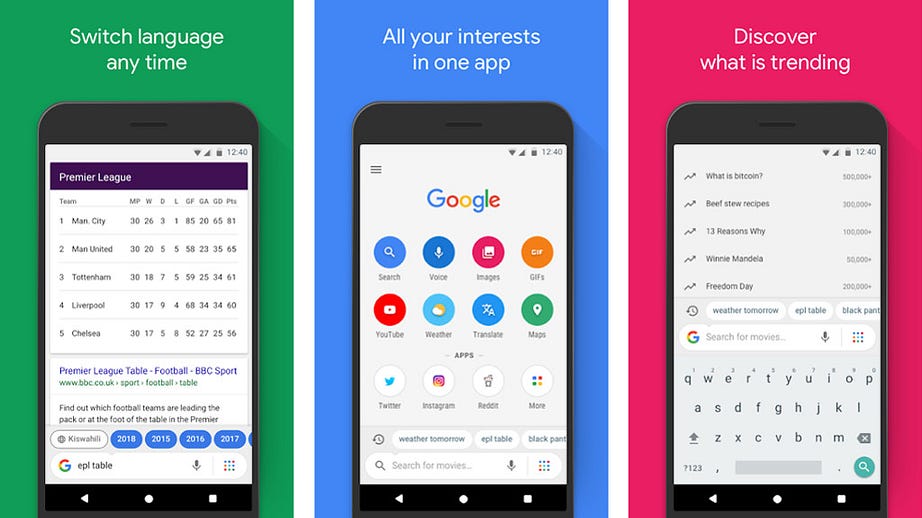
One great example of a current UX design that places great value on context is Google Go. The phone browser is small in size, only 7 MB, saving space on your phone. It is faster than Chrome, saving up to 40% data so that users do not waste precious data or run out of battery. It is optimized for voice search. They have also placed the search bar on the bottom of the screen making it easier to access while holding the phone with one hand. These properties may not be very important in other context but when you are on the go, they are extremely valuable.
To conclude, a customer’s satisfaction with a product depends on the context of its use. As user experience professionals we must keep that in mind when designing and when testing. We need to observe the users in their environment, in the right context. Or we will miss out on the necessary information and make poor decisions. After all, we want to make the future Game Boy and not the Game Gear or Lynx ?
Get the TNW newsletter
Get the most important tech news in your inbox each week.
