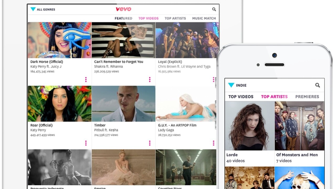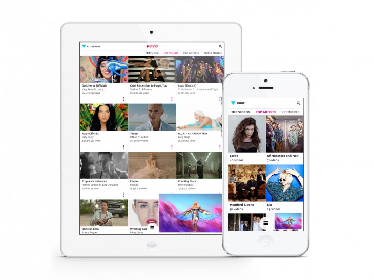
Last month we were given an early look at music video service Vevo‘s new iOS app, and now it’s gone live with a complete redesign across iPhone, iPod touch and iPad.
It features a feed-based interface to make it easier to discover new videos, a gesture-based interface and a YouTube-esque mini-player for navigating while you continue to watch videos. There’s greater emphasis on playlist creation and users in the US and Canada get access to Vevo TV, the old-school MTV-style linear approach to watching curated music videos.
The new app is live in the US, Australia, Brazil, Canada, France, Germany, Ireland, Italy, the Netherlands, New Zealand, Poland, Spain, and the UK. Versions for Android and Windows Phone are in the works.
➤ Vevo [App Store]
Get the TNW newsletter
Get the most important tech news in your inbox each week.


