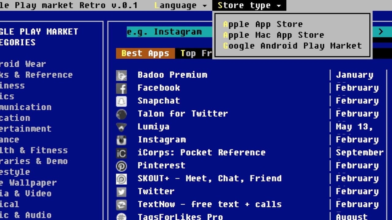
If you find Apple’s App Stores or Google Play a bit overwhelming at times, check out App Store Retro. This late-1980s MS-DOS style reworking boils today’s stores down to low-res text straight out of your parents’ old 386 PC.
The simplified interface is oddly calming. It offers a limited selection of popular titles and a search function to help you find your favorite app.
You’ll get sent hurtling back to the modern world when you click a link, but hey, the nostalgia trip can’t last forever. That said, I’d love to see popular apps’ store pages reworked in glorious blocky-vision.
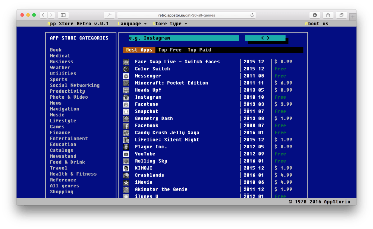
App Store Retro was posted to Product Hunt today by Ukranian entrepreneur Andrey Tkachenko, and the project was designed as a promotional vehicle for the Appstorio, Softwario and Androio app rankings sites. The work is based on the Bootstra.386 theme for Bootstrap.
I love the modern world, but part of me wishes life was as simple as it was when 386 PCs were cutting edge stuff.
Get the TNW newsletter
Get the most important tech news in your inbox each week.


