Rumors of a redesigned Twitter.com interface have been floating around for a while, and the company is finally showing off its new user experience.

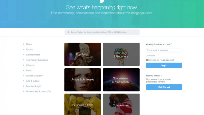
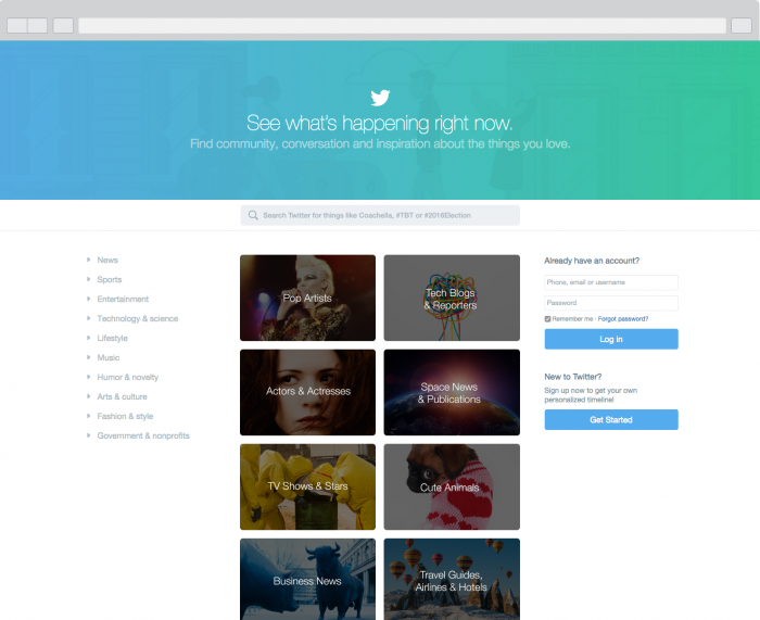
The company today unveiled a new home page that feeds content to users who either aren’t signed in or don’t have a Twitter account. From the start, you’ll see a list of topics such as Pop Artists, Tech Blogs & Reporters and Cute Animals (of course), among others.
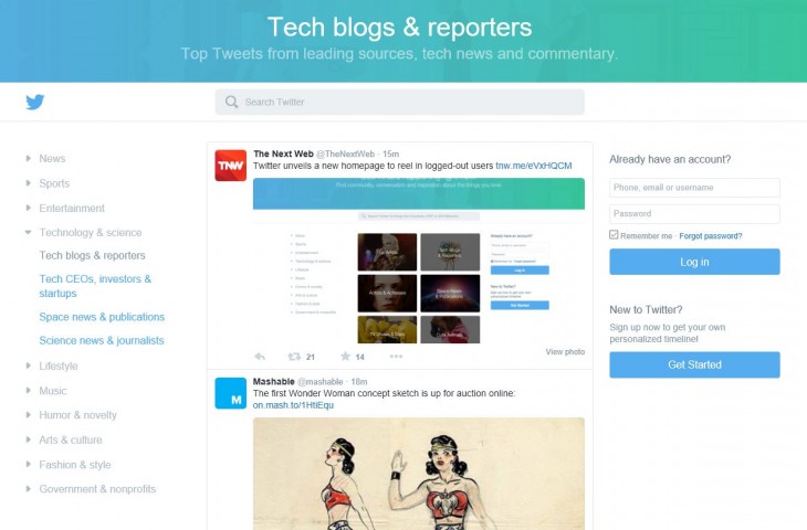
Once you click one one of those topics, you’ll see a stream of popular tweets within the category.

The UI is indicative of Twitter embracing its role as modern news medium.
It’s notable the company showcases broad categories rather than the trending topics it popularized, for instance. Although trends are Twitter’s bread and butter, showcasing the range of topics the platform can cover on a general basis, rather than whatever is trending at any given moment, could help ease new users in by positing the page as a general hub for news.
It’s also stark contrast from the old page, which first and foremost encouraged users to sign up.

And the change makes sense. Users who read Twitter don;t necessarily sign up, and being told to log in or sign up before you can read any news is an immediate deterrent to sticking around.
The new homepage also shows off flatter, cleaner design elements for Twitter. We may see these extended to other parts of the site soon. We recently reported on the company testing a new search layout which features a design that – while not identical – resembles the clean look of the new homepage.
The page is only available in the US for now, but Twitter says it expects a broader rollout soon as it continues to trial the design.
Developing…
Get the TNW newsletter
Get the most important tech news in your inbox each week.


