Twitter might be gearing up to change its search layout. Yesterday we spotted some users had noticed strange new UI when searching within Twitter.com. Today WebProNews confirmed Twitter is running a test with the new design.
http://twitter.com/OllyOsborne/status/585402042530791424
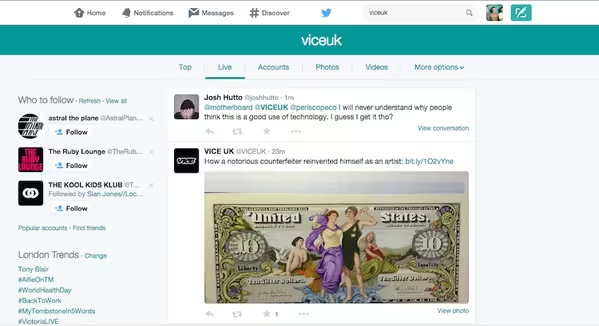
For reference, here’s what the regular search interface looks like.


The 💜 of EU tech
The latest rumblings from the EU tech scene, a story from our wise ol' founder Boris, and some questionable AI art. It's free, every week, in your inbox. Sign up now!
Comparing the two interfaces, the new design is simpler and much less cluttered. It reduces the default mess of options on the current layout to just a few tabs covering search categories at the top, while also matching your account’s theme color.
There’s been some renaming too; the ‘Live’ tab also seems to replace the “All” function atop the old search UI, so that you can easily look through tweets in chronological order (the default ‘Top’ view prioritizes trending tweets instead). The ‘People’ option has also been renamed to ‘Accounts.’
If you’re wondering where the options are to limit searches to people you follow or tweets near you, those are now tucked under the ‘More options’ tab, along with saving and embedding searches.
http://twitter.com/esills/status/585532182850048000
Twitter routinely runs tests on small subsets of its users, so we can’t say whether the new UI will end up being a permanent fixture. That said, we hope it does – it’s a lot cleaner and appears easier to use without reducing functionality.
➤ Twitter Confirms It’s Messing With Its Search Experience [WebProNews]
Image Credit: @ollyosborne
Get the TNW newsletter
Get the most important tech news in your inbox each week.