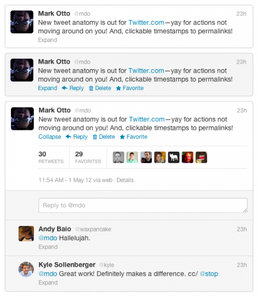
After we first spotted it a couple of days ago, Twitter has now confirmed some of the UI changes that you’ll be seeing in your timeline. The stalwart links at the bottom of the tweet? You won’t be seeing those anymore unless you hover over it. Here’s an example for you, courtesy of the Twitter blog:

As for posts containing media? Here’s what Twitter has to say:
“If the Tweet contains media, you’ll also see specific options like “View photo” or “View video”; otherwise, you’ll see the option to “Expand”. You can expand any Tweet in your timeline to see inline context like favorites or retweets from other people, or additional Tweets from that same conversation.”
The goal for Twitter, of course, is increased engagement. Perhaps not unlike the flashing HTML text in days of yore, having text that appears on mouseover is what gathered user attention. Twitter says that, of all the variations tested, this one showed the greatest increase to engagement.
What’s probably most notably missing from the changes that we saw the other day is something that was perhaps a mistake:
“When someone you follow mentions a user that you don’t follow at the start of a tweet, the interaction usually gets filtered out of your stream.
Twitter has changed that, according to Bonfire, now showing conversations your friends have with people you do not follow on Twitter.com.”
For those of you who have been on Twitter for a while, this will sound familiar as it’s how the service used to work. It wasn’t until just a couple of years ago that mentions of people you didn’t follow began being filtered from the stream, and it was those mentions that was a strong case for the original version of TweetDeck.
Though the argument could easily be made that including these mentions clogs up a user’s stream, there are those of us who would fully welcome our previous cluttered-feed overlord’s return. In fact, unless you’re using the old, Adobe-Air version TweetDeck, you have no access to these mention-started tweets, and it’s features such as that which have helped keep the dying client alive.
It appears that’s all the changes that we get to see today, but we’ll be keeping our eyes peeled for more. In case you missed it, Twitter also did some recent revamping to the Discover tab, and you can find the details here.
Get the TNW newsletter
Get the most important tech news in your inbox each week.


