Twitter co-founder Evan Williams has tweeted out a preview post with information about the upcoming publishing platform he’s building with fellow co-founder Biz Stone, former VP of Product for Twitter and former Blogger PM Jason Goldman at Obvious Corp. The post has been shared from the platform itself, and is an example of its simple article template.
Williams says that the Obvious Corp. decided to take on the construction of a new platform because “we believe publishing—and media, more broadly—is important.”
“So, we’re re-imagining publishing in an attempt to make an evolutionary leap,” says Williams, “based on everything we’ve learned in the last 13 years and the needs of today’s world.”
The preview shared today is one component of that overall vision for publishing.
Williams describes the platform this way:
Medium is designed to allow people to choose the level of contribution they prefer. We know that most people, most of the time, will simply read and view content, which is fine. If they choose, they can click to indicate whether they think something is good, giving feedback to the creator and increasing the likelihood others will see it.
Posting on Medium (not yet open to everyone) is elegant and easy, and you can do so without the burden of becoming a blogger or worrying about developing an audience. All posts are organized into “collections,” which are defined by a theme and a template. (For example, this post is in the About Medium collection with a simple article template.)
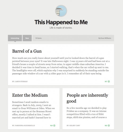
The post contains links to sample story collections like the one below, where we can see that the platform has a grid-based layout and appears to fall somewhere between Twitter and Blogger as an option for content creators.
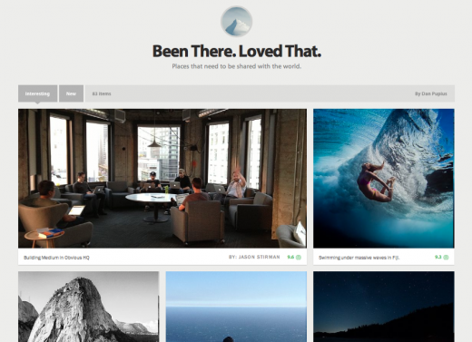
But the layout seems to work just as well for photographs, as the collection of images seen below seems to indicate:
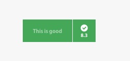
Interestingly, the posts feature a button in each post that reminds me a lot of Dustin Curtis’ ‘Kudos’ button on Svbtle. The button features messages like ‘Good one’ or ‘This is good’. I know Curtis took a lot of flack for the feature, but I like it. The button offers a bit more clarity of language, but the ‘like’ mechanic is very similar.
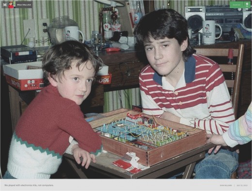
The interface for photographs is especially gorgeous, taking up the full window with the image and relegating chrome to the corners of the screen:
The author link you see in the bottom right corner goes right to the username on Twitter. From what I saw of the signup process, joining Medium appears to require a Twitter account, at least right now.
In all honestly, Medium feels a lot more like Posterous 2.0 than it does ‘Blogger 2.0’. It has a lightweight feeling, even lighter than tumblr and far more nimble than WordPress. We haven’t seen the backend yet, which would complete that feeling if it wasn’t heavy handed, but interesting so far.
Developer Dustin Diaz shared some technical information about the tools used to make the site. “For the techies, the Medium.com Frontend is running on Node, Matador, Closure, Ender, and LESS. Great time to be a developer.”
This preview follows up Obvious Corp.’s first collaboration, Lift, an “application for unlocking human potential through positive reinforcement,” and its second project Branch, a curated discussion platform that just came out of private beta. Both of those projects have Obvious taking and advisory role, where Medium seems to be an internal effort.
In the years since the introduction of Blogger, which was later sold to Google, and other structured networks designed for easy publishing, many other contenders have arisen. Tumblr and self-hosted linkblogs like Daring Fireball are now valid options for those looking to publish short or long-form works. There are also other blog network efforts like Svbtle, which are looking to strip away the excess and deliver a crisp, clean experience that lets the content take center stage.
With the pedigree of the team, it should be interesting to see what they come up with.
Image Credit: Jolie O’Dell
Get the TNW newsletter
Get the most important tech news in your inbox each week.

