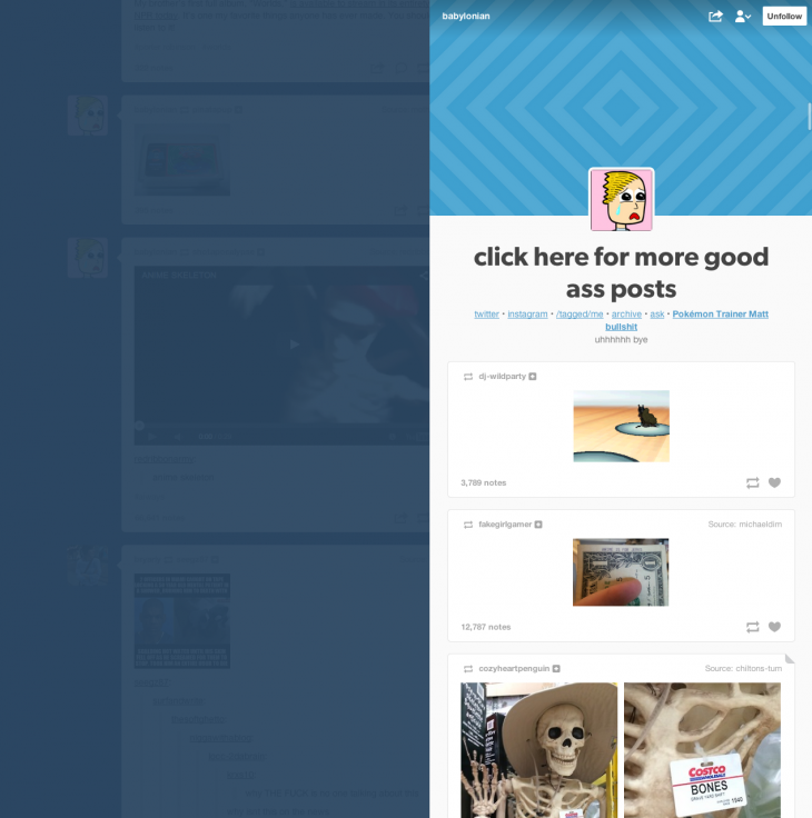
Tumblr has tweaked the design of its blogging platform so that individual blogs “slide” out from the right-hand side of the Dashboard on the Web.
As before, you can hover your mouse over a user’s display picture to see a small preview of their Tumblr blog. Clicking on the image, however, will now cause a slimmed-down version of their page to appear on the right, dimming the rest of your Dashboard and customised feed underneath.

Notably, Tumblr is using the ‘Appearance’ view to display Tumblr blogs in this way. These are the same designs the company recently introduced on mobile, and differ from the extensive theme options usually found on the Web.
While it reduces the amount of creativity usually afforded to user-created Tumblr blogs, it does ensure new slide-out panel is easy to read and consistent in its design. Moving forward, it’ll be interesting to see whether Tumblr continues to focus on the ‘Appearance’ view, and how it affects its traditional blog theme options – or at least people’s perception of them.
Featured Image Credit: Josh James / Flickr
Get the TNW newsletter
Get the most important tech news in your inbox each week.


