We wrote about a travel planner late last year that had a really nifty feature: it helped to optimize your itinerary so you could just pick what attractions you wanted to visit, and it would plan your route for you.
Now, Indian startup JoGuru has rebranded itself as TripHobo. CEO and co-founder Praveen Kumar told TNW that the reason for the name change was because many people in the Western world still don’t know the meaning of ‘guru’ — a Sanskrit term for ‘teacher’ or ‘master’ most commonly used in Indian religions.
“Once we started to grow, what we saw was that most of our traffic coming into the site — about 65-80 percent — was coming from outside India. Our initial preliminary research showed us that JoGuru had a lot of Indian connotation to it. And specifically in travel, we did not want to be a geography-based travel website, we wanted to be a global website,” Kumar said.
Also, Kumar said that the company has seen “far more travel fanatics who can plan way better than we could,” which is why it also doesn’t want to assume the position of an expert in the travel space, and decided to get rid of the ‘guru’ in its name.
Alongside its rebranding, TripHobo has also just received upwards of $1 million (more specifically, in the range of $1-$3.5 million) in funding from Bangalore-based Kalaari Capital.
Kumar told us that Kalaari had seen the kind of traction TripHobo had been getting compared to other travel planning startups out there, and “that is one of the reasons why we have been able to close the funding.”
So far, TripHobo has seen 25,000 itineraries created by its users in the last six months and a 300 percent growth rate in the number of monthly unique visitors to about 150,000 now. Its itinerary planning and optimization feature is also available for close to 180 cities now, up from 70 cities previously.
TripHobo has a series of improved features
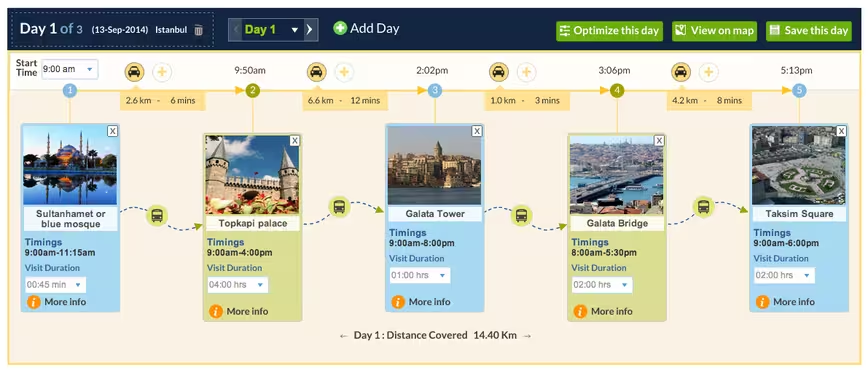
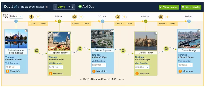
TripHobo aims to solve the hassle of creating an itinerary with a very visual solution: it displays a map with whatever attractions you have selected, and optimizes your travel route with an algorithm — basically arranging the sequence of your attraction visits according to the distance between them and their opening and closing times. You just need to click on ‘Optimize this day’ to enable that option.
The last time I tested TripHobo, I felt there were still some elements missing, in particular being able to add a location of your choice such as the airport where you will be landing, a restaurant that you decided to make a stop at while on your journey, or even an Airbnb apartment. Now TripHobo has added in the option to “Add Attraction of your choice” — technically a misnomer since you can literally add any location you want, not necessarily an attraction.
However, as the search function is powered by Google Places, there is still some frustration in trying to get specific addresses if they aren’t listed. TripHobo may have to tweak this gradually in order to make it easier for its users, though it is very much a welcome move.
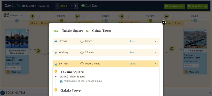
In a span of about half a year, TripHobo has also revamped its smart itinerary generator to add in transportation options for the route you can take, essentially making it even more convenient for a traveler to see at one glance what options are available — without having to be routed out of the site.
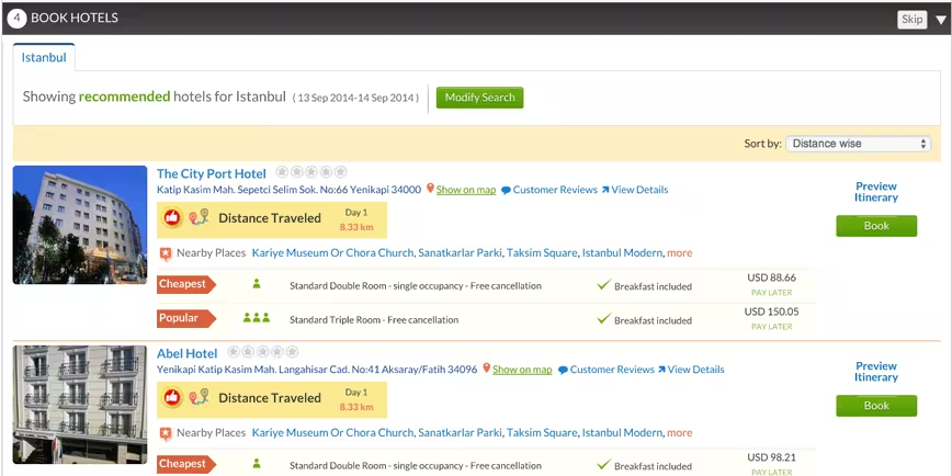
There is now also a hotel recommendation engine, tied in to Booking.com, that provides suggestions for hotels based on the distance within your selected attractions. This is particularly useful if you want to reduce the amount of distance you have to travel throughout your trip. You can then book your hotel right within TripHobo as well.
Future roadmap for TripHobo
With the latest funding, Kumar revealed that TripHobo is seeking to create about a million user-generated itineraries for about 3,000 cities in the next two years, to become a “TripAdvisor of itineraries” — just like TripAdvisor mainly dishes up reviews, it wants to serve an audience by collating the largest collection of itineraries.
The plan to widen its database of travel destinations available on its itinerary planning feature will kick off in August this year, with the introduction of about 1,000 cities first. And instead of the current way of listing cities, to manage a bigger database, TripHobo will soon feature a search bar where users can key in the cities they want to visit. Its algorithm will then pick up attractions and show them to the user.
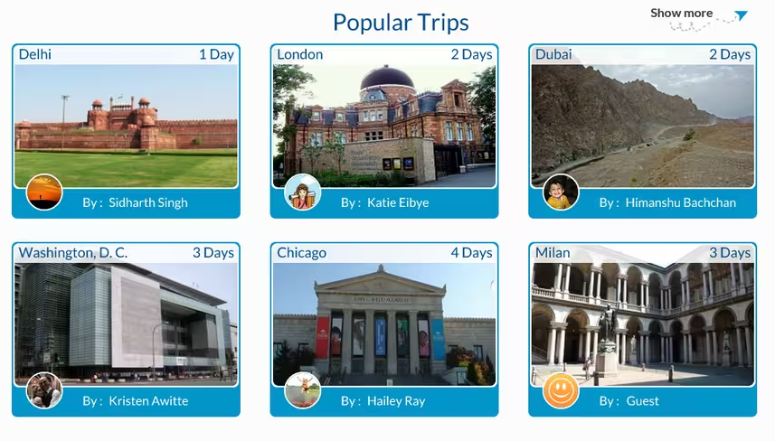
TripHobo is also in the midst of developing native mobile apps, which are scheduled to land in November this year. Currently, TripHobo’s site is mobile-optimized, but rolling out iOS and Android apps would let users sync the itineraries they have created across devices and gain access to them while traveling.
Although Kumar acknowledged the presence of other competitors in the itinerary planning space such as Tripomatic and Plnnr, he said that TripHobo seeks to stand out by providing rich logistical information including the opening and closing hours of attractions, showcasing itineraries that its users have created, and tapping on its backend technology which does more than optimizing travel, such as recommending hotels.
Hotel-booking is also a huge part of TripHobo’s monetization strategy — it takes a 5-15 percent cut if the payment for the hotel goes through via its site. This is also the reason why TripHobo can keep its itineraries free for users, and attract even more new travelers on board.
With its simple visual interface and the convenience of letting users select whatever attractions they want to visit, with TripHobo doing the rest of the legwork automatically, it’s easy to see why the startup could appeal to travelers. It also looks like TripHobo is on the right track to become a must-have travel tool co-existing alongside TripAdvisor, with its plans to introduce mobile apps and a more robust selection of cities.
Headline image via Shutterstock
Get the TNW newsletter
Get the most important tech news in your inbox each week.

