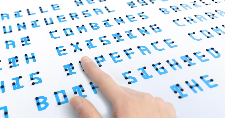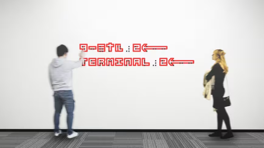
In an effort to make braille more accessible for the visually impaired in signage and printed media, Tokyo-based designer Kosuke Takahashi has hit upon a novel solution that merges those characters with English and Japanese alphabets, so they appear in the same place.
Essentially, the fonts in Takahashi’s Braille Neue typeface feature characters overlaid with their braille equivalents (with the dotted symbols embossed). That negates the need to accommodate braille text separately, and makes it easier to include braille in more spaces and media.

Takahashi developed the typeface by basing it on Helvetica Neue, and then tweaking each letter to include braille characters. The project features two main fonts: Braille Neue, which features Latin characters, and Braille Neue Outline, which supports both Latin and Japanese characters.

Braille Neue is being designed to work in large formats as well, so it’s suitable for signage in public spaces. It isn’t the first such initiative to try and bring braille into the mainstream, but it’s one of the most compelling projects of its kind. Hopefully, it’ll soon be ready for general use, and it’ll begin to pop up all around us.
Follow the progress on Braille Neue here, and find more of Takahashi’s work on his site.
The Next Web’s 2018 conference is almost here, and it’ll be ??. Find out all about our tracks here.
Get the TNW newsletter
Get the most important tech news in your inbox each week.


