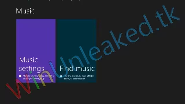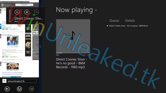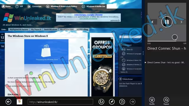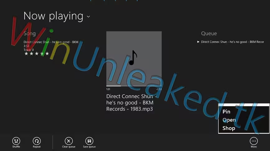
Well, this is disheartening. While the ‘Metro’ design theme that Windows 8 is set to embody has generally been met with positive reviews, it has always run the risk of being too flat, to square, and too dull. The music player that, according to recent leaks, is present in the current build of the operating system falls prey to each of those failings.
It is, to use a word, heinous. We are not going to try to strike about the shrub on this one, let’s jump into the images:
The splash screen:
What we presume to be the first screen upon launch:
The ‘Now Playing’ screen:
Again, but with the music player minimized:
And finally, the full view:
As with every leak from WinUnleaked.tk, we sincerely apologize for their watermarks. They are so painful that writing this sort of story is quite frustrating. Still, they have the goods. We recently covered their leaked screenshots of the Windows Store.
Now, Windows 8 is something that we have liked thus far, and by that we mean its full package of interface elements and features. However, that Microsoft could go from something as excellent and user-friendly as the current iteration of the Zune software to what is pictured above is quite sad. Let’s hope that between now and the beta of Windows 8 the company can borrow a few members of the Zune team for some design help.
Get the TNW newsletter
Get the most important tech news in your inbox each week.
