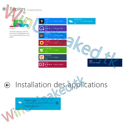
The Windows Store has had most of the wrappings torn from its sides, but we are not yet completely sure of how its every component will appear in the final version. Newly leaked screenshots however seem to indicate that what we have expected is what we will likley receive.
Given the massive focus on the ‘Metro’ design aesthetic that Microsoft is employing in Windows 8, one could easily come to the conclusion that the Windows Store, a component of the larger operating system, would mirror the theme. So far as we can tell, especially given these new images, that hunch will be borne out.
Now, to the images themselves. We’ll circle back afterwards.
Obviously, the original source of the images is WinUnleaked.tk. We mention that in case you somehow managed to miss the massive, ugly, and egregious watermarks.
Here’s my take on the image: Metro has a color problem. The smorgasbord of colors that we have going on in the images clashes a bit. I know that, and I get dressed in the dark. One has to wonder how many colors will be supported, and how they will be sorted. Will it be random? If so, Windows 8 could be a recipe for eye strain.
Please sound off in the comments: How should Microsoft handle the color scheme of the Windows Store? Should it be a free-for-all, or would you prefer more order to prevail?
Get the TNW newsletter
Get the most important tech news in your inbox each week.


