Whenever someone is looking to boost their productivity and they want to do so by using a combination of their Mac and their iOS devices, they are faced with a ton of options. Some of them are great, some of them not so much. But there are a few options that stand out among the crowd for a variety of reasons. Perhaps they were the first ones to step up to the plate, so they have lasting appeal. It could be that they have received a ton of coverage from technology sites, exposing them to the mainstream more than others. Perhaps they are just that good.
Or perhaps they fit a combination of any – or all – of the above.
Regardless, when the Mac and iOS user is ready to start looking for one of these productivity suites, they have to wade through a lot of information to find out which one suits them best. In this piece I’ll try to create less work for you, by illustrating how each of the more popular suites compare as a whole. The ones I’ll be examining are as follows:
While there are others out there, I believe these four offer the most complete experience on OS X and iOS. By breaking them down even further and examining how the apps are integrated, you’ll get an idea of which of these suites will serve you – and your productivity – best.
Let’s get started, first by introducing all of the contenders and then breaking things down further afterward.
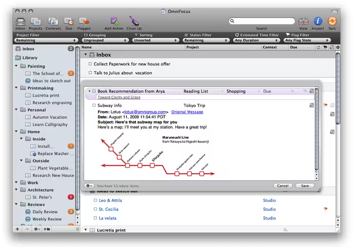
OmniFocus
 The Omni Group’s entry into the task management arena is both long and storied. Even now as they work on OmniFocus 2, the original has stood the test of time since its debut a few years ago. I remember putting the beta through its paces on my old MacBook Pro, and having used applications like iGTD and other comparable products, I was blown away by what OmniFocus offered.
OmniFocus was born through a collaboration between The Omni Group, Kinkless creator Ethan JA Schoonover, and the founder of 43Folders, Merlin Mann. With all of that talent behind it, the product was destined to be the product that many productivity enthusiasts had been waiting for. The application didn’t disappoint, and acquired a loyal fan base quickly.
Over the years, OmniFocus has become a more complete suite, having added both an iPhone and iPad app in the process. While there are not only differences in the interface between each of the versions, there are strengths (and, in turn, weaknesses) that some have as well.
OmniFocus for Mac
This is the version that started it all. In fact, it’s the one that you should have to get the most out of the entire suite. It allows for the most control and flexibility, including dealing with Perspectives – which are essentially user-defined views that display only what you want to focus on at particular times. That said, it isn’t exactly the most pleasing of these four apps to look at on a Mac. There’s a lot of power under the hood, though – and that’s what wins the hardcore productivity set over time and time again.
Here are just some of the features that you’ll find in OmniFocus for Mac:
- The ability to enter multiple tasks at once using the Quick Entry Pane
- Styling and “skinning” options to personalize the look of the application more to one’s liking
- A review mode, which is a must for “productivityists” like yours truly.
- Over-the-air syncing with other devices, so that they can sync when they go online, no matter where a user may be.
But the Mac version needs an update. If it wasn’t for its iOS counterparts, OmniFocus’s user base might not be as widely used. Let’s take a look at how the iPhone version integrates with the Mac version.
OmniFocus for iPhone
When you start using OmniFocus for iPhone, things (no pun intended) really start to click. Productivity apps are a natural fit for the mobile platform, and OmniFocus does a stellar job of making sure that the fit is snug and secure. Featuring a great over-the-air syncing option – which includes Omni’s own server – you can rest assured that if your iPhone is connected that everything will be up-to-date.
Some of the other aspects of the iPhone app that stand out include location awareness, which allows you to designate tasks based on location. This is incredibly handy for running regular errands at a particular store or if you’ve got a specific project that you’ll be working on in a specific location. You can also add photos and audio clip with action items, which I’ve used often for snapping shots of potential gifts or recording ideas for my writing. I’d be remiss if I didn’t mention the Siri integration, which is simply stellar.
That said, the syncing can be sluggish at times (although you can add new tasks while it syncs) and you cannot add any Perspectives from within the app – you’ll need the Mac version for that. You can view Perspectives, but the ability to add more to one would be a huge plus.
I use OmniFocus for iPhone about as regularly as I use the Mac version – and I use them for specific instances and reasons (setting up Perspectives on the Mac, snapping photos and grabbing audio on the iPhone, for example). But it’s the iPad version that I’ve used far more frequently since its arrival on the scene.
OmniFocus for iPad
The best-looking of the three versions, OmniFocus for iPad is what I’ve used most because the platform is the most appropriate for a productivity application. I mean, the iPad looks and feels like a clipboard to a certain extent, and I’ve used those on numerous occasions to hold to-do lists and project sheets. OmniFocus feels right at home on the iPad – and it looks that way too.
Many of the features on the iPhone version can be found on the iPad one, but everything just feels better on the iPad. The Forecast view is amazing, allowing you to see any synced calendars in the lower portion of the screen so you can work around anything that is “locked down” during your day, and the review option is incredibly well-executed, allowing users to conduct a weekly review with ease – and on time.
Whenever I’ve used OmniFocus, I’ve set things up on my Mac, including the addition of Perspectives. From that point forward, I spend more time on my iOS devices using it, with a ratio of 2:! favouring the iPad version. Like so many others, I’m impressed with all that the OmniFocus suite has to offer, but it does have its drawbacks…which I’ll get to when comparing all of the apps at the tail end of this piece.
For now, on to other things. Literally.
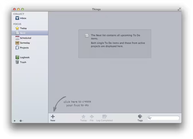
Things

Things by Cultured Code has had a presence in this space for a long time as well, often winning over those who might have opted for OmniFocus because the interface was more appealing than its closest competitor. But the design isn’t the only thing that this app has going for it.
Longevity has been its ally as well, having been around since 2009. Things has been given several awards in its history, which has helped propel it to significant heights in the productivity and task management application field.
Things is one of those apps that really is more than meets the eye, no matter what platform you use.
Things for Mac
As mentioned, Things seemingly puts design at the forefront, which has helped it gain a loyal and fairly large following. But there is a lot of punch underneath its glossy exterior.
Here are some of the features that the Mac version has to offer:
- A handy “Today” view right out of the gate
- The ability to assign tasks to others
- A “Someday” list that allows you to create a variant of the GTD-style “Someday/Maybe” list
- A daily review so that you can keep track of what you did…and when you did it
There’s plenty to love with the Mac version of Things, and when you take a look at how it works alongside its iOS editions then you’ll see how it starts to really shine.
Things for iPhone
The Things iPhone app is just as elegant-looking as the Mac version, and since Cultured Code has added Things Cloud to the mix the ability to sync has become much improved. The app is also built for speed – from startup to syncing – and entering tasks is set up in such a way that it is as friction-free as possible.
Things also allows you to easily filter by tag, which results in dealing with items on your task list easily and…quickly.
The iPhone version of Things has seen enhancements galore since it first arrived on the scene, and it is a perfect complement to both the Mac and iPad components of the suite.
Things for iPad
The iPad edition of Things takes full advantage of the platform, and like its aforementioned competitor, seems to work best overall on the device.
The overall look and feel of Things on the iPad is strikingly similar to its OS X counterpart, but it also sports a feature that allows users to really customize their workflow so that they can find things a whole lot easier.
The best part about Things is that all of the pieces work so well together that no matter which version you use, you’ll be able to keep on top of…things. Again, no suite is perfect – and Things does have its faults – but there’s a reason it has had staying power.
Up next is one of the newer entries into the space…
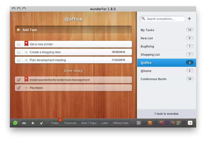
Wunderlist
 Wunderlist is pretty new to the task management space, having only stepped up to the plate in 2010. It is a multi-platform task management solution, with cloud syncing and apps for the iPhone, iPad, and Mac.
And unlike any of the other suites in this shootout, it is free.
Wunderlist is the most diverse of any of the contenders here in that the Mac is just one of the platforms supported. Beyond Apple’s platforms, the app is also available on Windows, Linux, Android, BlackBerry, and Windows Phone. That means that no matter where you are or what device you’re using, you can use Wunderlist. That means Mac users who need to use non-Apple smartphones can use Wunderlist freely and keep on top of what they need at all times.
Wunderlist for Mac
Wunderlist looks good – it has a slick design – and is further designed for quick and simple task management. It may not be as fully featured tas the rest of the candidates here, but the app supports reminders, notes, stars for important tasks, and emailing tasks – which is all that some users really want…or need.
Getting started with Wunderlist is easy, and unlike with the others on this list, it is n’t necessary to start things off on the Mac. Still, to get the real lay of the land it is probably a good idea to start here regardless.
Wunderlist for iPhone
The iPhone extension of the Wunderlist suite has a streamlined interface, but it’s tough to even begin to compare it to what both OmniFocus and Things have to offer. So I won’t try.
Instead, I’ll tell you exactly what Wunderlist for iPhone is: a to-do list that screams simplicity. Simple customizations, simple alerts, simple structure, and a simple calendar. Nothing more, nothing less.
But it’s effective and looks good while being so.
Wunderlist for iPad
Wunderlist for iPad is designed similarly to the iPhone version of the app. I’m definitely a fan of the iPad’s form factor for productivity apps, and while Wunderlist doesn’t have as many features as other entries in this space I still think it shines best here.
Syncing through a Wunderkit account means that all aspects of the suite are able to remain current. That means peace of mind – which is important no matter how robust – or simple – your task management suite is.
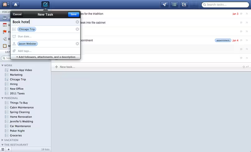
Flow
Flow is another recent addition to the landscape, but unlike the aforementioned it was designed to help teams effectively manage their workflow. But it’s much more than that. It’s very versatile and has the flexibility to be used by those just wading into a task management app for the first time to those who could be considered “power users”. Flow goes further than some of the other app out there in that it provides information in real-time so that users are always able to see the most recent live interactions. It looks great and its functionality matches its looks.
In the same way that Wunderkit requires an account. so does Flow. But the pricing is unlike Wunderkit, which I’ll get to later.
Flow for Mac
Flow works both on the Mac in desktop and web-based formats, meaning that it isn’t as platform-dependent as some of the more robust apps out there (like OmniFocus and Things).
One of the advantages of arriving to the party later than some of the stalwarts is that you can learn from what they’ve done and make changes to improve the user experience within your own app, and MetaLab (the team behind Flow) certainly has done that. As mentioned, Flow offers an efficient solution for businesses – but it also is flexible enough to work for personal purposes, and the consistency between the Mac app and the web app is astounding.
And that consistency carries over as much as possible to the iOS versions.
Flow for iPhone
The experience on the Mac and web continues on the iPhone, complete with push notifications, task creation, task delegation, and the ability to view activity as if you were checking out Flow on the web.
Flow for iPad
Again, this app looks and works great on the iPad. It’s recently been updated to take advantage of the newer iPad screen sizes (albeit not for the iPad mini as of yet), but MetaLab is consistently working on updates and lending support to its customers which means that any users of Flow can expect more to come with this already robust app sooner rather than later.
Pricing
I’ve already mentioned that Wunderkit is free, but its lack of features when stacked up against the other three contenders does put things in perspective.
To purchase the entire suite of Things will set you back $79.97, while picking up OmniFocus for the Mac, iPad, and iPhone will run you $139.97. These seem like pretty steep investments, but when you think about all of the money you will save (or earn) as a result of utilizing your newly adopted productivity suite, the price tag seems worth it – no matter which one you go with.
Flow cost $9.99 per month, which makes it the most expensive options of the bunch. But it is also the only one truly allows you to collaborate, and the price tag isn’t out of the realm when you take that into account. It definitely is something that will give people pause, as will the price tag for those thinking about OmniFocus and Things.
Syncing
All four contenders offer syncing, but OmniFocus offers the most options. You can use their syncing service, Dropbox, or even a WebDAV if you’d like. The others only deal with the service offered through signing up to use the app or a standalone service of their own (as in Things Cloud).
When it comes to syncing, having a variety of options is never a bad thing. That’s why OmniFocus might be the best on this front.
Design
This is a tough one. All four apps have great design in some form or another (with only OmniFocus’s Mac app trailing in this regard), but the overall form and function champion is Flow.
The team at MetaLab has assembled a great looking app from top to bottom, and even Things comes up short as a result.
Feature Set
Only Wunderlist really lacks here. All the others have some great features that some of the others don’t (Things’ Daily Review, OmniFocus’ Siri integration, Flow’s real time activity feed) and it’s going to be a matter of personal choice in this area.
I’ve found all three of the remaining apps to be great choices, but I’ve spent the most time with OmniFocus over the years.
The Last Word
All of these productivity suites have something to offer, but when it comes down to making a choice the ball is really in your court. If pricing is a concern and simplicity is what you need, then Wunderlist might be the way to go. If you’re dealing with others throughout your workday and need a task management solution for teams and price isn’t a concern, choosing Flow would be a wise move. But there will be other criteria to take into account, and what matters most to me will be different from what matters most to you.
The bottom line is this: with any of these apps you’ll be only a keystroke or swipe of the finger away from connecting to what you need to get done. That’s a lot of progress right there.
Now go and make progress yourself with one of these productivity suites.
Image Credit: Marwan Naamani/Getty Images
Get the TNW newsletter
Get the most important tech news in your inbox each week.


