
As designers, we are user advocates first and foremost.
We need to understand what users want versus need before they ever encounter our designs. Once they do encounter it, they must first feel safe and comfortable. This sometimes contrasts with our desire to innovate – which is why we have to align that desire with user goals.
To do this, we need to grasp how our users’ brains work— the mental models they’ve created that help them navigate the Web. This understanding then gives us a platform from which to create, a process called neurodesign (introduced back in 2012).

Photo credit: Allan Ajifo. Creative Commons
Through careful research and usability testing, we can better understand what’s going on in the brain when a user or customer interacts with a good (or bad) experience. We can then use that knowledge to create better experiences.
In this piece, I’ll explain how to take advantage of patterns for better Web design and when to break those patterns to leave a lasting impression on users.
Pattern Recognition: A Useful Shortcut for Web Design
Pattern recognition is a cognitive process during which we look at a stimulus, and try to match it with what we already know.
It’s a form of heuristic, or shortcut that we use to solve a problem. Heuristics make up what Gerd Gigerenzer first called the ‘adaptive toolbox’— a set of rules that we use to make decisions in situations that are limited in time, resources, or information.

Photo credit: Vinoth Chandar. Creative Commons.
If a situation is new to us, we’ll reach into our adaptive toolbox to see if we’ve encountered anything similar before.
We learn various patterns through interacting with the Web, both as users and as designers. So when we interact with the Web, we attempt to match what we see with what we know already— if we’re after a specific item in a store, for example, previous experience tells us that we can (and should) be able to search for it in a very specific way.
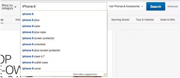
Photo credit: Ebay
This recognition and learning allows us to navigate the Web quickly and efficiently using heuristics, instead of thinking through an interaction from scratch every single time. We look for patterns of interaction that, in the past, have led to success by minimizing time and maximizing reward. If we don’t find these patterns, we will often look for another page that will offer us that familiarity and expediency.
These shortcuts do sometimes lead us astray, but more often than not, they work. As explained in Web UI Best Practices, you must be intimately familiar with these patterns and expectations if you want your website to succeed.
Examples of Common Web Design Patterns
Design patterns are a way of documenting a common solution to a design problem.
There are many excellent pattern libraries out there—UI Patterns, Yahoo’s Pattern Library, and PatternTap to name but a few fantastic resources— but here are a few examples of common design and user interface patterns, and the problems they solve:
The hamburger menu: It’s controversial these days and people are now questioning whether this is actually a design pattern, or just bad design. Regardless, it’s ubiquitous, and allows for more space on mobile devices.
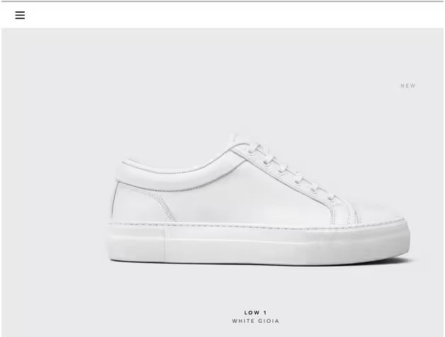
Photo credit: ETQ Studios
- Breadcrumbs: A way of allowing your users to feel safe and well-oriented when navigating a hierarchical site.
![]()
Photo credit: Newegg
- Account registration: A way of gathering information from the user in order to offer them something in return; the opportunity to buy, for example. Patterns might range from a shortened form to a social sign-in.
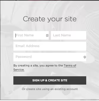
Photo credit: Squarespace
- Continuous scroll: A way of consuming a large amount of content that may not be displayed on a single page right away. Perfect for visual storytelling.
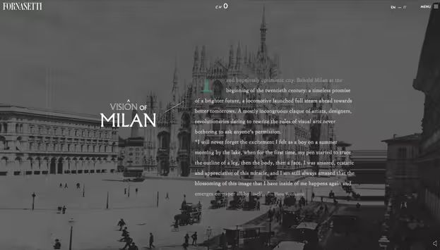
Photo credit: Fornasetti
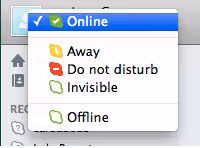
- Availability (e.g., Skype): Know quickly if someone is available, unavailable, or away with a traffic light system.
- The FAQ: Offers the users an easy-to-find space to get answers to common questions.
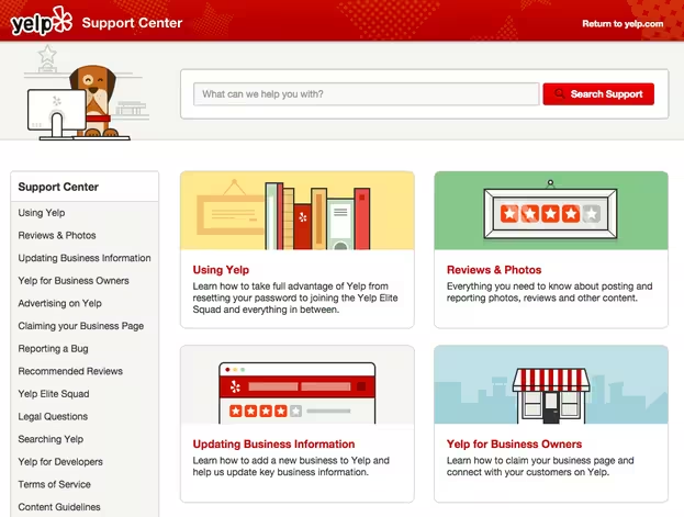
Photo credit: Yelp
More examples of UI patterns can be found in Web UI Patterns, which includes 63 useful patterns described in a problem/solution format.
Top-down vs. Bottom-up Web Design Approach
This is where we can start using these neuroscience basics to make our jobs easier (or more complicated, depending on how you see it). We also must remember that users perceive the Web differently from those who create it.
When we build for the Web, we use design patterns along the way as we discover various design problems. We often make this journey from the bottom up: we start with the problem before us and its various elements, and then attempt to create a cohesive experience. As we break an interface into its atomic components, we immerse ourselves in sub-problems, goals, tasks, and information architectures and flows.
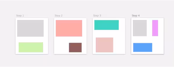
Photo credit: Narek Khachatryan.
This is why, after a while, we become oblivious to problems with our design – we cannot see it as a whole.
But as I described in Designing Better UX With Patterns, users don’t interact with an interface this way. They do so from the top down.
Users don’t see the parts but their sum, and use prior knowledge of rules to guide their interactions. They look for patterns in what we’ve built that match up to past experience with similar products or sites (known as external consistency), to help them navigate much faster. This method of processing is fast, but sometimes wrong— especially if the interface has somehow deviated from the status quo.
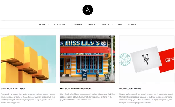
Photo credit: Abduzeedo
Therefore, we should ensure that the site interface is consistent with user expectations and with itself. For example, if you choose a cards UI pattern, most users know how to navigate the content due to the pattern’s popularity. To prevent confusion, you must also implement the pattern consistently throughout your site.
It’s our job to guide the user, to make this processing as easy and as satisfying as possible, and to make sure that they recognize just enough patterns in our interfaces to feel comfortable. External consistency (similarity to competitors or other sites) isn’t always necessary, but internal consistency – consistency within the product – is paramount.
You’ll build user confidence, trust, and safety.
Designing for Recognition and Reward
The user has an expectation for each interaction, no matter how mundane.
Every flick of the eye towards a piece of content, every mouse click, every key press— all of this is guided by previous experience and interaction, and the user will expect a certain outcome from each of them. We like patterns — they make us feel safe and happy.
This happiness happens at a neurochemical level. Each time we successfully recognize a pattern, we get a jolt of dopamine— a neurochemical associated with pleasure and reward. And then, when the interaction itself is successful, we get another jolt.

Photo credit: UXPin
When something is “intuitive,” this essentially means that a pattern has been followed, and the user’s expectation has been met— they were pleased when they saw a pattern, and again when the pattern performed as expected. However, if the pattern is broken, that dopamine never comes and we’re left unsatisfied. The user, of course, then associates this dissatisfaction with the site or product.
In addition to patterns, we need to understand the expectations that are tied to them, in order to maximize dopamine and minimize dissatisfaction. We want to give people what they want and expect.
But we also want to be innovators and creators – after all, very few clients come to us asking for a site that “meets expectation,” or looks just like their competitors’. It’s a difficult balance, but all is not lost – we just have to dig a little deeper.
The Risk of Breaking Web Patterns
In our desire to innovate, we want to develop new and novel ways of doing things. Our attempts, however, can also alienate users.
For example, in my blog post about bad designing leading to self-blame, I mentioned the design of Ello, a social network which aimed to be minimal and innovative, but broke with far too many patterns.

For example, a button should look clickable. If they don’t, there had better be an excellent reason (and a way for users to learn it). Every time we break a pattern, we want to be sure that we’re asking ourselves a few difficult questions:
- Why are we breaking that pattern?
- Have we created a new one— and is it better?
- Will our users be able (and willing) to learn that new pattern, and quickly?
Those aren’t easy questions to answer, so think hard before choosing to break from a well-established pattern— is it worth it?
Breaking Patterns for Delight
Of course, we shouldn’t abandon all innovation and just stick with what we know— design patterns aren’t the be-all and end-all. They’re simply a baseline for layering your own creativity. People are capable of learning and recognizing new patterns, particularly when those patterns result in rewards.
For example, consider the dopamine reward system we just discussed. We mentioned that if a user expects a reward and gets one, this meets expectations. If they expect a reward and don’t get one, this breeds dissatisfaction.
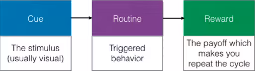
Photo credit: Interaction Design Best Practices
However, what if they don’t expect a reward? Even better, what if they don’t expect a reward, but we give them one?
Yes, we break from a pattern, but we can do so in a place where the user doesn’t necessarily expect it, and we can win them over. We can strengthen new patterns by rewarding when users don’t expect it, therefore reinforcing that new method of interaction. This moment of delight is, in our opinion, the key to innovation and a successful break from pattern and status quo.
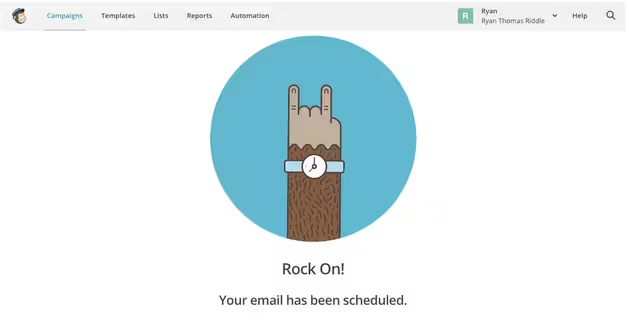
Photo credit: MailChimp
Of course, it’s difficult to find these situations, these opportunities to delight a user when they don’t expect it— after all, how are we expected to know when users will be particularly pleased by something if they don’t even know it yet? This is where testing comes in.
The Power of Prototyping for Testing Patterns
The only way we can find which patterns to break and when is to try, to experiment and see the results.
These experiments come in the form of thoughtful, well-conceived user tests. We need to be aware of the pattern we’re trying to break and how the user perceives it, why we’re trying to break it, and how. With a prototype, we can tightly control and test the pattern itself, even if the user isn’t aware of that control.
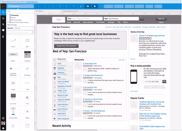
Photo credit: Rapid prototype via UXPin
For example, in UXPin, we can create a rapid prototype with the existing UI libraries. We can then validate the effectiveness of those patterns (and the overall design functionality) by starting a remote usability testing session. Write down the core tasks, invite users, then start experiencing the moment of truth.
The reason that prototyping (and testing in general) is so useful is because often, people can’t articulate what they need. User testing allows them to show us instead. Users behave normally, while we observe and listen to their reactions.
Here’s a sample process for improving upon existing web patterns:
- Identify the design problems – As design thinking dictates, research your users (ethnography, interviews, surveys, to name a few) to uncover the main pain points.
- Study existing design patterns – Once you know the problems to solve, explore sites or apps with patterns that target the same user issues.
- Prototype your design – Start with existing patterns as a baseline, and work from them, or change them completely. Whatever you’re doing, ensure that your assumptions at the start are clear. Create a low fidelity prototype and feel free to add some creative nuances.
- Test your design with at least 5 users – Choose whatever methods make the most sense based on time and budget. Steve Krug’s Rocket Surgery Made Easy provides an excellent starting point. In a pinch, hallway usability tests involving a couple coworkers is always better than nothing.
- Learn from the results and iterate – Since you started in low fidelity, incorporate your learnings as you increase fidelity. If it serves the users, feel free to add elements of delight to make the patterns more interesting. Continue testing and iterating until the design is finalized.
There’s no need to try too hard— where the user expects a reward, we should give them one (or at least offer an excellent reason for not doing so). However, we can certainly explore opportunities to break from pattern and create new delightful methods of interaction.
Conclusion
When it comes to improving old patterns; study the underlying problem and ask why the pattern is so useful. As world-renowned designer Jeffrey Zeldman once said, consideration beats pattern. Previously-successful design patterns, applied without consideration, will only harm your website.
There’s a quote by Henry Ford, likely overused to the point of cliche, but it’s true: “If I’d asked my customers what they wanted, they’d have said a faster horse.”
When it comes to web design, we can and should follow patterns in a considered way. It’s perfectly fine and often preferred— for a variety of good reasons. After all, we have accepted it as a pattern for a reason.
But when we make no effort to innovate and stick only to patterns, we’re just building the faster horse.
The free e-book Web UI Design Best Practices includes more advice for patterns and other techniques. The 109-page e-book includes hands-on tips based on examples analyzed from 30+ companies.
Read Next: How to design websites developers won’t hate
Image credit: Shutterstock
Get the TNW newsletter
Get the most important tech news in your inbox each week.