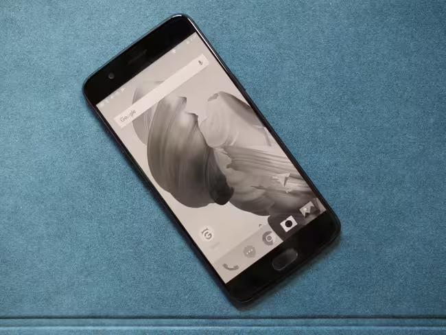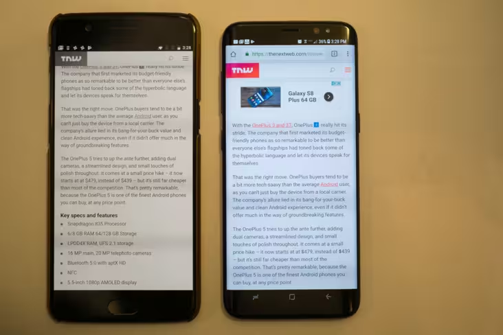
The OnePlus 5 became official today, and we wrote a a review earlier today, which you can check out here. But I want to highlight one particular feature of a phone that, however small, was pretty unique and very awesome: The “Reading Mode.”
Basically, it’s a simple visual filter that tries to imitate physical books and e-readers. Devices like the Amazon Kindle use reflective screen technologies, meaning they reflect the color temperature of the light source around you, be it the sun, a lamp, or a disco party light of.
Phones, on the other hand are emissive. They create their own light, which lets them display fancy things like magical moving pictures. Unfortunately, that colorful light is often distracting and is strongly linked to sleep deprivation.
OnePlus’ reading mode basically tries to mimic a reflective screen using an emissive one. It does so in a similar way to Apple’s True Tone technology on the iPad Pro, adjusting the screen’s color temperature to match your ambient light. Unlike Apple’s, implementation, however it also makes your screen go greyscale, and that makes it much more awesome in my book.

I do a lot of reading on my phone. As in, the vast majority of it. But using Reading Mode on the OnePlus 5 made me realize how easy it is to get distracted by all the colors on the typical phone’s screen. In Wikipedia, blue links tempt me to go on endless tangents. YouTube’s bright red and Facebook’s deep blue make me forget what I might’ve opened the launcher for. And a cacophony of notifications make sure there’s always something else to distract me.
To my surprise, reading mode does a decent job of helping me ignore those distractions. My eyes are no longer drawn to whatever the most saturated thing on my screen is, so navigating my phone feels a little more purposeful. It’s easier to ignore notifications when reading manga or e-books, and ads become much less bothersome when browsing the web. You can set it to only activate on individual apps, but I often found myself preferring to just leave it on for hours on end or and prefer to actively turn it on via the Quick Settings menu.

Since the whites are matched pretty decently to ambient light, and quickly adapt to changing lighting it feels a little easier on the eyes too. It’s still obvious you’re looking at a phone screen in really lowlight, and sometimes the display is a bit overzealous in warming whites. But in normal indoors lighting or in the average daylight, it makes everything a bit easier to read, and does a good enough job to make me forget I’m connected to the entire world in the palm of my hands. Sometimes, that’s a good thing.
Of course, this is a personal anecdote. It’s a small feature, and your mileage may vary, but I’d be glad to see similar feature make their way over to more devices.
Get the TNW newsletter
Get the most important tech news in your inbox each week.


