Social web recommendation engine StumbleUpon has today launched a completely redesigned version of its iPad app. It’s a smart looking and smooth way to stumble through interesting corners of the web on your Apple tablet.
I’ll be honest, I’ve never been much of a stumbler. For whatever reason, I missed out on the StumbleUpon craze and, though I’ve tried it once or twice, I’m not one of the millions of people that use the engine to discover interesting things on the net every year and make it the biggest driver of traffic in the social media space. Yes, bigger than Facebook.
The general concept of StumbleUpon [App Store, free], if you’re not familiar, is that you visit the site, set up some preferences and then smack the Stumble button to get a new image, webpage, video or other bit of web ephemera delivered right to your face. Once you take a look at it you can ‘like’ it or rate it down. StumbleUpon will learn from your preferences, and those of your friends and even other stumblers, to deliver you content that you’ll want to see on topics that you’re interested in.
It’s really the perfect formula for iPad greatness. The iPad is the perfect device to use while you’re kicking back on the couch or in bed, reading or checking out random things on the web. Just the thing that StumbleUpon is good at. Unfortunately, the last StumbleUpon iPad app was basically a glorified browser window with a toolbar at the top. It replicated the stumbling experience, but only in a barely acceptable way.
The new iPad app is a real surprise. Not only is it much more stable than the older app, it also looks great. Nice small popovers lead you into the experience of using the app gently. Once you’re up and running the stumbling experience is just as you’d want it, seamless. You can tap on the stumble button to get rolling or simply swipe back and forth. Swipe left, get a new stumble, swipe right and you get the last one.
All of the options that you need are here, from liking a result, to down voting content you don’t want to see again. There’s a nice popup pane that shows you comments and other stumblers that like that particular result.
You have access to all of the stumbles that you’ve liked in the past, of course. And the home screen gives you a beautiful scrolling view of your interests to make it easy to narrow your stumbles to a particular category. StumbleUpon has also built in a special section at the top that narrow it down to stumbles that are ‘best on iPad.’
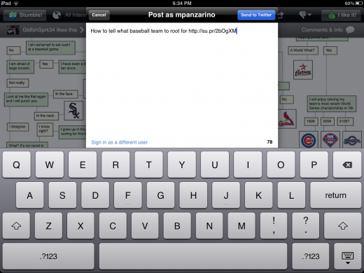
If you find a stumble that you like, you can share it to another stumbler, to Twitter, Facebook or by email. They didn’t stop there either, you also get Instapaper support, Read It Later, Tumblr and Google Reader. It’s a very complete array of sharing options.
All is not completely roses though, the Twitter sharing option didn’t work for me while testing, but I’m not sure if it’s because it was pre-release. Now that the app is out, I’ll have to try it again. The UI is clean and doesn’t offend the eyes in any way, but it uses almost completely standard UI elements provided by Apple aside from some coloration and a few tweaks. In a future version I’d love to see the great feature set here combined with a custom set of interface elements that show off the app in a more unique way.
If you’re a religious stumbler and an iPad owner, there is no reason not to snatch the new app immediately. It’s a gigantic improvement over the last offering and really drives home how ‘made for stumbling’ the iPad is.
If you’re not familiar with StumbleUpon, or haven’t used it in a long time, it’s definitely worth checking out if you’re interested in the concept. The iPad has always had the potential to be the absolute best way to use StumbleUpon, and now it has an app that makes it possible.
Get the TNW newsletter
Get the most important tech news in your inbox each week.


