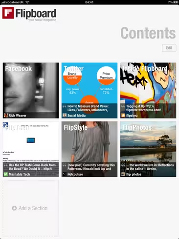
Those of you who follow @Scobleizer might very well have heard him rave about an upcoming app release for the iPad. Well, while not confirmed (update: now confirmed!), we believe we’ve got our hands on the app he’s betting will be a game changer – it’s called Flipboard.
Before we carry on, lets take a quick look and some of Scoble’s superlatives:
Now, let me restate this, we don’t know for certain (update: now we know for certain) this is the app that’s got Scoble bouncing off the walls. What we do know is the app he’s referring to is being released tonight, as is Flipboard, someone suggested Flipbook as the app he was referring to, Scoble retweeted it, and finally we now know Flipbook comes with all the features you’d expect someone like Scoble to get excited about.
So what is Flipboard?
Flipboard is supposedly “the world’s first social magazine”, bringing the “timeless layout of print media to social media.” Big promises.
It offers a way to “flip” through news, photos and updates from what your friends on Facebook and Twitter are sharing. Rather than scrolling through posts and links, Flipboard organises everything shared into a magazine like format, not unlike a favourite of ours, Feedly.
So is it a game changer?
In all honesty, time will tell. What it is however, is an incredibly elegant way of transforming your social stream links, media, images and updates into a beautifully put together iPad magazine. Basically, exactly what Flipboard promises on the tin.
Flipboard isn’t the first to this idea however. Others have attempted to create newspaper and magazine like UI’s from the barrage of information shared on social media sites, but none seem to have done it better than Flipboard. Where this app stands out is; in its elegant design and seemingly its ability to pinpoint what’s important/relevant to you.
Let me make one thing abundantly clear. This is, without a shadow of a doubt, the most elegant reading experience I have seen on the iPad. From the (slightly gimmicky) page flipping affect, to its ability to select images that draw in the eye encouraging you to read – it’s simply outstanding.
My first, albeit short impressions, browsing articles were equally impressive. When you launch the app you are presented with a selection of squares, each square has a topic (e.g. tech) and you are also given the opportunity to insert your Facebook and Twitter account details into other available squares. Pressing a square takes you into a world of content, beautifully presented. Time will tell exactly how well targeted the articles are to users preferences, but you’ll notice each article has a like button that presumably helps Flipboard learn more about what you enjoy reading.
Flipboard also includes its own commenting feature, creating a community within the app itself but also providing a simple way to reply to Facebook shares and tweets.
Whether this is in fact Scoble’s “revolutionary” new app or not, it’s certain one to keep an eye on. If you’re a twitter user, think of Flipboard as the tweetie of newsreaders. It’s set a new bar, a new standard, one that’s going to be tough to surpass.
For another aspect, here’s Scoble’s video, and his review of the application.
It’s not all good news for Flipboard however. A number of old media publications, including the NY Times, have attacked a similar app named Pulse, accusing it of misusing its content. Whether Flipboard will end up on the same end of the stick, time will tell. On the up side, the 20 person company, co-founded by Mike McCue (previously of TellMe) and a former Apple iPhone engineer Evan Doll, has just raised $10.5 million funding from top Silicon Valley heavyweights. On top of that, according to All Things D, the company has just sealed the acquisition of Ellerdale, a relevancy engine for the real-time Web – should come in handy.
You’ll find Flipboard in iTunes now, for free.
Get the TNW newsletter
Get the most important tech news in your inbox each week.


