The automotive human-machine interface is the prime point of interaction between driver and car. Drivers use HMI to set climate preferences, change car suspension settings, play favorite music, and do dozens of other things. With the ongoing integration of computer systems into vehicles, automotive HMI is quickly becoming an integral part of the vehicle. Users often evaluate car experience based on the experience they have with HMI.
The design of automotive HMI should be humane-first, and in this article, I will cover four major problems that designers have to overcome to achieve this goal. The insights mentioned in this article are based on experience working with leading car manufacturers like Mitsubishi, Mercedes Benz, GAC Motors, and many others.
Bad learnability
Learnability is a major factor that influences user experience. Generally, the more features the system offers, the more time it takes for the new users to learn how to use it. With more and more car features added, modern human-machine interfaces are growing in complexity.
Users rarely read product manuals and instructions; they learn things by doing. Some users tend to learn how to use the system on the go (while driving)—no need to say that severe increases the risk of car accidents.
A good user interface is invisible. It gives users the information and features they need when they need them. Designers need to craft HMI in a way that minimizes complexity and prevents cognitive overload.
Product design processes should always start with learning user needs and understanding the use context. The goal is to define critical scenarios of interaction. Once you do that, you can go to the drawing board and prioritize features.
In the context of a car user interface, it’s vital to:
- Ease of mapping. Show the frequently used controls such as climate control or navigation upfront so that the user doesn’t need to spend any time finding them.
- Measure the time it takes users to complete a particular operation (i.e., set a destination in the navigation system or set a comfortable temperature). Validate your design in realistic situations (i.e., a user changing radio stations while driving). If it takes more than a few seconds to do that, it’s time to go back to the drawing board and redesign this feature.
- Consider user mental models. User mental models are expectations users have about your car HMI based on their experience with other cars. If a person changes car models, they shouldn’t have to learn how to use the system from scratch.
Distraction while driving
The nature of driving a car has not changed much since the beginning of the automotive revolution (early 20 century). What has been changing drastically is the integration of electronics in modern vehicles. Large displays of modern car user interfaces demand a lot of driver’s attention and can have a negative impact on safety.
Since touch-based displays don’t have physical buttons, users cannot rely on muscle memory to change settings and don’t receive direct mechanical feedback that helps them understand the result of the operation.
The USA National Highway Traffic Safety Administration guideline states that drivers’ eyes should be looking at the road ahead. But when drivers have to glance at large displays while driving, this might lead to car accidents.
The HMI should be designed so that the driver’s attention to the system displays should remain compatible with the attentional demand of the driving situation.
First, the system should not force users to keep a lot of information in working memory. Users cannot keep a lot of information in short-term memory so that the system should answer the key questions that users might have on the home screen (i.e., What is the current speed? How many miles can I go on this tank? What is the temperature in the cabin?).
Manufacturers should provide this information either in the instrument cluster or in the head-up display. The latter is preferable because drivers don’t have to look away from their viewpoint.
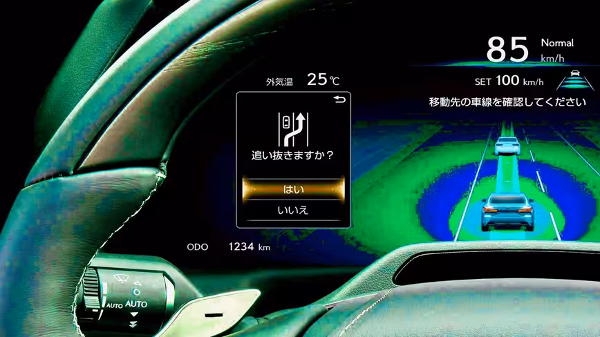
Second, the system should give users freedom of choice when in selecting an interaction method. The system should support voice and gesture controls to enable the user to say or show what they need, and the system can respond with appropriate solutions.
For example, instead of interacting with the touchscreen to find a restaurant located nearby, the driver should be able to say “I’m hungry,” and a car responds with the most appropriate options. Next, the user can use gestures to select a particular option and set it as a destination.
Old Infiniti Q45 ad that demonstrates the power of voice-based communication while driving.
Last but not least, the system should overwhelm users with too many notifications. Best practice includes postponing the sending of non-critical visual alerts (alerts that don’t have an impact on user safety) till the moment the user stops the vehicle.
One fits all solution
Modern HMI systems are truly powerful—they offer users a lot of options that users can customize for their needs. At the same time, most options remain in their default settings simply because most users don’t change default settings even when the system allows that. As a result, even cutting-edge technology won’t be used to its best advantage.
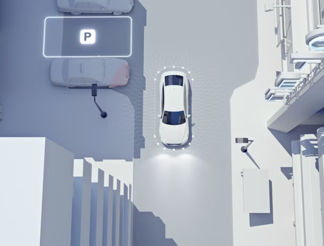
It’s much better to introduce mechanics that learn about user preferences and suggest changes proactively. The car system should learn and adapt to user needs on the fly. For example, when a car learns that the user is following the same route to work every day and experiences problems with parking, it can find a free parking space automatically and suggest a better time for travel.
The learning process should be fast enough to satisfy the needs of the new generation of users—people who don’t own but rent a car for long or short periods (car sharing).
Emotionless experience
HMI is an integral part of automobiles, and, as was mentioned above, users typically evaluate car experience based on their experience with HMI. Yet, the visual design of HMIs often does not spark any emotions.
Most car manufacturers follow the same approach—they put neon red or blue text on dark backgrounds along with metallic textures. This pseudo-sci-fi aesthetics creates a cold and uninviting feeling right from the beginning.
One second of emotion can change the whole reality for people engaging with a product.
— Gleb Kuznetsov
Ultimately, the goal of visual designers is not (only) to wow the first-time users but to create a visual language that will resonate with users and spark positive emotional responses from them. By improving the system’s visual aspect, we improve how the system is perceived. The attractive design has a better chance of creating a positive first impression and staying in a user’s memory.
Interacting with a voice-based AI assistant. Image by Gleb Kuznetsov
To achieve this goal, you need to:
- Think about moments in interactions that can bring moments of joy and delight to customers. The Peak–End Rule suggests that the most powerful user’s positive (or negative) emotions can lead to their long-term Impressions of a product. Designers need to identify moments in user flow where users can experience positive emotions and reinforce them with good design. For example, the moment when a user receives an award for safe driving can be truly memorable.
- Constantly collect feedback from people who will drive a car. When you validate your solution, you shouldn’t measure only the functional aspect of the system (i.e., task competition time and the number of errors) but also user satisfaction. It’s important to ask questions “How does this design make you feel?” when you conduct usability testing with real or potential users. Test participants can share their thoughts on your design, and this information will help you identify areas of improvement.
Written by Gleb Kuznetsov and Nick Babich
Get the TNW newsletter
Get the most important tech news in your inbox each week.