“Why can’t I open up an app that tells me where to find a good drink?” That’s the question that the Jeff Rock and Marc LaFountain of Mobelux were asking themselves when they came up with the idea for Elixr.
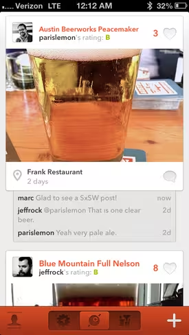
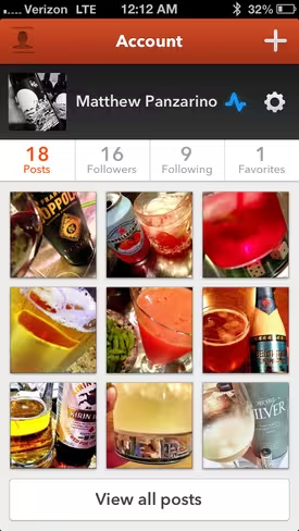
Elixr is an app for iOS that I’ve been testing for a while and I’m really enjoying it. It’s one of those apps that seems easy to sum up on the surface. “It’s Instagram for drinks,” I said when I showed it to some friends while testing it out. And it sort of is.
But it’s also an app that, if successful, could use data to help you drink better stuff in better places, and it’s that data play that makes it even more interesting.
I spoke with Rock about the genesis of Elixr which, appropriately, started in a bar. LaFountain turned to Rock in a Richmond watering hole and said “I’ve got this idea…I want to know when I walk into a city, where the good cocktail bar is. And there’s no way to do that right now.”
The idea, to build an app that let you find good drinks and good places to drink them, originally centered solely around cocktails. From there, the concept grew to include beer and other drinks as well, cross-posting to Foursquare, Tumblr and Twitter and a focus on images.
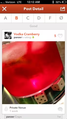
People were already using other services to snap photos of drinks. I know that a good portion of my Instagram feed is cocktails and craft beers. So there is built-in demand for this kind of thing. And on top of the photos is a system that allows you to rate the drink, categorize the venue (traditional vs. modern, etc) and add a location.
“The goal for me with Elixr,” says Rock, “is data and the interesting things that you can do with this data. It’s a really cool dataset. Drink menus are more concise, they’re shorter…and there’s not as many places in town to get a good drink as there are places to get good food.”
The concept is to make entering the drink data as pleasant and fun as possible, allowing Mobelux to build a data set that will help you when you go out to find a good drink, as well as helping everyone else who comes after you.
If there’s enough information being gathered, for instance, Elixr could perform a dynamic estimate of the places that you might like to drink, based on how others have rated places nearby and how they’ve described them.
I have a feeling that the people that will contribute to the app the most are likely to be a smaller set of the overall user base. But that’s fine as long as that data is able to benefit other users regardless of how much they post, much the way that all Foursquare users benefit from the people that do check in.
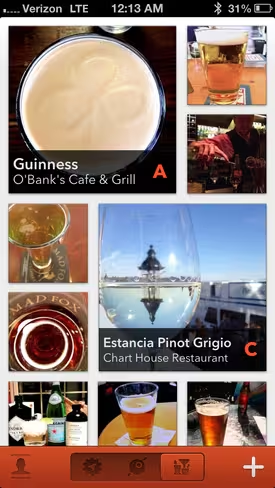
The app is beautiful, and the ‘work flow’ doesn’t feel anything like ‘work’. The photo-centric workflow indeed does feel like Instagram, which isn’t a bad thing. There’s a reason that focused experience resonated with so many. A photo as the keystone of an entry does a lot to set the scene and tell the tale. Rock says that the team experimented with different ways of setting a post up but ended up realizing that a photo as a centerpiece was just the right way to go.
The design is pleasantly retro but doesn’t smash you in the face thematically. The palette is pleasantly contrasty, with a great logo and a ‘lounge’ vibe. Rock and Rob Green’s design work is stellar here, and Jeremy Greenwood and Andrew Mayers deserve credit for how pleasant the app is to use.
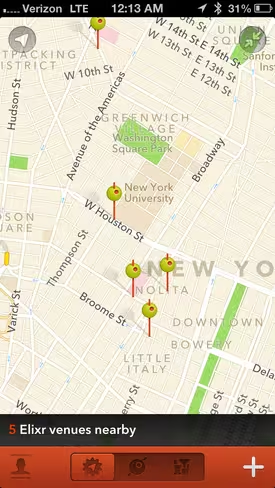
It’s fluid and fast and is filled with clever little details like the the location pins as cocktail skewers with olives on them. The filter selection (yes there are filters) is solid and cleverly over-sharpened to compensate for dim bar lighting.
Rock says that there are expansions to the basic concept planned as well. When I suggested that it could become a great directory for finding a special drink, as well as a venue, he noted that they were definitely looking into that. And he also hinted at special video content as a possibility.
In the end, Elixr may feel like Instagram for drinks, but in the end it may end up being much more like Foursquare for drinks. And that’s pretty cool.
Also, best testing regimen ever for an app. You can see what I’m drinking at @panzer.
Headline image via Minerva Studio / Shutterstock
Disclosure: This article contains an affiliate link. While we only ever write about products we think deserve to be on the pages of our site, The Next Web may earn a small commission if you click through and buy the product in question. For more information, please see our Terms of Service.
Get the TNW newsletter
Get the most important tech news in your inbox each week.
