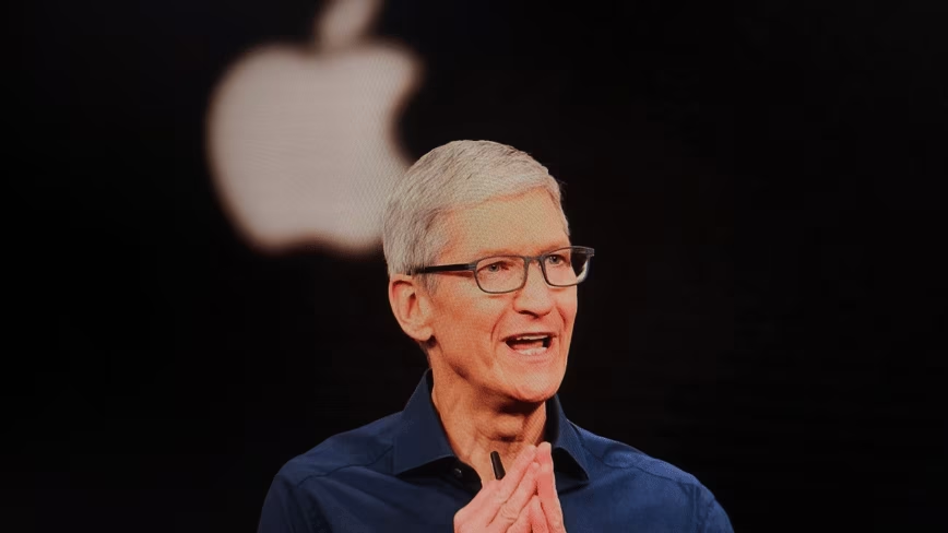
When Apple formally announced iCloud last week, it was part of an action packed Keynote address that included major updates to Apple’s iOS software as well as new features of OS X Lion, which arrives next month. iCloud was the only new product announced at WWDC this year and was the only one introduced solely by CEO Steve Jobs.
Whether you were at the event or watching the Keynote later on video you could tell that iCloud was close to Job’s heart. Apple has been working on its cloud offering for some time in an attempt to rectify the sins of early MobileMe. The announcement of iCloud sets the tone for the way that Apple is handling the move to cloud computing that has saturated the offerings of most of its major competitors.
iCloud differs in a major way from its competitors in one important way though, it doesn’t actually exist.
Cloud services from Google, Amazon or smaller operations like Dropbox are easy to visualize. Google has its web applications like Google Docs, Amazon provides cloud storage and now a music player. Dropbox offers integration directly into the file system of your computer with a neat little Dropbox folder. iCloud has none of this. Instead it’s just a collection of services, some old and some new, that run in the background of iOS, on OS X machines and embedded into apps.
Many of these services have been a part of Apple’s portfolio for some time. If you’ve re-downloaded an app from the App Store for instance, you’ve accessed Apple’s cloud already. All that’s changed there is a small cloud logo where the ‘purchase’ button used to be. The addition of the cloud takes care of the confusion inherent in a ‘buy’ button for an app that you already use and includes the re-download service in the iCloud suite, all with a change to an icon.
There are many new aspects to iCloud however. The ability to re-download songs that you’ve purchased is a huge part of the service as a whole and required a slew of license negotiations with music labels to enable. You now also have the ability to push apps and music to all of your devices with one purchase, which means no more installing universal apps several times just to use them on all of your devices. In addition, developers now have the ability to use iCloud to synchronize documents, accounts and Core Data across devices, which should allow you to switch between the same app on different devices and continue working or playing seamlessly.
The embedding of iCloud services into native apps was characteristically kicked off with its inclusion in some of Apple’s own apps in the iWork suite. The ability of Pages, Keynote and Numbers to share documents and work states automatically with no interaction from the user was set up as a template to show developers how and why they will want to include iCloud in their apps.
A common thread throughout the various aspects of iCloud is the lack of front-facing interaction. Aside from a few modified icons here or there, a user of iOS 5 will never see iCloud at work. This is why it will succeed.
While users have been exposed to cloud offerings for some time and there is doubtless a significant overlap in the users of iOS and Google Docs for example, there is a much larger number of iOS users who have yet to discover any of the ‘power’ features introduced in iOS 4, a year later. The anecdotal evidence that many users have yet to tap into features as simple as the multitasking drawer was strong at WWDC this year. Many times over the course of conversations with developers about the new fancy features of iOS 5, the conversation turned to how their friends, family or users of their apps were shocked to be shown the ‘double-tap’ action and the multitasking tray.
Many people still don’t even know that there is a multitasking function or why they’d want to use it instead of just dropping back to the home screen and tapping on an app. It’s a prime example of the power of the basic function of the home button for sure, but it also demonstrates that, by-and-large, users must many times be led to water more carefully than you might think.
This fall, all users of iOS 5 will instantly become iCloud users, without any interaction on their part. Their Apple ID’s will be automatically transitioned and cloud services automatically used by the native apps that they’re installing. They will become embedded in iCloud and data-dependent on it without ever having made a conscious decision to do so. It’s brilliant.
The focus on native apps makes a huge amount of sense from the perspective of Apple, which sees the 200 million iOS devices out there as living proof that the native experience is one with resonance to users. Web apps are definitely part of the equation and, unlike Joshua Topolsky of This is My Next, I don’t see Apple as forgetting that as completely as it may seem. But the primary way that Apple will drive adoption of iCloud is by integration into the OS and into native apps.
Once developers start investigating and implementing Core Data syncing through iCloud they will be able to tap in to that instant-adoption pipeline. They will gain the advantages of the transparent nature of iCloud as well as an improved user experience that will allow people to use their apps seamlessly across platforms. That experience, as long as it proves to be as seamless as we’ve seen in the demonstrations, will grow to be an expected feature of apps with data to share. Come this fall, if your app is usable on multiple platforms, it will absolutely have to have some type of syncing between devices.
There are doubtless many hurdles for developers looking to make iCloud their primary method of syncing including push notifications and integration with external services, some of which developer Steve Streza has set out in an excellent post. But the trade-off for the effort in integrating iCloud is huge for developers and I expect to see widespread adoption of iCloud services in native apps. It’s a positive outlook that many developers I spoke to at WWDC shared, although it was tempered by the question of the web.
Once the demonstration of iCloud was finished and the fog began to clear, there was still one major sticking point: What about web apps?
Longtime users of MobileMe have just begun to enjoy the benefits of a refined and much-improved experience with the services’ mail, photos and calendar offerings and there has been much gnashing of teeth over the lack of information about the future of these now that MobileMe is dead.
I think that it’s much too early to call the web aspects of iCloud dead, especially as there has yet to be any official announcement from Apple about the future of the web-app versions of mail, calendars and photos. While they won’t exist in their MobileMe form, I would be very surprised to learn that they won’t live on, in web form, under the iCloud banner.
There are other options for data syncing like Amazon S3, Dropbox or a host of others, but after last week, none of them seem quite as attractive or seamless as iCloud. The barrier to cloud adoption by consumers has just been dropped to zero and any other platform or service that wants to compete with iCloud in the long run needs to match that bet.
Get the TNW newsletter
Get the most important tech news in your inbox each week.


