Svpply, which has long brought the window shopping experience online, just launched a redesign that modernizes the entire site. The new look pulls everything together and is much more fluid for users.
Along with the redesign, Svpply is now working directly with select stores, and explained in the official announcement that every product in their database was “built by someone,” which is why they want “to have access to their products and their audience, (interested store owners, click here!). You can check out some of the stores [they’re] already working with here: Steven Alan, Zuriick, LN-CC and Ghostly.”
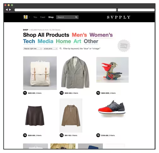
As stated in the announcement, the redesign introduces simplistic categories like Men’s & Women’s Clothing , Cookware and Camping. You can also now filter any category by your own keywords like Red or Nike.
From Svpply’s post:
Hot damn! We’ve released a new version of Svpply.
A whole new way to Shop:
Over 3,000 new products every day, pulled from across the web
Every product is hand-selected by our members
Simple categories like Men’s & Women’s Clothing , Cookware and Camping
Filter any category by your own keywords like Red, and Nike
Easily discover who found each product and follow them in your Feed
A new design with more space for the goods:
Less clutter in our Member and Store profiles
We’ve removed a ton of deadweight from our navigation for a simpler experience
We’re also starting to work directly with Stores:
Every product in our database was built by someone, and we want them to have access to their products and their audience, (interested store owners, click here!)
Check out some of the stores we’re already working with: Steven Alan, Zuriick, LN-CC and GhostlyWhat’s next?
Various small improvements as we listen to your feedback on the redesign
Full OAuth API launching early next week
Our new iPhone App launches this April
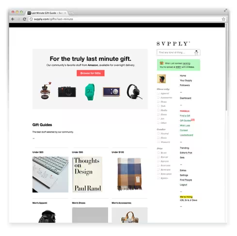
As for the design, Svpply has removed a ton of deadweight and clutter, pushing a minimalist look that emphasizes images. You can see the old design followed by the new design below:


More details from the announcement include the fact that the site now features over 3k products per day, pulled from across the web. Each one of which is hand-selected by members.
With these new changes, I personally can’t help but find that the site has somehow wedged itself in-between Pinterest and Fab. We’ll have to wait and see how the community reacts to the changes, as this space has become increasingly competitive over the past two years.
Are you using Svpply? Or have you taken to Pinterest to curate and share fashion?
➤ Svpply
Get the TNW newsletter
Get the most important tech news in your inbox each week.


