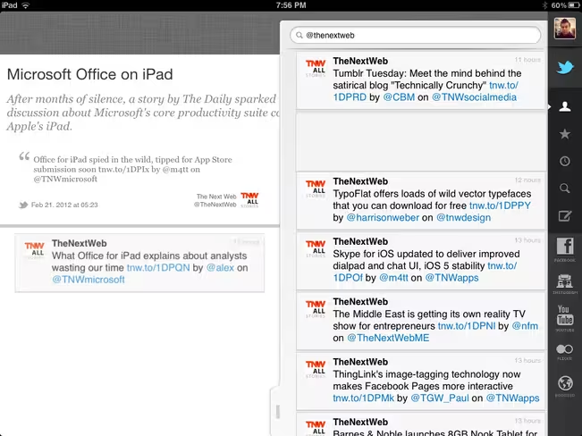
Storify is today announcing a brand new app for the iPad, bringing its drag and drop curation of Tweets, videos and other web links to the tablet. The experience looks smooth and carries over the core features of the web app.
Storify is a service that lets you combine links from Twitter and other sharing services at large into cohesive stories, something that we love to do here at The Next Web, as we did with the story surrounding the death of Steve Jobs. It’s a great, and fast, way to collate a bunch of links, bits of media and Tweets into something coherent and fluid and much easier to read.
“Whether you’re at a conference or at home, you can mix social streams to create simple, beautiful stories to share and remember the moments in life that matter,” said Xavier Damman, Storify co-founder and CEO. “You now have storytelling at your fingertips.”
The iPad app keeps the process of creating new stories simple, allowing you to pull from five specific and very popular services including Twitter, Facebook, Instagram, YouTube and Flickr, as well as the web. Once you fire up a story, you choose a service on the right and flick your way through items that are divided out into easily grabbable sections.
To build a compilation, you just grab an item on the right and drag it over to your story on the left. It actually feels quite a bit like you’re an editor preparing an edition of a magazine or newspaper, moving, organizing and curating content to craft your story. It’s a pretty interesting experience and one that actually makes a lot of tactile sense.
With easy access to the various services you can grab video of an event, your Facebook friends’ shots, your own Instagram shares and Tweets around the event’s hashtag to whip together an easily shareable experience that you can publish out to Storify. It’s honestly a far better experience for me than the Storify web app.
Yes, the iPad version does lack some of the granularity of the web version, and it doesn’t have all of its features, but it delivers the core experience well. It also gives you one additional feature: the ability to Tweet right from inside the app.
As with the standard version of Storify, once you’ve finished your story you can publish it out to the website and choose to share a link on Twitter or Facebook. You can also notify anyone mentioned in the story that you’ve used something that they’ve posted or said.
There isn’t a way to grab embed code here, so if you’re looking to quickly Storify something and then post it right to your blog in an iPad app you’ll need to jump out to the web interface to grab it.
The process is smooth and has a satisfying feel, but there are a few niggling issues with the interface that will hopefully be worked out soon. I would really like to see a slightly lower activation time when you tap and hold an item, so that grabbing and dragging feels more immediate. There is also a bit of pane confusion at times when moving back and forth between various sections. This has to do with the way that Storify layers a browser pane on top of a tapped link. I’d also like to see the web pane stay on the last page you were looking at, rather than defaulting to Google.com.
Having links remain live in your story view would also be nice, as it would allow you to bounce around through linked pages within Tweets. There also seems to be no reason why the app makes you grab an item by the right edge to change its order, grabbing an item directly as well would be a good option to have. But these issues are comparatively minor when compared to the rest of the app.
The iPad app’s focus on a select number of services and direct sharing to Twitter and Facebook are indicative of the company’s desire to make Storify something that ‘regular’ users, not just social media addicts or bloggers, use regularly. It’s making itself into something that you might use to easily share all of the various bits of media from your vacation in one cohesive story form with friends or relatives.
Storify for iPad is a great first step towards expanding the service outwards from its niche service position and it’s a highly polished first effort. Whether you’re creating stories around tech news or your favorite foods, Storify wants to be your tool. It will be interesting to see if this effort pays off in the long run, but even this initial stage of the plan it’s well worth trying out.
Storify for iPad is available now on the App Store.
Get the TNW newsletter
Get the most important tech news in your inbox each week.


