There are very few things that are more integral to daily life on an iPhone than mail. Everyone uses email. Your mom uses it, your cousins use it, your grandmother probably uses it. Deciding to make a mail app for the iPhone isn’t something that you undertake without some balls.
That’s where the guys from Sparrow come in. A team of only 5 developers and designers based in France, who started on a mail client for the Mac on the basis of a feeling. “The idea was that most mail clients that we were using weren’t satisfying in the sense that they were taking up too much real estate on the screen,” Sparrow CEO Dom Leca told me in our interview, “that was really the basic statement about the app.”
Instead of the standard ‘wide load’ email clients like Mail on OS X, the Sparrow team would create a single column experience reminiscent of Tweetie for Mac. They liked Tweetie so much, actually, that they called up its creator Loren Brichter and asked him if he wouldn’t mind if they just used that look. He said sure and asked to be one of the project’s advisors.
That’s how Dave Morin of Path and John Maeda, President of the Rhode Island School of Design, got involved as advisors as well. You can see shades of Path’s influence in the sliding panes used to access mail folders in the app.

The 💜 of EU tech
The latest rumblings from the EU tech scene, a story from our wise ol' founder Boris, and some questionable AI art. It's free, every week, in your inbox. Sign up now!
When the team moved to the iPhone, they knew that they had to rethink what they did with the Mac version of the app. They decided to focus on two main guidelines:
- Give the content a lot of space
- Make working with email fast
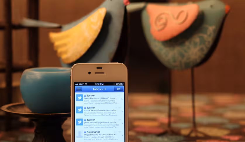
The main view of Sparrow is dominated by a single streaming view of your email, making the content your primary view. The navigation bar at the bottom has been done away with in order to keep your browsing space open and visible. It all has the feel of a very slow Twitter feed, to be honest. Which stands to reason, I suppose.

A right-to-left swipe on any email brings up familiar Gmail management options including reply, star, tags, archive and trash. A tap on another mail triggers a slick and snappy navigation that exemplifies the care put into the app at every turn.

Tapping on the folder button in the top left slides out a single pane that displays your unified account, or single email account if that is all you have set up. Note that you can also swipe right-to-left to reveal these panes, right from the main view. All of your favorite Gmail folders are here, including All Mail, Starred and Priority inbox. A tap on the accounts button in the top left slides yet another pane out, revealing your accounts and giving you access to the settings pane.


I highly recommend that you enable the Facebook support here if you have an account. Seeing all of the faces in your inbox makes for far easier identification of your common contacts and generally puts a ‘face to the name’.


It’s one of the things that I loved about Sparrow for Mac and it works doubly well on the more personal, and more space-conscious, iPhone. When you’re more prone to judge email at a glance, a face can save you more time than any amount of email summary can.
Swiping back outwards is a natural left-to-right motion of your thumb, bringing you back to the main view.


The small nub in the bottom right features a standard ‘compose’ icon and brings you, not to your standard ‘new mail’ view, but to a list of contacts that you can choose as the primary, Cc or Bcc recipients. You notice why when you’ve moved on to the next screen. The compose view is opened up by removing clutter from the view and allowing you more space to write your message. This split process may feel a bit awkward at first, but makes complete sense after a few uses.
Tapping on the title bar from the compose view allows you to swap the email account that you would like to use to send the message. This isn’t the traditional Gmail ‘send as’ but a more prosaic account switch.
If you’re reading an email that has multiple replies, you’ll find that Sparrow handles threading in a unique way. You can pull downwards or upwards from the beginning or end of a message to travel right on to the next (or previous) email in the bunch. This makes reading a conversation extremely pleasant, although I found myself wanting to use this method to navigate from one email to the next, even if it wasn’t threaded, which would be nice.


To top it off, tapping the title bar brings up the entire thread of messages in a clean, tappable list. This makes for a gorgeous visually pleasing way to navigate through a conversation. Your place in the thread is indicated with a bolded number on the left, ensuring that you know where you left off. There is a whole lot to love with threaded email, and the interface in general.
Which brings us to the only major disappointment with Sparrow for iPhone as it stands now. Its lack of true push email.
Lack of push
There are technical reasons why you won’t see push — the ability of an app to receive new data on the fly, even in the background — in this version of Sparrow for iPhone, and indeed, why you might not for a while. The Sparrow team was essentially using an API reserved for VoIP apps in order to check for new emails. Apple predictably took umbrage and rejected the app. Adding it back will be tough, especially if the team wants to avoid running its own push server and all of the security mess that entails.
For now, the app launches without push notifications and I can tell you that it is a real pity. The app had the push feature for much of its beta and it was fantastic. Now, not only do you not get notifications for new emails, but they tend to drop in en-masse when you launch the app, triggering your notification tray. The app was very clearly designed to work while retrieving mail on the fly and, even though the standard ‘pull to refresh’ action is present, it feels all the worse for not having it.
Sparrow for iPhone is a gem of an app. Every nook and cranny of this thing has been gone over with a fine-tooth comb and the animations are incredibly fantastic. It can easily be held up as a sterling example of Mail app design, if not iOS app design in general. The build quality here is absolutely off the charts.
Increasingly, we’re using our iPhones to manage our email, rather than write extensive replies. Sparrow concentrates on this by using natural gestures and thoughtful navigation to make your mail management experience best-of-breed.
That’s why, even without the lovely convenience of push, Sparrow for iOS has become my default mail app on the iPhone, and will remain that way, notifications or not.
If you’re looking for a beastly mail client with every option known to man, including push, you won’t find it with Sparrow. Remember too that it is IMAP only. That’s Gmail, iCloud, MobileMe, AOL, Yahoo and any custom accounts, but not standard POP. But it is the first app that I’ve seen that comes close to feeling as if it was made explicitly for the way that we use and hold the iPhone. It’s made mail management feel natural and even delightful, which is a neat trick indeed.
Get the TNW newsletter
Get the most important tech news in your inbox each week.