Gilles Bouchard is the CEO and Chairman of Livescribe, Inc.
The tech industry is obsessed with innovation – there’s a reason “disruption” is such a big buzzword. When it comes to wearables, the gadgets that are winning are not only innovative, they also integrate into people’s lives without being intrusive.
The key to a gadget’s ubiquity is balancing both function and design, so the device can enhance someone’s lifestyle without requiring them to change their behavior…too much.
I was lucky enough to spend 17 years of my career at HP, mostly with the PC and printer business, at a time when we were creating new businesses and taking new ideas to market at a breakneck pace
Some of the basic rules I learned back then became extremely relevant when I joined Livescribe. Right away, we shifted our product design to embrace smartphones and tablets given the ubiquity and power of modern mobile devices.
Good design is invisible
What is “good design?” Good design is sleek, stylish, and attractive. It’s about designing a device that feels natural – a device that doesn’t need a user manual to be useful.
Good design means not having to re-learn how to do something – it works intuitively, as a natural complement to your daily life.
When a product’s focus is more about disruptive innovation than unobtrusive design, you run into problems. In a recent piece for CNN, Astro Teller, part of the Google X lab that created Google Glass, noted that wearables need to become invisible to succeed.
“Technologies often fail not because they don’t function; they fail us because we know they’re there,” he wrote. “When a technology reaches this point of invisibility, it has reached its ultimate goal: becoming part of our routine, with no compromise between us and the technology.”
In the creation of a gadget that changes the way we work and live, it’s easy to get caught up in technological innovation alone, but that is really only half the story. The history of this industry is riddled with great ideas that received plenty of industry hype, only to falter.
Many of us have heard time and time again that “hardware is hard,” but this rings true not just because it’s difficult to design a product or to bring a physical, boxed product to a saturated market (though it certainly is). No, the greatest challenge in the hardware game is in finding the sweet spot between function and design – a balance that helps determine if a device flies off the shelf or ends up on eBay six months after launch.
This is a massive subject of course, but in my experience I’ve learned a couple of things that hopefully reinforce the importance of good design in consumer electronics.
Embrace new technology to simplify experiences
When we first launched the Pulse smartpen back in 2007, the iPhone didn’t exist yet. The Pulse (and its successors, the Echo and Sky smartpens) was designed to be an all-in-one computing device, with display, microphone and speakers all built in. There wasn’t much else we could leverage, so we had to do it all – and invent a whole new customer interface. This had its benefits, but also limitations on the form factor and user adoption.
When Bluetooth 4.0 Low Energy (BTLE) became widely available with the iPhone 4S, we began thinking about how to make a smartpen act as a companion to the mobile devices all of us already carry. A smartphone or tablet already has a great display, microphones and speakers, so we could off-load those functions to the phone and slim down the hardware on the smartpen.
In other words, we made it so if you wanted to use a smartpen you only needed to know how to use a pen and a mobile app, instead of learning a new platform.
Designing for widespread consumer adoption and retention is a challenge that wearable technology has faced in recent years, but I believe it’ll eventually catch on as companies discover the right balance of functionality with the already attractive designs that appeal to consumers.
Skeuomorph – maybe not in UI, but essential in wearables

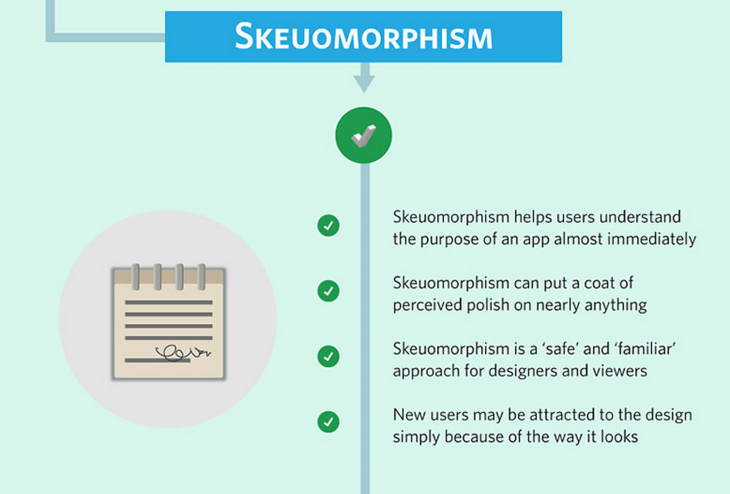
Skeuomorph – the use of ornamental design cues from the physical world as a metaphor in software design – has fallen out of favor in lieu of streamlined interfaces. In iOS 6, the Contacts app looked like a spiral bound address book. In iOS 7, this was simplified some, but you can still see the lettered ‘tabs’ in the icon on the home screen.
While this technique may be going out of style in software, I strongly believe that skeuomorph is absolutely necessary in smart objects, to maintain familiarity while incorporating a technological makeover ‘under the hood.’
Mainstream consumers have perceived usage notions, and if devices don’t meet those expectations, adoption will falter. We expect to wear a watch up to 24 hours a day. We expect our glasses to easily fold and fit in a shirt pocket, right next to our pen.
In our case, we made these adjustments by adding a simple shirt-pocket clip to the pen, balanced the weight from tip to end, and drew inspiration from fountain pens for color, feel and elegance. Our “smartpen” first had to meet the expectations of a “dumb pen” that writes with ink on paper, and “boots” in the time it takes to twist a ring and start writing on paper.
Losing any of these attributes would significantly impact its chances for market success, because using a pen is such a common experience that people have very specific expectations.
Utilize partnerships to grow your market
Finally, along with keeping up with the curve while making a product people can intuitively use, I’ve also found you can’t do it alone. You need partners to succeed by adding their core competencies to your capabilities, which will help bring your product to new audiences in a context that is familiar and helpful to them.
With each one of our successive models, we have increased the contribution of partners, including companies like Anoto and Evernote, Microsoft and Moleskine.
The next great gadget will change the way we live, but we’ll barely even notice it at first. What is the most important aspect of device design for you? What sways your purchasing decision the most – function, style, or usability? What are some examples of recent innovative gadgets that will break through the early adopter bubble and end up in everyone’s pocket, on their wrist, or on their face?
Please let us know in the comments what you think, and I look forward to seeing the ‘smart product’ revolution bring us more and more useful items…hopefully with disruptive – but not intrusive – design.
Read next: Google Ventures’ 6-step design process: How we revamped our entire product in less than a week
Get the TNW newsletter
Get the most important tech news in your inbox each week.


