Bastiaan Janmaat and Mike Dorsey are co-founders of DataFox, a predictive intelligence company reinventing the way investors, analysts, and business development professionals research and track technology companies.
Time is often the scarcest resource for a startup. When you’re building a complex technology, how do you prioritize between laying the foundation (the back end) and packaging it delightfully (the front end)? How do you quickly define what you are building next and make sure that everyone is on the same page?
We faced this dilemma recently and reached out to the design team at Google Ventures (our backers) for help. The team at Google Ventures (GV) taught us a process that allowed us to design a better user experience, faster.
What? Better and faster? Impossible. Core to the process is preparation, rapid idea generation and democratic consolidation.
Our founding team first began working together in the famed Launchpad class at the Stanford d.school, so we are certainly no strangers to brainstorming, whiteboarding and running creative-oriented design sprints. In fact, we already apply the methodologies we learned at Stanford to our quarterly roadmap planning.
But what’s the best way to collaboratively plan a complicated UI/UX for a software product?
The 6-step process below is an adapted version of the process that the design team at Google Ventures taught us. It worked for our team, but we believe it’s applicable regardless of whether you’re a 10-person startup or a team within a Fortune 500 corporation.
Process and preparation
We’ll walk you through each of these steps in detail:
- Patterns & Intent
- Crazy Eights
- Individual Mockups
- Wall Vote
- Consolidation & Wireframe
- Feedback and Iteration
But first, a few guidelines and pieces of advice:
Which team members should join?
Our policy: anyone who’s interested! But: the process takes a lot of time (usually one to two full days) and it doesn’t accommodate part-time attendance, so it’s up to you as a team to decide how to prioritize engineering, product, and sales folks’ time.
In our case, four leaders from our engineering organization and our CEO attended. Note: we’re an engineering-driven organization, so this is a normal breakdown for us.
Why the engineering-heavy focus? Engineers know the possibilities and tradeoffs of our design decisions as well as anyone, and in our case, are also highly capable designers and grounded strategists.
Allocate enough time.
Instead of tackling a redesign of your whole product in one session, pick one or more specific parts. For example, we chose to work on our onboarding flow and dashboard.
No laptops or phones!
This has to be a strict policy. Distractions are deadly.
Take breaks.
We recommend taking at least five to ten minutes every 90 minutes to recharge.
Prerequisite: ahead of the design sprint, your whole team should be aligned on a) your company’s vision and brand, and b) the objective for the sprint.
Okay, one more procedural trick – but it’s important:
How-Might-We’s
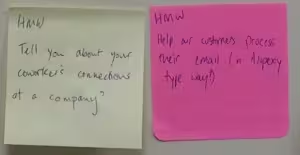
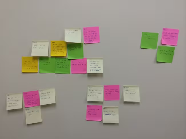
Throughout the design sprint, one tool you will use is the “How-Might-We” (HMW). As your team goes through the sprint, everyone should have a stack of post-it notes available to jot down any questions that come to mind. That way all ideas or concerns are captured without interrupting the flow.
For example, if in designing the onboarding flow the thought crosses your mind that your customers are really busy, and therefore you want the onboarding flow to feel fast/efficient, you can jot down “HMW make onboarding go quickly – not feel like typical, slow onboarding?”
Tell your teammates to keep all of their HMWs, that we will put them all on the wall, and we will digest them together.
If you don’t have a stash of post-its laying around, this might seem skippable. However, this is actually one of the most important components of the process. I’ll tell you why:
1. Individual voice.
It gives your team a way to voice the myriad ideas that come up in the process of this sprint. By letting everyone know, in advance, that we will go over the HMW notes together helps everyone believe in the process and feel confident that “there will be an opportunity to discuss what I’m writing down.”
2. Solution oriented.
Rather than creating an environment where negative feelings/frustrations bubble up – this approach encourages team members to voice their concerns, objectives, and questions in an open and transparent way.
By phrasing it in terms of a HMW, the speaker and everyone else on the team are naturally led to think about solutions, not the sorts of negative feelings that can otherwise derail team planning sessions.
3. Clarity through repetition.
Typically, when a bunch of smart people are all exploring the same ideas together, a lot of the HMWs end up being clustered around a few common themes. Seeing all of those HMWs together helps reinforce to the team what topics are most important (through seeing their repetition on the wall) and the most creative (by how differentiated they are).
In both respects, these memorialized thought bubbles help everyone on the team focus on the most important things.
4. All-in focus.
Once a team-mate quickly jots an idea down, they can stop thinking about remembering the idea – and get back to participating in the process. It’s important to not forget the best ideas – and it’s also important to be focused on the moment at hand.
Next: Ready? Let’s get rolling
Step 1: Patterns and intent
Before the design sprint, the sprint leader (me, in our case) was responsible for finding websites and products we might seek to emulate, “patterns.” These patterns could be as high-level as the “personality of website X” or as granular as a typeface or other visual style.
I prepared and walked my team through 10 to 20 screenshots of these patterns. This helps avoid reinventing the wheel – some other company like yours has already had to optimize for a certain functionality or appearance, so find great companies to learn from and emulate.
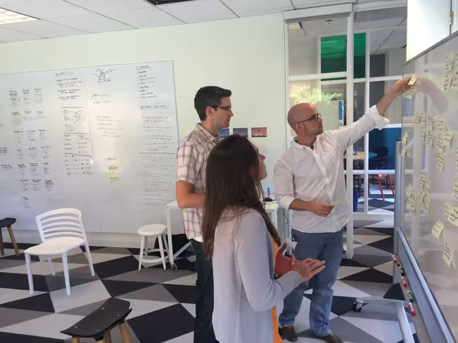
As you discuss these patterns, allow for Q&A; what do your teammates like, and why? Best practice is to keep track of particularly effective patterns on a white board.
While going through these patterns, be sure to explain their connections to the intent of your product or the part of your product that you’re designing. What’s your goal and why might this be an effective example?
Be open to others’ suggestions, supplied ad hoc. This is the one time you’re allowed to use your laptop by the way.
Before moving on, spend some time going through all the HMWs that have hopefully been supplied. Try to batch the HMWs into similar topics, and discuss how challenges might be tackled using certain patterns.
Step 2: Crazy eights
Renamed “Ocho Loco” by our team, this part of the process is exciting and nerve-wracking at the same time.
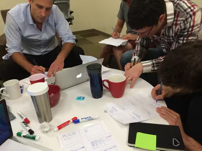
Have each participant fold a letter-sized sheet of paper into eight rectangles. For 60 seconds at a time, everyone will sketch one of their ideas in one of the rectangles. The idea is for each person to tackle an idea or component of the product – whatever comes to mind first. This can be a specific piece of copy, a functionality, an interaction, etc – but you only get 60 seconds per rectangle.
After 60 seconds, move on to the next rectangle, where you can iterate on your previous thought process, or move on to a new component. Enforce the time constraint and keep moving.
At the end of this process, we took turns illuminating our thought-process. You can allow for a brief discussion to ensue, in order to fully absorb all these new ideas, but try to keep moving.
Don’t forget to take a break to recharge…
Step 3: Individual mockups
In this next step we individually get 20 minutes to draw a full mockup of the product/feature we are designing. Encourage the team to make full use of all the tools that have been created: patterns, crazy eights, as well as any new ideas or inspirations. Importantly, put pen to paper quickly, because those 20 minutes will fly.
Try to nail the actual wording that should be used, rather than scribbling filler text. Copy is a critical yet often overlooked part of design.
Step 4: Wall vote
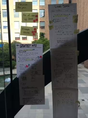
With the individual mockups complete, stick them all up on a wall, but try to keep submission anonymous. You can encourage contributors to give their mockups playful names such as “Wordy Wonder” or “Short but Sweet,” so they’re still easy to distinguish and point out.
Distribute five to ten stickers per person and ask everyone to use them to vote on specific parts of the mockups. People might like a heading, an illustration, a particular interaction, or an overall layout.
When voting is complete, one person should walk through all the mockups and call out on the features that have been voted on, particularly those that stand out with multiple votes.
Step 5: Consolidation and wireframe
After absorbing the result of the voting, it’s important – as a group – to list out the features, styles, and components that received the most votes. For these to be consolidated into one masterful wireframe, you may need to discuss the pros and cons of any items that conflict with one another. This is an enlightening and insightful phase of the process.
This ends an intense session (or multiple sessions) of research, ideation, and discussion. It’s up to a small subset of your team (ideally one or two people) to take the selected components and leverage them to create a single wireframe.
Step 6: Feedback and iteration
You’ve come a long way in a very short time, but building an exceptional product will require multiple cycles of feedback and iteration between the first wireframe and a final wireframe that’s ready for a visual designer to translate into pixel-perfect mockups.
We found that using a GoogleDoc was an effective way to aggregate everyone’s feedback, questions, and suggestions after the first wireframe. One person should parse everyone’s feedback into batches, so that the group can methodically go through the main topics and debate the merits of suggestions and alternatives.
Voila!
Using this process, in just three days, we were able to produce the ingredients for wireframes redesigning our entire product.
The pixel-perfect mockup and UI implementation phases that followed still involved plenty of debate and iteration, but we were able to get ourselves to a great starting point using the tools and processes that Google Ventures had shared with us.
What we’ve learned
Fantastic design is really a multi-dimensional optimization problem. To really nail a design, you have to nail all of the little details across numerous dimensions: user flows, bits of copy, graphics, colors, fonts, calls-to-action, etc. It’s really difficult for one single person to think of, analyze, and optimize across all of these dimensions.
The beautiful thing about this process is that it always turns out that some of each person’s ideas are the winning ideas for different aspects of the product.
It works both ways. On any given dimension, if it was your idea that ended up receiving a lot of votes, then you know that you have the endorsement of your team to pursue what you were convicted about. If your idea received no votes, then you can see that it’s time to move on from the position you held. Because everyone sees and cares about different aspects of the UI/UX, everyone can usually feel good about contributing some portion of the final plan.
Most importantly, having participated in the process, everyone feels good that the best overall ideas were surfaced and that the plan is an excellent one.
With the design sprint behind us and our entire team now focused on building according to our plans, we are excited and proud to share the outcome of this work in September – an altogether new and more powerful version of DataFox’s powerful intelligence engine.
In the meantime, let us know what you think of this process, and what methods your team has employed to efficiently collect ideas and build beautiful products.
For further inspiration on the subject, here are a few more resources we have found useful:
- Stanford d.school’s “use our methods” page
- The product prioritization process Pandora used
- A talk by some of the Google Ventures folks who taught this process to us
Read next: Setting the stage: Killer user onboarding starts with a story
Get the TNW newsletter
Get the most important tech news in your inbox each week.
