In November, Sky showed off its next-gen TV service, called Sky Q.
At the launch event, we got the chance to get a guided tour around a few of the features the system has on offer, but it was a brief 10-minute affair, during which taking control was a definite no-no.
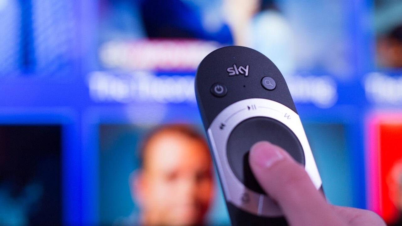
Now, however, we’ve had the chance to spend an hour checking out the service more thoroughly – and yes, a chance to try out that new touch-sensitive controller.
What is Sky Q?
Sky’s next-gen TV service blends on-demand and traditional programming in a totally new interface and with completely new hardware.
There are two ‘main’ boxes to choose between – either the regular Sky Q box or the ‘Silver’ model.
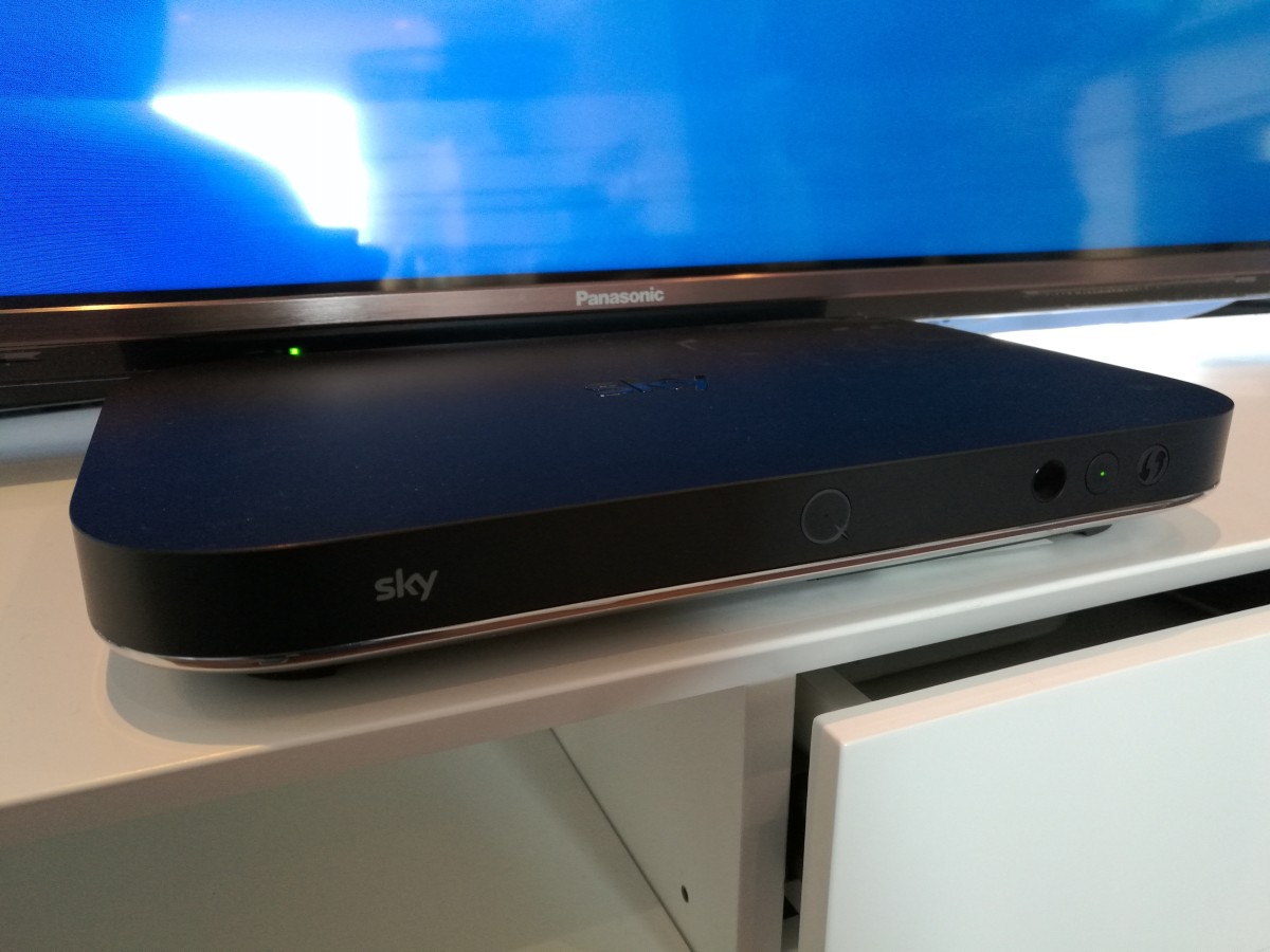
The difference between them comes down to how many channels you want to watch and record at a time, largely. The Silver model has 12 tuners for various things (Picture-In-Picture preview, future proofing, recording, etc.) but the end result is that you can record four shows at once and watch a (different) fifth one. It also supports multiple tablets at once.
The regular box will let you record three channels at once, while watching another live and another on one tablet, which is probably enough for most families.
There’s one more reason that you’ll probably want to go for the Silver box though – it supports Ultra HD content and the regular one doesn’t. If your TV is 4K/Ultra HD then it’s a no-brainer. The Silver also has more room for recordings, with 2TB versus 1TB.
Beyond the main box, there’s a the Sky Q Mini. This is the unit you’ll have in your bedroom, kitchen or wherever else you might want a Sky connection.
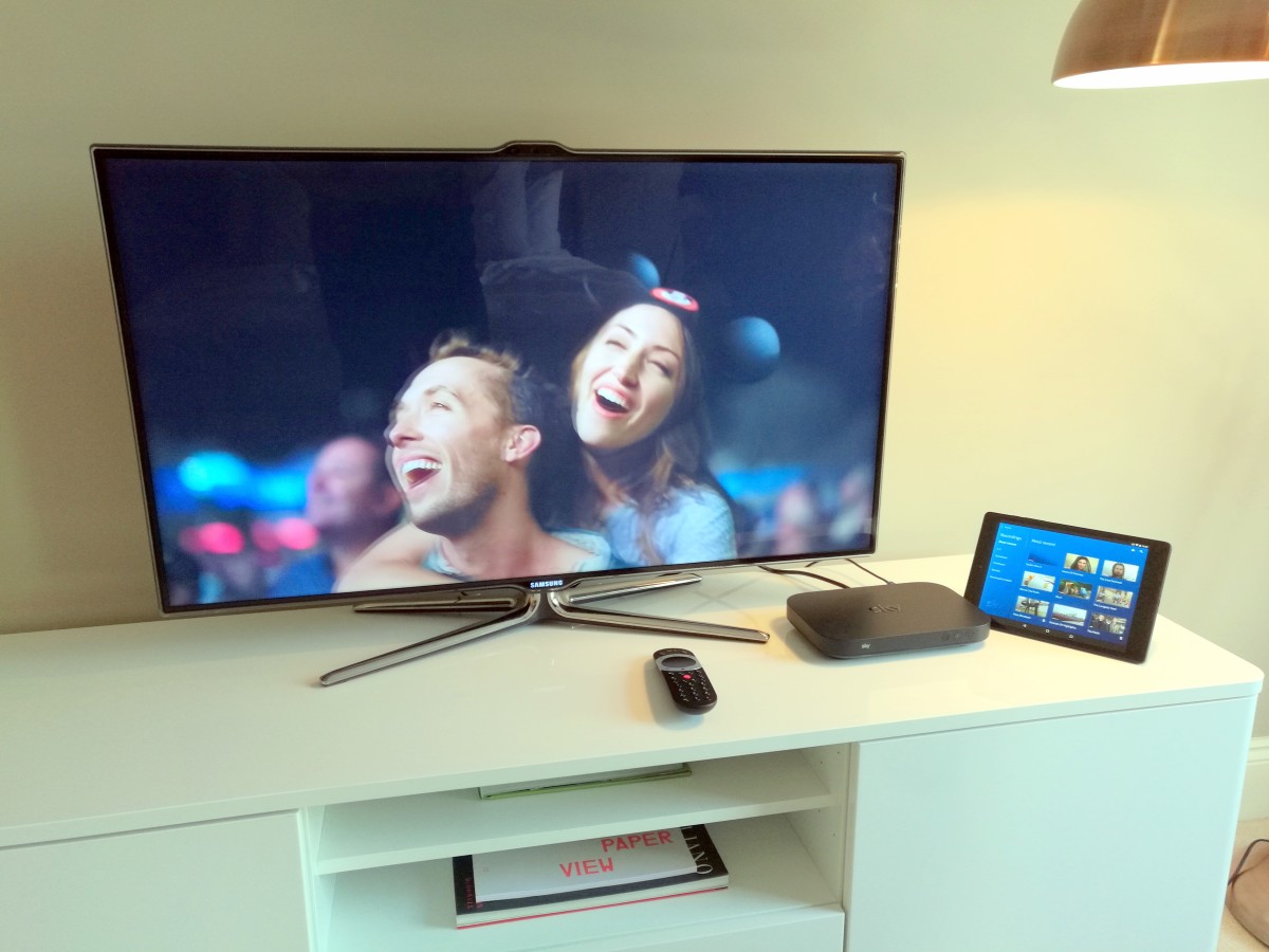
Unlike Sky’s existing setups, the Mini boxes don’t require a connection to the dish, only an HDMI and power connection.
That’s all you actually need for a multi-room setup, but if you also want each of your Sky boxes to act as a Wi-Fi booster for other devices, then you can achieve that by adding the Sky Q Hub.
If you’ve got a large house with lots of TVs, this will be particularly attractive. There’s a catch though – you need to be a Sky broadband subscriber to get the best out of the Hub.
That’s all the new hardware, but there’s also a new Sky Q app as well for watching on-the-go.
The remote
The remote is the real hub of the Sky Q system, with most of the navigation coming via the touch-sensitive middle pad where the directional and ‘Ok’ buttons are on the regular controller.
There’s now a shortcut button to take you directly to your recordings, as well as a home button that bounces you back to the main Sky menu, with My Q as the default selection.
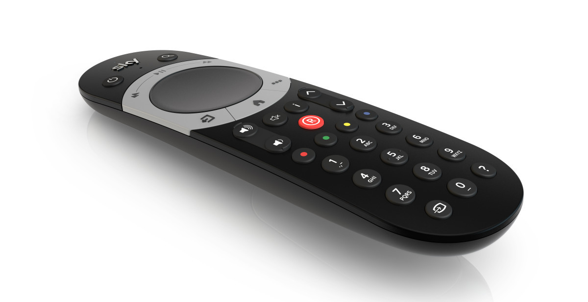
The touchpad lets you either push once to move one item across (or up, or down) at a time or you can just hold it down to freely flow through the channel listings (or anywhere else in the image-heavy, list-based UI). It’s really pretty intuitive, and Sky’s put effort into making sure you get very subtle feedback that guides you along.
For example, if you look closely, any selected item has a slight glow (called a ‘glass panel’ design) above it. This starts in the center, and you might not even notice it if you weren’t looking for it, but as soon as you start gently pressing in any direction, that starts to move, giving your brain re-assuring feedback about what your input is resulting in.
It also increases in speed the longer you hold down the button. Similarly, if you’re fast-forwarding or rewinding through a program, you can either tap the directional arrows or use a touch gesture and keep it held down to zip through quicker.
Sky says that the wider part of your thumb is harder to use precisely, while the top of your thumb is good for precision control. As such, horizontal menus contain larger, image-based lists to scroll through, while vertical ones contain the categories. Smart.
What are the best new bits?
Sky’s put a lot of effort into making sure everything feels familiar but in reality, everything has been redesigned and it really makes the existing Sky+ HD UI look ancient.
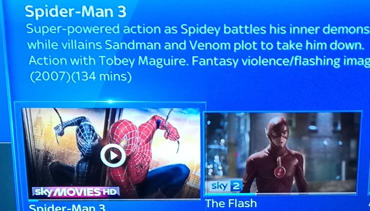
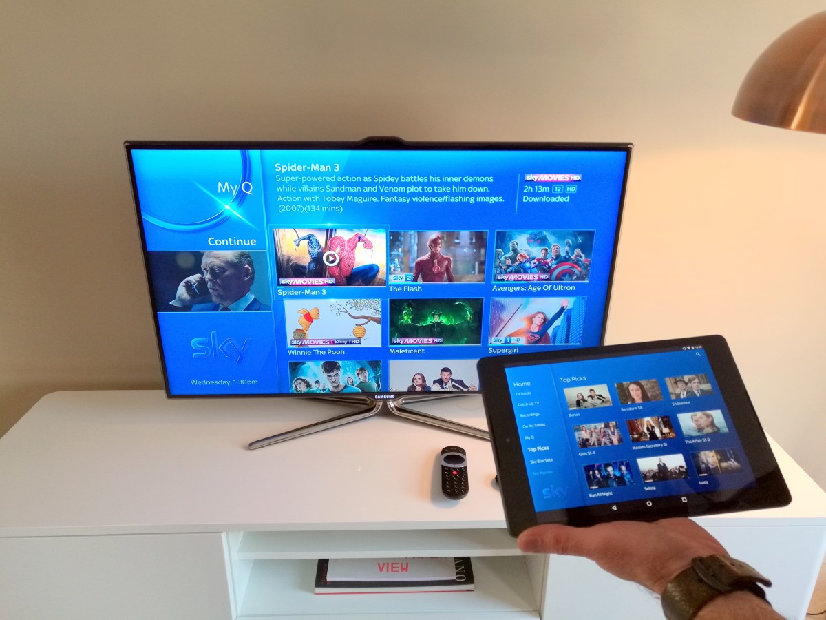
Key to the overhaul is a new section called My Q, which is the default view when you hit the home button on the remote. My Q is split into three further sections.
‘Continue’ – this contains anything you’re watching but stopped part-way through. Not only does it take you back to the point where you left off (regardless of device you started or continued on), but if it’s a TV show where there’s another episode available(regardless or not of whether you’ve downloaded it already), as soon as you return to continue when an episode ends, the following episode will be at the top of your queue.
Needless to say that’s pretty appealing for binge-watchers.
Continue is the only section in My Q that’s shared across devices – so you can pick up and watch your recordings wherever you want, including on a tablet.
The other sections – ‘New Series’ and ‘For You’ – are recommendations based on your viewing. You don’t get any control over what shows up here, but there are controls that let you filter out adult shows and kids TV.
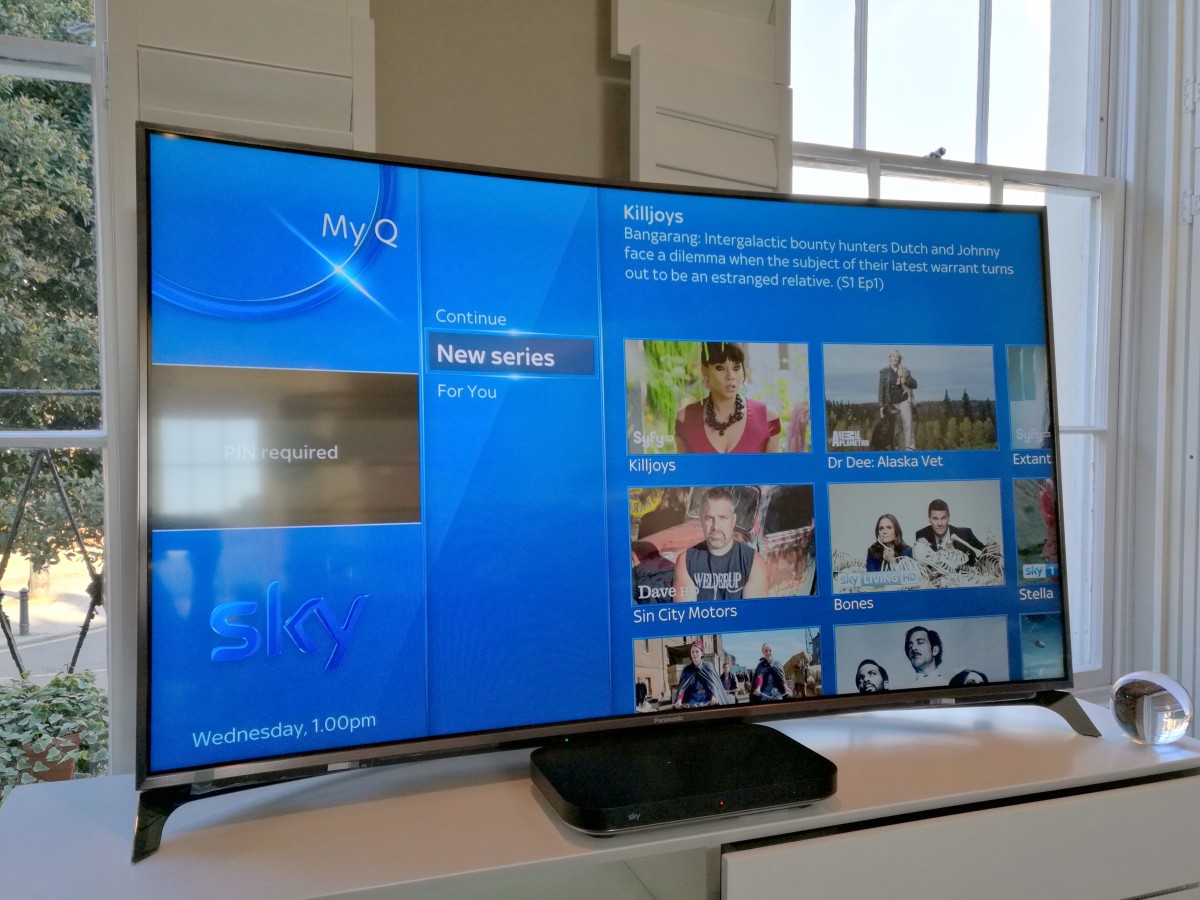
Each box serves up their own recommendations based on what you watch, and when. If you have a family and kids with a TV in their bedroom, the recommendations will be different from the main TV. Similarly, if you have a family that all shares the one main TV, recommendations in the morning will be different to those at night.
Behind the design of the UI is the underlying principle that where and how you find the shows you want to watch doesn’t really matter, just that you do.
As part of this, recordings are ordered by most recent first, and when a new episode downloads, the whole series gets jumped to the top of the list.
If you’re looking for a specific program, but don’t know when you recorded it, there’s an A-Z strip that you can quickly scroll to find whatever you’re looking for.
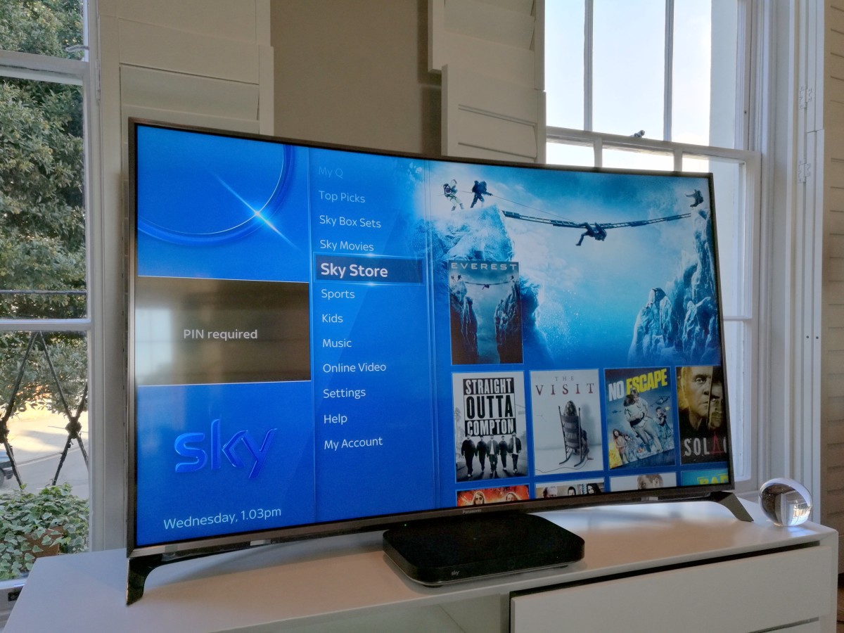
TV guide, catchup and sections like Sky Movies, Box Sets and Store will be familiar to existing Sky+ HD subscribers, and are functionally pretty much the same with the all-new interface.
Sky’s also focused on asking the viewer fewer questions, so when you select to record a show that’s a part of a series, it’ll automatically download any new episodes in the future, tapping the record button once more turns it into a one-off recording.
As already mentioned, there are a lot of lists in Sky’s UI and some of them ultimately lead you to the same place (as the idea is that it doesn’t matter how you find the thing you want to watch, it just matters that you do).
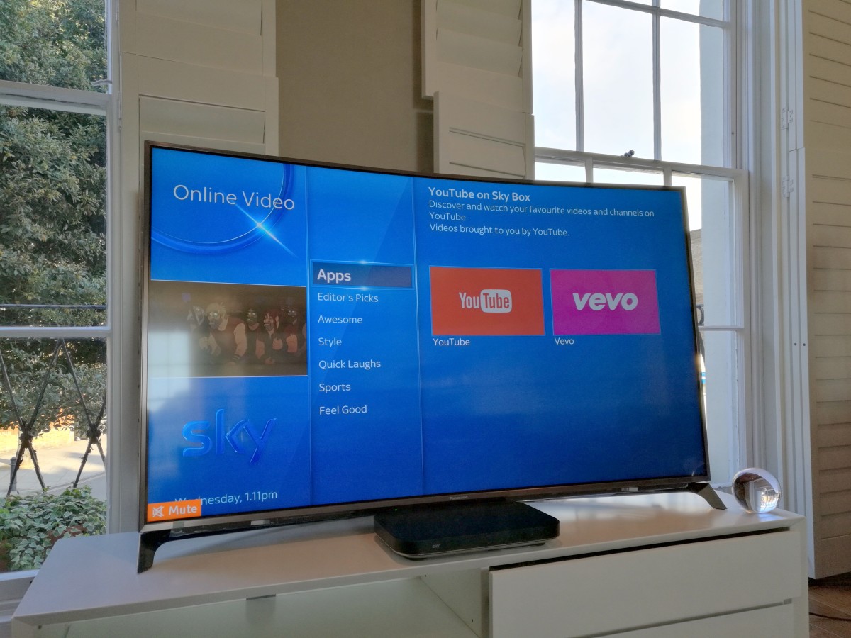
However, unlike Sky+ HD, the essential navigation has switched from horizontal to vertical. Sky says this is because vertical lists are something we’re trained to read from early childhood and we apply a certain logic structure to them. Therefore, using vertical lists instead of horizontal creates less mental friction in getting around the UI.
Browsing a section like ‘Sports’ splits shows into further sub-categories designed to make it easy to find whatever you’re looking for. For example, there’s an ‘On Now’ selection, which shows every sports broadcast on at that particular time across all channels, and any upcoming scheduled shows in the near future.
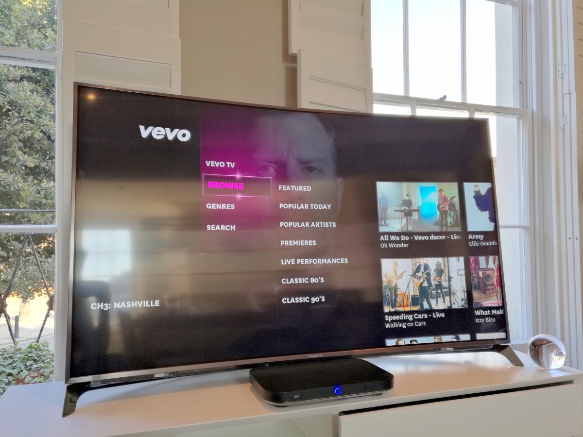
You get the same ‘On Now’ option in the ‘Music’ section too, but more importantly, there’s now a much deeper music catalog. There’s also a new Vevo integration for additional on-demand music content.
With a new controller, new My Q hub as home to all your recommendations and part-viewed shows, new app integrations and a flipped UI orientation, it might take you a few minutes to find your way around but it shouldn’t take long and once you do, you probably won’t want to go back.
Beyond TV, Sky’s making a play for Q to be the hub of all your home entertainment, so if your best sound system is your TV, then you can play back music from your mobile through that instead.
There’s no proprietary faffing here – Q box just appears to your phone or laptop in the same way a Bluetooth speaker would. AirPlay has also been integrated into the boxes.
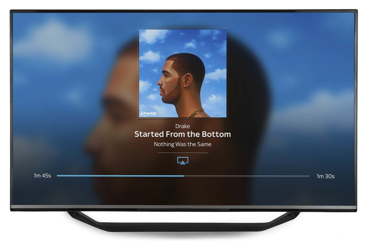
If you use iTunes on your Mac or PC, you get the option to send the same music to other TVs around your house, in addition to any other AirPlay devices you might already have.
It’s an unexpected Sonos challenger for your home, and it’s pretty damn impressive.
What’s the catch then?
Sky still hasn’t said how much it will cost or when installations will begin.
It’s a short criticism, but without that information, it’s hard to get an idea of value or how long potential customers will have to wait to get up and running.
If money’s no object and you’re a TV addict, then this isn’t a concern for you, but it will be for a lot of people until it’s disclosed.
First thoughts
Sky Q is a seriously impressive service to browse around – and there’s a whole lot more to it than covered here, but with just an hour to look, there’s only so much you can see and test.
The key in that sentence that it’s a seriously impressive service to browse around, I haven’t lived with it or used it for any extended period of time, so it’s hard to say what the potential niggling problems that arise over time might be at this point.
On the surface of it, the new feature set makes it easier than ever to keep up to date with shows you watch regularly. As a subscriber to Sky’s existing service, it’s an update that excites me and definitely one I’d want to consider.
It gives you the ability to record more simultaneously, brings in additional on-demand services, serves up customized recommendations, dramatically improves the UI, lets you watch in other rooms without the need for a connection to the dish, potentially boosts you Wi-Fi network and could even end up as an integral part of your multi-room stereo system.
Sky’s gone all out to make Q an all-singing, all-dancing media hub for your home, but whether or not I’d end up handing over the cash is a different matter.
For families already shelling out for a premium Sky+ HD subscription, Sky Q is probably the update you’ve been waiting for.
➤ Sky Q
Get the TNW newsletter
Get the most important tech news in your inbox each week.


