Eight months after arriving on iOS and one month after teasing us with mockups, Banking startup Simple has finally launched on Android. To create the app, Simple says it needed to rely on an “outside perspective,” and did so by recruiting mobile product development firm Two Toasters — the same firm behind Airbnb’s Android app.
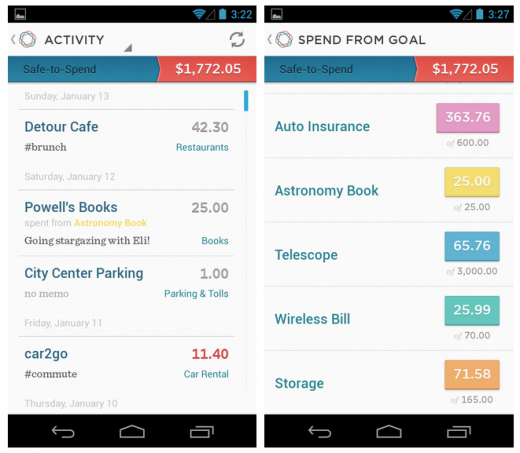
On its blog, Simple emphasized its decision to design the app from scratch, rather than porting the iPhone design to the Android platform. Shown in the screenshot below, Simple’s Android app packs largely the same functionality as you’d find on iOS, including photo check deposits, but with a different color scheme and new navigation patterns.
Considering how long this release took, Simple for Android could hint at what’s to come in the next iteration of Simple for iPhone. That said, given how closely Simple’s Android app follows many Android design conventions (clear lack of skeuomorphic textures, a bright color scheme, solid colors, etc), it’s more than likely that the two apps will remain completely different animals.

As a recap, Simple is a banking service that technically isn’t actually a bank, but rather an alternative to one. The startup offers unique features, including goal oriented spending, natural-language filtering, granular transaction reports and an incredibly strong emphasis on design (something you’d never find at a typical financial institution).
Simples says this release will “help many more people can replace their banks with Simple.” The app is available now on Android 2.3.3 and higher, but unfortunately for the curious, Simple’s service is still invite only. Nevertheless, you can request an invite here and download the app via the link below.
Image credit: Thinkstock
Get the TNW newsletter
Get the most important tech news in your inbox each week.


