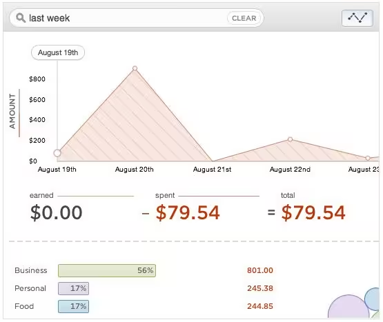
I’ve sung the praises of Simple since becoming a customer a few months ago. The banking-alternative startup has won my heart and my business not only for its incredible practices but also for its gorgeous use of design. The latest feature for the company, according to a blog post, is the addition of granular reports, the likes of which we’ve never seen in the consumer side banking industry before.
The company points to the fact that there are over 30 different fields of information that are reported every time that you swipe your card. Most banks, however, distill those down to a simple business name and amount spent. But Simple believes that there’s value to the rest of that information, and the inclusion of Reports is aiming to tap into that resource.
What’s interesting about how Simple works is the natural-language filtering that you can do on transactions. Searching for “fast food this month”, for instance, would return all transactions with the Fast Food tag since the first day of the month. These same sorts of filters stay in place for Reports as well.
“If you want to know into which categories your small purchases fall, try “under 100”. Comparing the last couple of days, weeks, and months of going out to eat is as easy as searching for “restaurants”. Elegant graphs render instantly to help you see the why behind the numbers.”

It’s a logical addition to an already-incredible product. Combined with the company’s newly-released Goals feature it should also help you to better understand where your money’s going, leading to more informed decisions about how you spend it. Just make sure you’re not tweeting a picture of your new debit card…
Get the TNW newsletter
Get the most important tech news in your inbox each week.


