Sometimes the only way to really dig into a topic is to really dig into it. And when you do that, it’s all too easy to end up with fascinating data points and facts that become almost impossible for anyone else to comprehend easily – and people on the Web like things to be easy.
Take, for example, the question “how long would you have to work to afford the Apple Watch Edition?”
The Guardian formulated this question and answered it for a few different people – world leaders, Tim Cook, an average Foxconn employee.
It was a pretty interesting story, and one that was based around hard data and verifiable facts. This is exactly the sort of thing that Silk’s structured data platform was made for.
That data was then pulled together for each of the nine countries where the Edition model first went on sale.
Did you know it would take someone in China an average of 280 days to buy the cheapest Edition model Apple Watch? And that’s accounting for no taxes on that income, no bills, no food – nothing. In the US, that figure is just 43 days.
Having a responsive, easy to modify way to display that information is Silk’s sole purpose, and presenting it in a simple, easy to digest way is a smart way to keep people reading on the Web.
First launched in 2011, Silk lets you upload data via a spreadsheet or input it manually. You can also add images, to keep things visually interesting, and link items to a specific geographic location.
Entered data can then be automatically arranged into a variety of graphs or charts, depending on what you want to display. At the point of adding data, Silk recommends a visualization you might want to use – these have also been updated this month to provide better matches.
Once you’ve added all the information you want to display on a topic (images, text, charts, data etc.) your Silk becomes its own self-contained page that’s discoverable by search engines and shareable across social media.
To help keep things orderly, there’s now a tabbed view to distinguish between pages that contain structured data (‘datacards’) and pages that visualize that data.
Given that it’s free, that means you can also use it for some less exciting purposes, like creating a slightly less boring than average team page private only to your company.
Personally, I prefer finding out things like more than 11 percent of musicians’ cause of death is homicide.
Creating private pages may one day become a chargeable service, but for now, both Silk tiers are still free.
To date, the company has more than 2 million datacards on the platform and there are more than 20 million ‘facts’ (pieces of structured data – value of a company, birthplace of a person, etc.) buried away.
The company says the first million datacards took two and a half years, and that second million came in just six months.
With its mobile-friendly redesign, those numbers seem likely to keep growing, particularly if it can continue to make things easier for creators, as well as viewers.
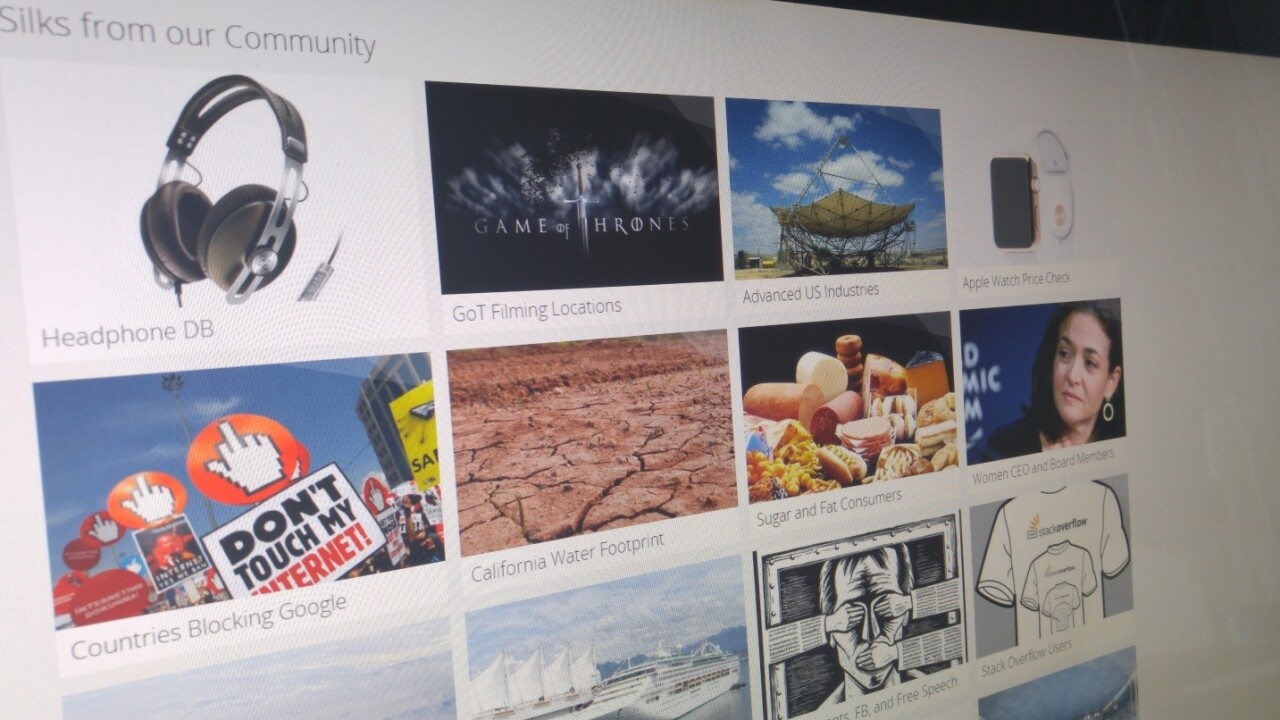
It’s OK though, you don’t have to pretend that you’re going to read about global traffic congestion, when we both know you’re probably headed straight for the Game of Thrones filming locations.
➤ Silk
Get the TNW newsletter
Get the most important tech news in your inbox each week.


