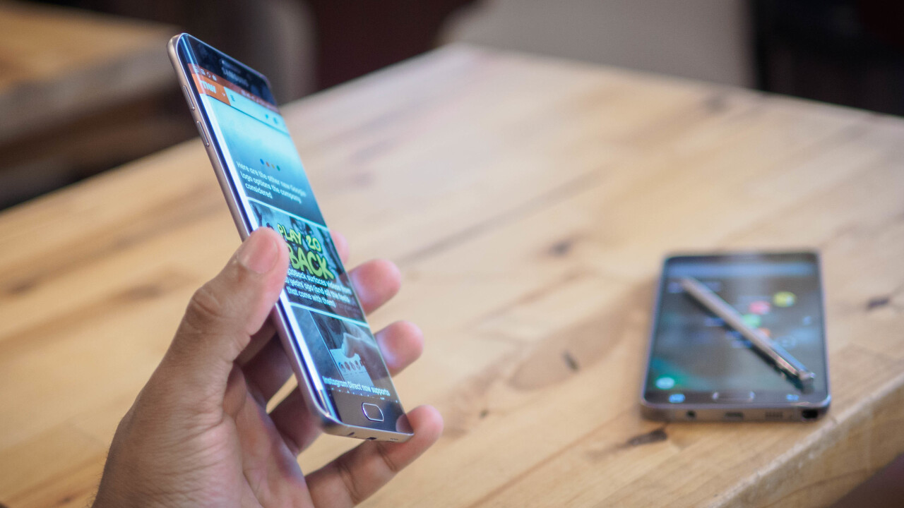
Yesterday we published an extensive, 3,000+ word review of the Galaxy Note 5. Our verdict? It’s pretty much the best phone you can buy anywhere right now if you can live with the size, price tag and limited storage.
We’re trying something a little different with the S6 Edge+ though. Not because that phone isn’t good enough to deserve a full-fledged review, but because honestly, you shouldn’t have to read the same thing twice.
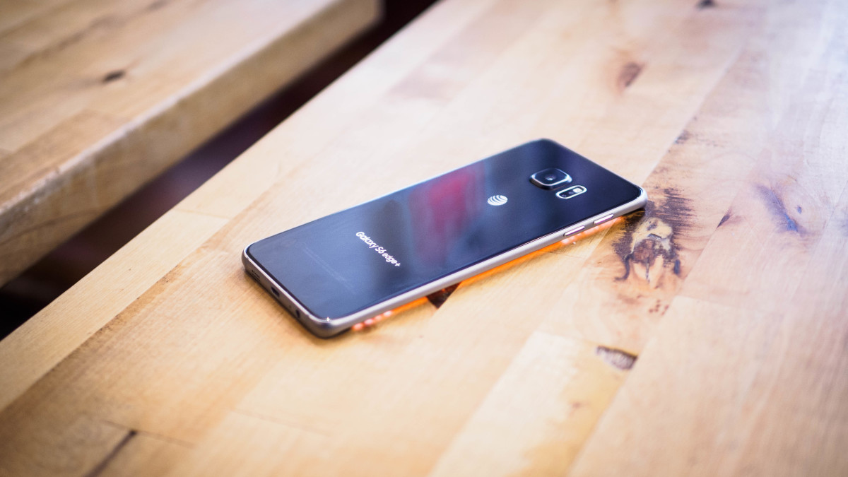
I’ve been using them side by side for a while now, and for most purposes, they’re basically the same phone. The internal specs are exactly identical, and the only differences are outside: one just has a curvy screen, the other has a stylus.
If you want the full nitty gritty of most of what Samsung is offering with the Edge+, head on over to our Note 5 review. If you just want a TL; DR version though, these are the qualities the S6 Edge+ largely shares with the Note 5:
- An even more beautiful, high-quality design. The Note 5 is no slouch in the looks department, but the Edge+’s screen still stands out more than pretty much any other display out there due to the curved panel. It’s one of the best looking smartphones ever made, and its the one thing the Edge+ has over the Note 5.
- Speaking of displays, a very sharp QuadHD AMOLED screen with accurate but vibrant colors and pure blacks.
- An excellent fingerprint sensor that works quickly with just a tap.
- Ridiculously good performance powered by Samsung’s Exynos 7240 processor and 4GB of RAM. It seems incapable of significantly slowing down.
- Probably the best camera on iOS or Android, with full manual control, RAW support, optical image stabilization and 4k video. The new manual controls help it outdo the smaller S6 models for enthusiasts, but I could find no difference between the Edge S6+’s camera and the Note 5’s.
- Useful multi-tasking features, including split screen and windowed modes.
- Surprisingly resilient battery life that will have no trouble getting you through a full day of use and 3+ hours of screen on time, depending on what you’re doing (streaming video lasts longer, for instance). It’s the main reason to choose new big Galaxy phones over the smaller S6 models.
- Very quick charging if your battery does die; we’re talking 0-90% in an hour or less.
While the Note 5’s distinguishing factor is the S-Pen – more useful than ever now that it works without unlocking the device – the Edge+’s features are really just clever software disguised as hardware advantages.
You can swipe in from the edge to pull up favorite contacts or apps, for instance. It’s a neat feature, but it’s also something several free apps on the Google Play store can essentially replicate, even if swiping does feel a little nicer on the curved screen.
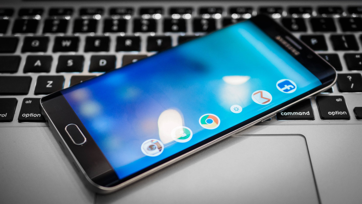
The most unique feature is the ability to set different tickers on one of the edges for quick access to information like notifications, weather, RSS feeds or Twitter trends. It’s nifty, but I hardly ever used it given I own a smartwatch, though your mileage may vary. There’s a pretty limited selection of tickers, and it’s also a bit slow to launch – about a full second or two after initiating the gesture (there’s no always-on option).
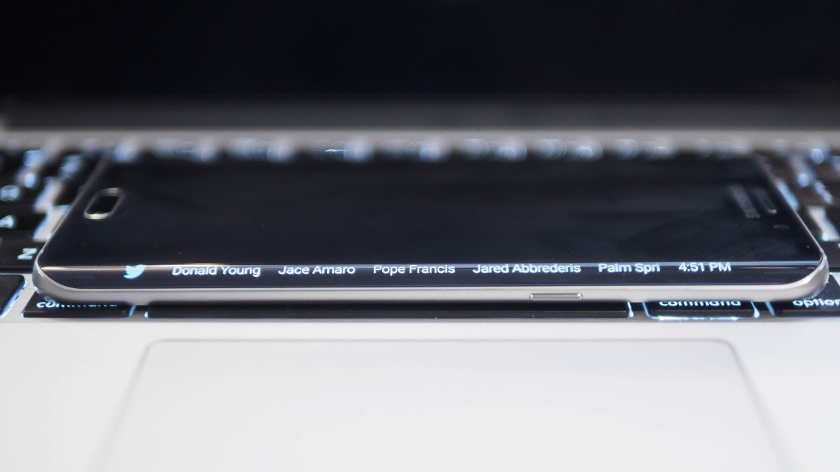
None of these are as hard to replicate as the S-Pen, and though some people will probably appreciate the built-in functionality regardless, the S6 Edge+ also has some distinct disadvantages compared to the Note 5 too.
For one, it’s significantly harder to hold. The Note 5 felt surprisingly good in hand thanks to its narrow frame and curved back, and it was even fairly usable with the included one-handed mode activated by tapping on the home button thrice. But the the Edge S6 has a flat back and curved screen, essentially creating the opposite effect in the hand.
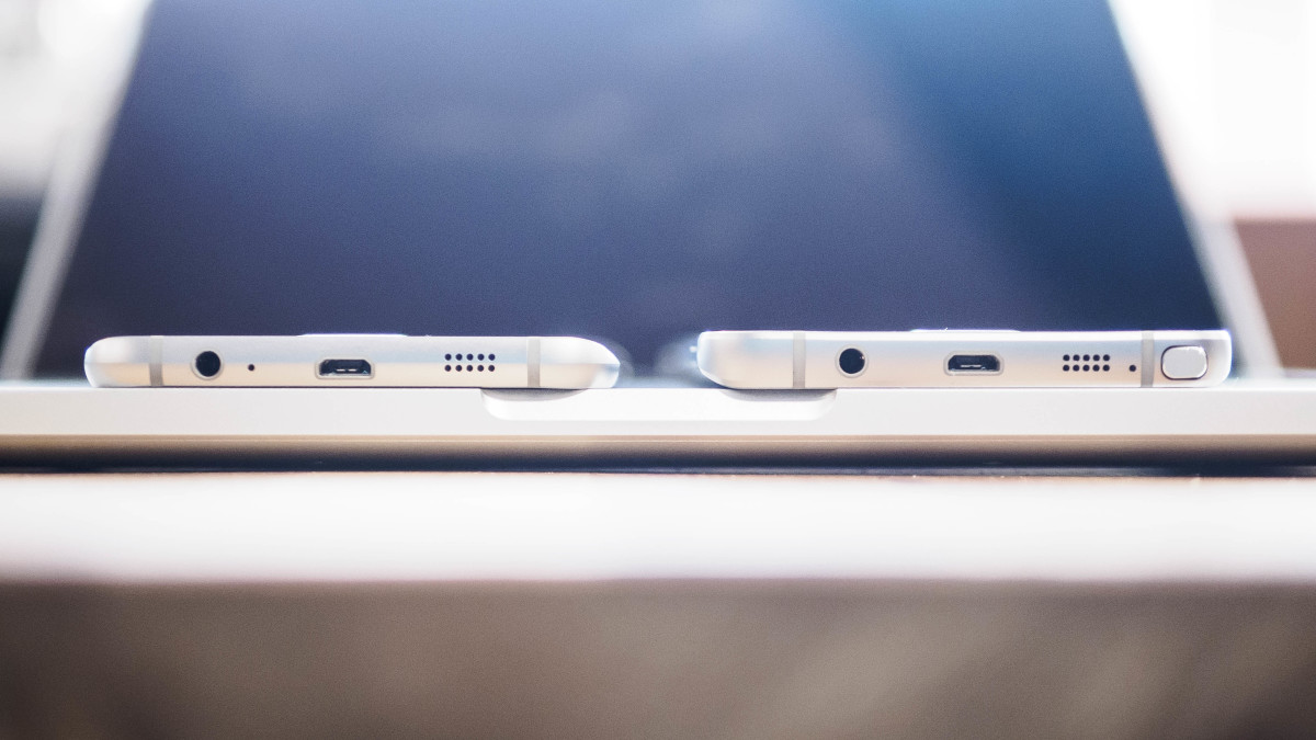
Those with larger hands may not have to worry as much, but in my medium-sized ones it was difficult to keep a solid grip on with on, and I frequently felt at risk of dropping it (and what’s point of a case on a phone this pretty?). To pick it up from a table, you need to pinch at the sides. For me, it’s a strictly two-handed device.
But most importantly, the S6 Edge+ costs more. Pricing varies from carrier to carrier, but in the US, the Edge+ ranges from about $770-$820.
As such, I can’t reasonably recommend the Edge+ over the Note 5. That is, if you can buy the Note 5 – Samsung has apparently deemed Europeans unworthy of the almighty stylus.
If you’re not in the old world, then the legitimate usefulness of the S-Pen and high cost of the Edge+ make the Note 5 a no-brainer. The Edge+ is to the Note 5 what the steel version of the Apple Watch is to the Sport – except in this case, a little less functional.
But that’s the thing: we humans don’t always make the most rational choices. Sometimes we just want the shiniest thing, and that’s okay too. The Edge+ is a conversation starter, and nothing else looks like it.
If you like the curved screen, have no interest in a stylus or can afford the extra $100 or so, go for it. You’re still getting the second best phone around.
Get the TNW newsletter
Get the most important tech news in your inbox each week.


