I recently met up with the team behind Read It Later over a drink in San Francisco. The product lets you quickly bookmark any page of text on the web, quite often articles, to read later. Quite frankly I just wanted to say hello and introduce myself personally after a fair bit of banter on Twitter…but they sprung a surprise on me. A new product.
“A new product?” I said curiously. “You mean you finally have the update to Read It Later ready?” Read It Later users will have been aware of the (ridiculously) long-awaited upcoming release to the product. Seemingly taking months and months.
“No, this is a brand new product that replaces Read It Later.” replied Nate Weiner (right, below), Read It Later’s founder, with a grin (yep, exactly the grin in that shot).
“Replaces Read It Later??” I said, baffled.
“Yes, it has a brand new name and it’s a brand new app”
 Nate pulled out his iPad from his bag, swiped it unlocked and proceeded to press a cute, colorful icon.
“Say hello to Pocket” he said in true Apple flair and launched the app.
Oh my.
If there were ever a bold move for a start-up, this was it. And with the acquisition of the “ReaditLater.com” domain only a year earlier, who’d have thunkkit?
Over the next hour or so, Weiner and his team took me through their brand new product. A Read It Later not just for pages of text, but videos, images and, in the long term, perhaps much more. No longer will you “Read it Later” but rather you’ll “Save to Pocket”, or my personal preference, “Pocket it”.
Why the change?
Well aside from the fact that YouTube.com is Read it Later’s most saved domain.
“The name represents our vision and intention: To make taking the content you discover with you as simple as putting it in your pocket.” Weiner explains.
![]() This is by no means a ‘pivot‘, at least not in the typical “we’re failing and need to change” sense. The product is a market leader, has over 4.5 million users and items are saved at a rate of 5 times a second…that’s over 400,000 items saved a day. However despite being the most popular ‘read later’ application on the market, it has often lost in the ‘coolness’ department to competitor Instapaper and more recently, Readability. Well no more. Weiner and his team have been brave enough to refresh when things are going rather well and have elevated their status from the “Windows” of read later apps (at least according to Marco Arment, founder of competitor Instapaper) to the Apple, the innovator.
This is by no means a ‘pivot‘, at least not in the typical “we’re failing and need to change” sense. The product is a market leader, has over 4.5 million users and items are saved at a rate of 5 times a second…that’s over 400,000 items saved a day. However despite being the most popular ‘read later’ application on the market, it has often lost in the ‘coolness’ department to competitor Instapaper and more recently, Readability. Well no more. Weiner and his team have been brave enough to refresh when things are going rather well and have elevated their status from the “Windows” of read later apps (at least according to Marco Arment, founder of competitor Instapaper) to the Apple, the innovator.
“The decision to rebrand was made almost a year ago. Deciding when, what, and how took a lot of time and work… Funny enough, the decision to rebrand ended up being almost the exact same time as the completion of acquiring ReaditLater.com. That is why getting the domain was rather bittersweet. We never ended up replacing the old readitlaterlist.com domain because we knew we were going to change it again and didn’t want to get hit with some SEO problems as a result.” says Weiner
Pocket raised $2.5 million in 2011 from unnamed angel investors along with VC’s Foundation Capital, Baseline Ventures, Google Ventures, and Founder Collective. What did the collective of investors make of the move? After all the company just spent a significant sum (assumed, not revealed) on the ReaditLater.com domain.
“Our investors were incredibly supportive. For everyone who understands where we are headed and where we want to be, it was a no brainer.”
So what’s new?
Frankly, near-on everything aside from the familiar functionality of being able to save for later.
On the design and branding front, along with its new name and logo, out goes the gloomy black & gold branding, and in steps crisp white, unique fonts and a thin lining of green, pink and orange to add a little character. Pocket is beautiful, minimalist and most importantly, it works as advertised.. elegantly.
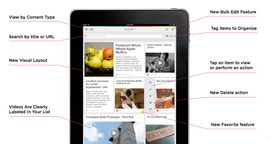
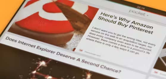
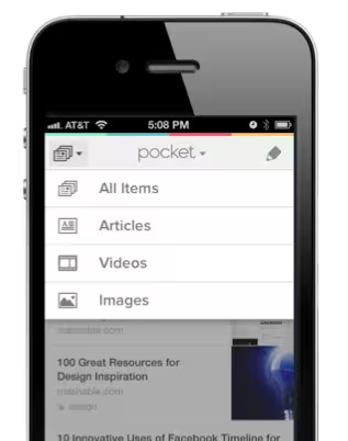
Functionality wise, Pocket’s most obvious new feature is the ability to save not just pages of text, but videos and images too. But with these, it brings an entirely new UI to its apps, particularly to the iPad (or any Android tablet for that matter). Pocket for iPad’s home screen is (optionally) laid out in a magazine like format with clear easy to read fonts, easy filtering of types of content, a smart UI for each article’s toolbox and a neat ‘slide off’ effect for whenever an article has been read. Users can favorite content to save for eternity and also bulk edit content for streamlined organisation. It does miss the swipe and slide between articles feature which I’ve become accustomed to using on many reading apps. This means you’re forced to return to the home screen once you finished viewing an item.
Article pages include an elegantly designed toolbar to adjust font sizes, night mode, favorite and share; but one touch hides the bar entirely leaving the article alone, allowing you to focus just on the content, a nice touch. Fonts are limited to just two, they’re solid choices but for font geeks like myself, I’ll miss Readability’s plethora of options. Pocket for iPhone and Android features much of the same, bar the magazine style layout which simply isn’t suitable for a mobile’s screen size.
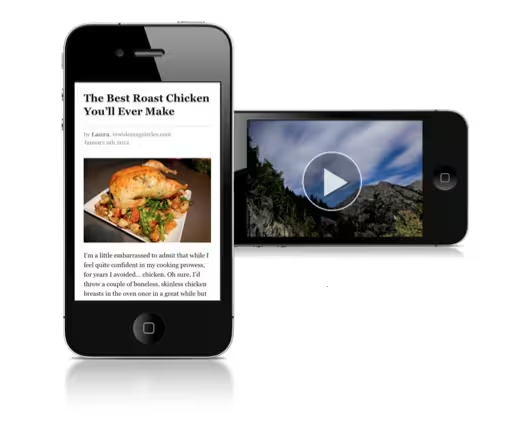 Saving content is straightforward but could be a little more innovative. You can still use all the various extensions, bookmarklets and third party apps (Flipboard, Zite etc.). Images can be ‘Pocketed’ by Pocketing the image URL which is ok but I’d prefer to see Pocket improve its browser extensions to enable saving of a specific image from any web page, same goes for video. At the moment, to save a video, you’ll need to Pocket the YouTube or Vimeo URL, sadly offline viewing isn’t available.
Weiner explains its omittance:
“We’d love to do it but almost all of the major video sites strictly forbid it. To be quite honest, offline is a great feature in Pocket but it is not what we’re betting the company on. Connectivity is increasing at an incredible rate. I don’t imagine an ‘always-connected’ future is that far off.
Articles are same ol’ same ol’, Pocket any page of text on the web, even paginated articles, and Pocket will save it for later. The web app has seen a design change too but far less significant than its mobile counterparts.
The Competition
With competitors like Instapaper and Readability focusing exclusively on text, Pocket finds itself in a unique position of being the only app intended for quickly saving all main formats of content. With that however, it’s also treading the fine line of becoming a bookmarking service. It even features tagging to help organisation. My gut feeling is that as long as the company makes Pocketing a one click interaction, the differentiator between itself and sites like Pinterest will remain clear.
For Weiner, Instapaper and alike are the least of his concerns:
“Our biggest competition is people who are still emailing themselves links, bloating browsers with open tabs, or favoriting things on Twitter to read later. We aren’t in a competitive space like the browser wars where everyone understands the value of the product and uses one or the other. We are simply fighting for the people who don’t know there is a better way to save their content for later.”
Monetization
 With its apps now going free (having previously been free & ad-supported OR premium & paid) what are Pocket’s monetization plans, if any? Or is Pocket hoping to In$tagrammit to success?
“We’ve been planning a move to a new strategy and this is just the first step in that process. We understand that there is the stigma of the Silicon Valley startup with the business plan of “We’ll figure it out later”, and that is not who we are. We’re simply executing the first part of a well planned process.”
But why would a company decide to give its product away from a seemingly large user base of over 4.5 Million, with rankings as the number 1 paid news app on Android and Amazon, as well as a top paid app on iOS?
Weiner explains:
“One, it is difficult to ask someone to pay up front before they understand the benefit. Making something like Pocket a part of your day means seeing the benefit yourself. No app store description or screenshot can do that for you. Two, we have incredible retention. Once a user starts using us, they use us for years. From a business perspective, having a user pay $2.99 up-front, once, and then use the app for 4 years doesn’t make a lot of sense.”
The Future
With its bold diversification plan, it’s reasonable to assume Pocket wants to become the de-facto service for saving any type of content to view later on any device. Perhaps eventually replacing ‘recording’ of shows and videos on TV or replacing ‘queue instantly’ on Netflix – akin to its integration on almost every popular news reader app on the market, currently over 300(!).
Weiner refrains from being so bold:
“It’s hard to say exactly where we’ll be in 5 years: Read It Later was only started 4.5 years ago. That was a time before iPhones and iPads dramatically changed the way we interact with online content. All I know is that Pocket positions us exactly where we believe things are headed and that is the best path for us to focus on.”.
➤ Download Pocket (iPad, iPhone, iPod Touch, Kindle Fire and all Android-based tablets and smartphones)
Get the TNW newsletter
Get the most important tech news in your inbox each week.
