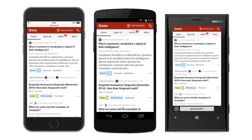
Question-and-answer service Quora has launched a redesign of its mobile Web interface that brings it in line with its native app experience.
With today’s launch, the company achieves product parity for the reading experience across all platforms, including desktop Web, mobile Web, iPhone, Android and iPad.
The one difference between the mobile Web version of Quora and other platforms, however, is the lack rich text editing features due to browser limitations. Even so, the new look should help Quora pull in new visitors arriving from search engines or Twitter. Quora business development head Marc Bodnick touted the new reading experience as “indistinguishable” from the company’s mobile apps.
Quora has heavily ramped up its investment in mobile this year, releasing a redesigned Android app in July and an iPad app in August.
To achieve its new mobile Web design, Quora rebuilt the site from the ground up with reusable components designed to transfer across platforms.
Get the TNW newsletter
Get the most important tech news in your inbox each week.


