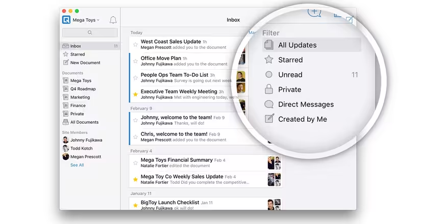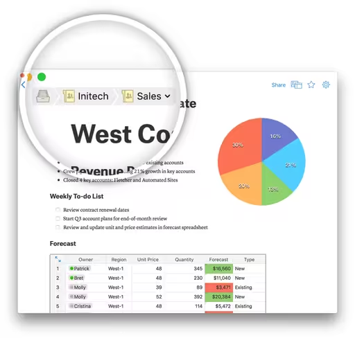
Mobile-first productivity suite Quip is changing. To better suit what it calls the ‘living document,’ Quip has redesigned its inbox and folders features.
Inbox will now update you when changes are made to a document, which will come in handy for teams. It also sports filters and a starring feature for pinning favorite files.

Folders also surface documents you use often, especially within teams. Shared folders are now more prominent, which will make files easier to find. There’s also a new ‘all documents’ view that shows you every file you’ve got access to.
The concept of a ‘living document’ is centered on team interaction; the more you and your coworkers access a document, the longer it stays alive — and Quip wants to make it easier to find and work on your files. Quip is available on the Web, iOS and Android. These updates are rolling out today.
➤ Quip
Get the TNW newsletter
Get the most important tech news in your inbox each week.


