If you’re an avid Tumblr user and fan like we are, you might have noticed a bit of a change when you logged into the service today.
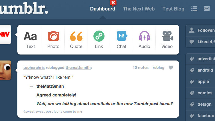
The dashboard that serves as the starting point for millions of posts ranging from text to video, has gotten a bit of refresh with new icons.
As a reminder, here’s what you saw when you logged into Tumblr before today:
This memorable set of icons have been in place since Tumblr first launched, with new options following the same design when they were added. A designer at Tumblr, Zack Sultan, posted a confirmation on his blog that these new icons were in place for everyone:
You’ll notice that the icons have gotten a more literal treatment, especially for the audio, video, and photo buttons. The colors are more vibrant as well, and the “page” background on each icon has been removed so that the graphics can stand up by themselves.
This is a nice change of pace for Tumblr and better represents its fun and powerful self-expressive nature.
For those of you that use Tumblr every day, did you notice the new icons and do you like them? Tell us in the comments.
Get the TNW newsletter
Get the most important tech news in your inbox each week.


