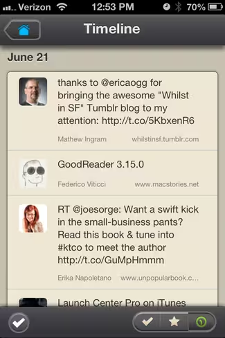
While Twitter might be my preferred network for discovery and communication, filling your Following list with hundreds of people means that it also gets noisy post-haste. Filters and lists help to keep things under control, but a new app called Plume for the iPhone may be the best addition to Twitter yet. Essentially it captures only tweets with links, turning Twitter into a well-curated feed akin to RSS.
There are three main parts to Plume, and they’re all exceptionally simple. Your Timeline is a firehose of tweets containing links. You also have the ability to access your pre-confiugred Twitter lists by enabling them in the settings. Finally you can create Plume-specific lists, called Feathers.
Feathers are an interesting thing. They’re essentially just Twitter lists, but Plume is encouraging them to be shared with your friends as well. They are shared as an iOS-compatible file, so they’re going to work for anyone who has the app installed. What’s unfortunate, however, is that setting them up is a manual process that can only be done inside the app itself. That’s a barrier that I think will turn quite a few users away from embracing them.
From your timeline, clicking on a tweet will take you to an overview of the story itself. In most cases it gives you enough information to decide whether or not you’ll want to continue reading via the site, but large title text will run into issues like the third screenshot below where no body text is included.
That lack of body text leads me to believe that the app is only including what can be packed into a specific height of pixels. While that’s great, in that it sends you to the original work to read further, it causes a problem if there happens to be a large font. The app would do well to strip out or apply a different formatting, so that more text could fit on the page.
A couple of options exist to make things easier, including the ability to show the full text in the app itself, and an option to hide social checkins, which often include links.
Interestingly, there is a “Mobilizer” view option included on the page, so it doesn’t stand up to reason as to why the original links aren’t mobilized as well. Unfortunately the Mobilizer option wasn’t very successful in my testing, and I quite often found myself staring at a status message of “This page could not [be] mobilized”.
 Everything else about the app is pretty straightforward. There are three options on the bottom right of the Timeline screen, which allow you to toggle between Unread, Saved and the firehose display. A check mark in the bottom left will refresh your list manually.
Sharing options are plentiful, and about what you’d expect. You can add to favorites, retweet or tweet a link, share by email or send it to your Instapaper account. I’d love to see the team add support for Pocket in the future, but this is still a 1.0 release, so we’ll cut them some slack. The final options will enable you to open a link in Safari, or to copy it to your clipboard for use elsewhere.
In all, Plume is a great way to sort through the noise of Twitter, when you’re looking more for discovery instead of conversation. It’s $2.99, via the App Store, and well worth it in my ever-so-humble opinion. So give it a try and let us know what you think. It’s not quite perfect, but it’s very close.
Image: Matthew Venn via Flickr
Get the TNW newsletter
Get the most important tech news in your inbox each week.


