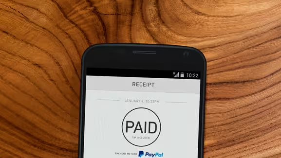
When you think of Web design, PayPal might not be the first company that springs to mind.
PayPal’s business depends more on its servers than its interface. However, in recent times, PayPal has taken a closer look at its design and how it can still remain simple and functional, as it redefines itself as it tries to redefine itself as a software platform independent of eBay.
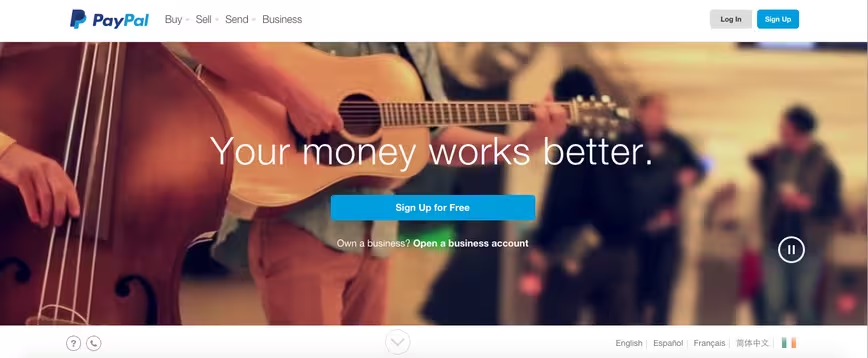
The website had a major redesign in 2014, which ushered in a flatter overall look, rounder edges and a scrolling homepage with moving image backgrounds. The site instantly became more stylish
As well as the homepage, PayPal updated its internal pages as well. Making fonts bolder and larger makes the pages easier to navigate and more accessible for people with less than perfect vision
The man behind this mission is Uris Dacosta, PayPal’s head of design and user experience.
His team focuses on design thinking as much as they do actually designing. They look at the value of design in a financial world and how the look and usability of necessary screens and tools can help change people’s lives.
I spoke to Dacosta about PayPal’s UX and design.
TNW: How did you come to work at PayPal?
Dacosta: Before joining PayPal, I was User Experience Director at Roundarch (now Isobar), and previously worked at Keane as a senior principal UX architect.
I think my strong international background and journey provide me with an intrinsic global perspective. I’m half Spanish, half Portuguese, born in Angola and went to school in both the UK and the US.
When I joined PayPal, they were looking for someone with a global viewpoint to build a new design organization that would create world-class products at a global scale, with a high level of craftsmanship and respect for global differences.
Since I arrived, my team has done lots of heavy lifting, creating an organization and structure to get the right people in place to fulfill this goal.
What do you think defines good design?
Good design makes living in the world better and easier. Design can mean a lot of things, but I do think that ultimately design’s purpose and goal is to improve life and well-being.
Design feeds off our unique human ability to be creative beings.
From my experience, macro problems and behaviours across the globe are eerily similar. However, cultural nuances and varying design needs globally cannot be discounted.
Technological maturity and adoption also play an important role. In sum, great design, that is globally scalable, understands cultural nuances but accepts the global nature of human behavior.
Great design is rooted in empathy. It’s critical to connect our design, product and technology teams to the people we’re solving problems for and the environment they live in.
The best designs come from designers who take pride in their craft and the solutions they help shape. These are both areas of focus for the PayPal team, and we’ve worked hard to develop a culture, even tools and methods around those.
Design hasn’t always seemed to be the focus for PayPal though, what changed?
I believe talent and skills have always been at PayPal, but we needed the right framework and structure in place, including a broader organizational culture that embraced design thinking.
My team has been on a journey to rethink design at PayPal. How can we bring world-class experiences to our customers and what does it take? While you need the core ingredients, the overall recipe is just as important.
Design thinking, doing and craftsmanship are all crucial to anyone looking to create successful user experiences in a competitive landscape such as PayPal’s.
Did the joining of John Maeda to chair the Design Advisory Board make a big difference to your team?
Yes. John was a great spark for all of the teams – he helped expose designers and the great talent that was already inside our walls. Personally, he was a great mentor through a period of rethinking design at PayPal.
As a design-lover, has working for a company that admittedly focused more on function than design for so long ever deterred you?
In my opinion, great design is functional and useful. At PayPal, we deal with people’s money – so if it’s not functional, it’s not worthwhile.
What keeps me at PayPal though is altogether different. I fell in love with PayPal after realizing the impact we can have in the world, and that hit me like a ton of bricks after I met my first PayPal customer out in Boston.
That customer was pregnant when she walked into our learning studio. She used one of our products (PayPal Here) to sell her artwork and told us the story of how she was trying to make it on her own after not seeing eye-to-eye with her dad.
She was pursuing her life’s dream – art. She was living sale-to-sale, but kept at it anyway. PayPal was allowing her to live her life the way she wanted to.
It was a real moment of clarity, and it gave me a sense of deep purpose that drove me to action. As a designer, you take experiences to heart, and you don’t stop until the job is done.
Believe me, it’s rare that you get to work on products with that kind of impact on people every single day, thousands of times a day. You’re lucky if you have that opportunity once in your professional life. At PayPal, we do that every day.
What is it about design at PayPal that excites you now? And what are you currently excited about working on?
Designers want to make the lives of others and the world better. I’m given the opportunity to do that at PayPal every day. But I have to say that, at least for me, I get excited about what some may see as the small things.
I get as much excitement about creating a better check box as I do about creating an entirely new design system and product. I may be a bit of a geek in that sense.
This year is going to bring forth the best work of our lives – putting all our hard design work into tangible experiences and rolling out new products. That’s one hell of a thrill ride for a designer!
Read next: The future of UX design
Get the TNW newsletter
Get the most important tech news in your inbox each week.
