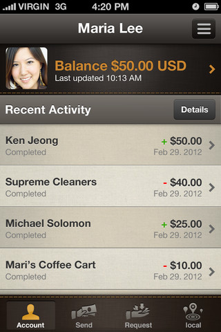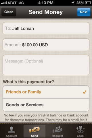
PayPal has released an update for its iPhone app today that brings along a completely new design that is, at first glance, much more visually appealing than the last version of the app. This edition of the app brings back the ‘Local’ feature which used to show vendors that accepted Paypal.
Now, the Local section will show you merchants nearby that use the new PayPal Here service specifically. This is the new service that PayPal launched today to act as a competitor for Square. That service actually requires a different PayPal Here app that is on the App Store, but is only for merchants.
The app has also been redesigned to allow quick access to managing your account, sending money and requesting money from people. The old app was fairly awkward in many ways and the new one still isn’t as good as it could be, but it fixes some annoyances, especially the speed at which you are able to navigate around the interface.
I use the mobile version of PayPal primarily to check on available balances or to see if payments went through, and to pay a friend for the occasional lunch if I (conveniently) forget my wallet. I’d imagine that, aside from heavy eBay users or event organizers, this new app should be a nice improvement and do pretty much everything they need it to.
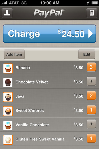
Ironically, the look of the PayPal Here app is actually a bit nicer and cleaner looking than this app, which has a very ‘hey look, I’m your wallet’ feel.
Get the TNW newsletter
Get the most important tech news in your inbox each week.
