This post originally appeared on the Shutterstock blog, where you can find more inspiration like this.
Last year, our imaginations were so worked up by the films being honored at the Oscars that we asked our design team to create their best Pop Art twists on the Best Picture contenders. And the results were so great that we’re doing it all over again.
2013 was a fantastic year for cinema, delivering a plethora of films notable for their strong emotional impact. Whether they were dealing with the travesties of American history, the emotional disconnection of the future, or the personal trials of family affairs, there were few selections among this year’s nominees that didn’t resonate on a very deep level. Of course, there were the brilliantly constructed capers and spectacles, too, and we didn’t love them the slightest bit less.
Once again, we gave each of our designers their choice of Best Picture nominee to filter through a Pop Art lens (although there may have been a fight or two over who got to tackle a few of them). Armed with their love of big-screen brilliance, art-history savvy, and the endless assets of the Shutterstock library, here’s what they came up with, along with their thoughts on the designs.
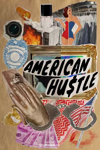
American Hustle by Jami Miles
“Inspired by artist Eduardo Paolozzi‘s collage style, this poster particularly reflects the aesthetics of his 1948 work ‘Dr. Pepper,’ as well as his BUNK series, using popular imagery and elements of surrealism. I wanted to sum up the film and its dramatic yet humorous mood by presenting literal and figurative imagery that played into its brilliant narrative, and Paolozzi’s collage style felt like the perfect way to pull the visual components together.”
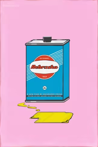
Nebraska by Cristin Burton
“Playing off of Warhol’s and other Pop artists’ nod to American consumerism and mass reproduction, this poster features a flat, simple illustration of a motor-oil can, which compliments the flat tone of the movie. While there is no direct reference to motor oil inNebraska, the plot centers around a Middle-American road trip, a small town, and even a visit to a mechanic’s shop by the main characters, Woody (Bruce Dern) and David (Will Forte).”
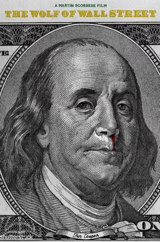
The Wolf of Wall Street by Jordan Roland
“For me, Pop Art is as much about the bold, simple message it relays as the visual itself. I chose to show The Wolf Of Wall Street for what it represented in a simple, confronting image. Stylistically, I looked to Robert Dowd and the pieces for which he painted currency with either simple alterations — or none at all.”
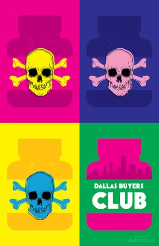
Dallas Buyers Club by Adriana Marin
“The silhouettes of pill bottles with a skull and crossbones represent the ineffective and eventually toxic drugs used during clinical trials for HIV treatment; they’re contrasted by neon colors inspired by Jared Leto’s vivacious portrayal of Rayon and Matthew McConaughey’s equal gusto as Ron Woodroof. The final bottle represents the illegal but live-saving drugs that Woodroof was smuggling in from Mexico, which not only helped many other HIV-positive patients, but also extended his own life by several years.”
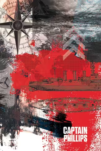
Captain Phillips by Rachael Polack
“Paint, overlays, and scrap imagery come together here to represent the complexity and gripping truth behind the story of Captain Phillips. This poster was created in the style of pop artist Robert Rauschenberg, who was a master of textures, ‘combines,’ printmaking, sculpture, and more.”
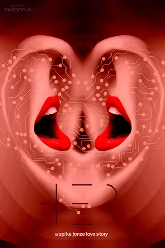
Her by Deanna Paquette
“Nodding to Allen Jones‘ obsession with physical relationships, this poster explores sexuality driven by communication. Aesthetically, the colors in Spike Jonze’s unconventional love story are both encompassing and crucial to the storytelling. I used Adobe Kuler to help capture the palette directly from the film and bring it into this design to translate the mood.”
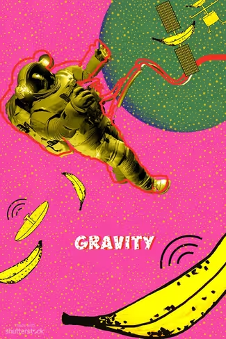
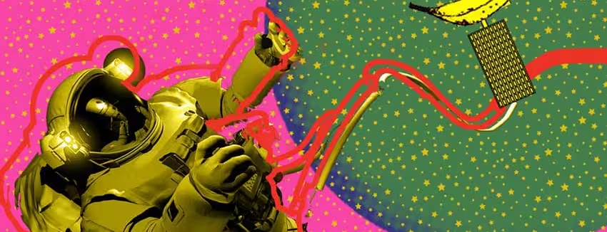
Gravity by Lily Ou
“The idea for my Gravity poster was to take a common Pop Art pattern, but replace the dots with stars to set it in space. To give it a humorous twist, I used bananas as missiles, striking and shattering the satellite, sending the hapless astronaut plummeting away.”
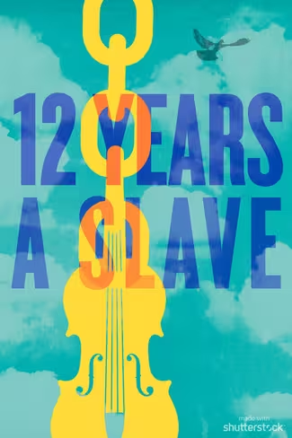
12 Years a Slave by Kathy Cho
“I wanted to use vibrant, bold colors in an abstract but simple way, with imagery representing the idea of freedom that is so inherent in this film. When Solomon is abducted and sold into slavery, it’s actually his talent at the violin that makes him a target. His music is often an aid during his imprisonment, but the violin and his chains are inextricably linked. The bird represents finally finding freedom after all the hardship and horror.”
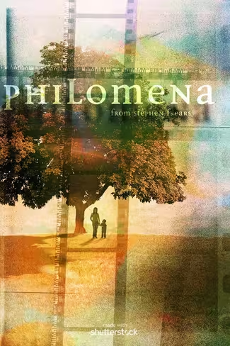
Philomena by Philippe Intraligi
“My spin on Philomena is based on the core aesthetic of the film, which plays with memories in the form of Super 8 snippets. Super 8 cameras were among the first mass-marketed consumer tools for capturing people’s lives, and they play into the spirit of Pop Art and readymades. The design of the poster uses film snippets overlapping as a cross, framing the main character and her lost boy. The tree stands for the Tree of Life, playing into the main storyline of the film.”
Get the TNW newsletter
Get the most important tech news in your inbox each week.
