Opera launched a new version of its Internet browser for Windows PC and Mac users today, with a cleaner design, a new ‘Speed Dial’ tool for finding favorite sites and faster webpage loading.
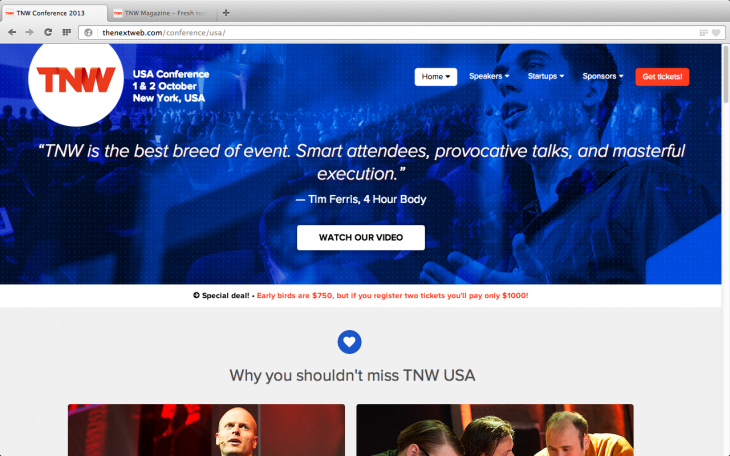
Similar to Firefox in recent years, Opera has taken a few visual cues from Chrome and removed much of the clutter at the top of each window. Tab selections sit alongside the various icons for minimizing, closing and expanding the window, allocating more room for the webpage’s content.
Search queries can be submitted in the URL field, again similar to Chrome, and there are the usual buttons nestled on the left for refreshing the page, as well as moving forwards and backwards through the user’s browsing history.
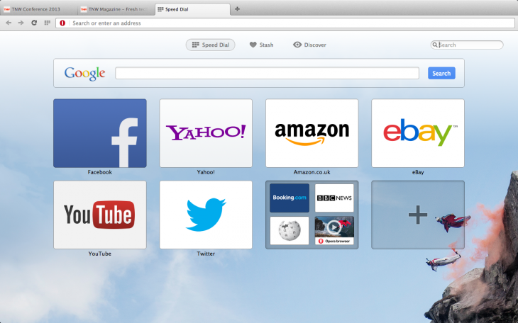
There’s a new icon here though called Speed Dial. It’s a take on the Top Sites page offered in Safari whenever the user opens a new tab, albeit with a couple of extra features. By default, there’s a grid with a few of the most recognizable social networks and services, including Facebook, Twitter and Amazon. Users can add their favorite pages here for easy access and also sort them into folders, rather like apps on a smartphone or tablet home screen.
A search bar for Google resides just above this area, but arguably far more useful is the secondary search icon in the top right-hand corner. This allows the user to quickly search through their folders and favorite sites, again speeding up the process of locating a specific webpage or service.
Opera is also taking a stab at services such as Evernote or Pocket with a new feature called Stash. When the user loads up any webpage, they’ll see a small heart icon at the far edge of the URL box. Clicking it once adds the page to Opera’s Stash area, available as a separate tab in Speed Dial. Multiple pages can be compared simultaneously and resized here using a slider on the right-hand side of the screen. It’s a little jarring, but could be a useful feature for comparing flight times or price tags in multiple e-commerce stores.
Rounding out the Speed Dial section is Discover, a third and final tab that serves up a curated selection of news articles. A drop-down menu offers specific categories such as science, sports and technology, but the interface ends there. Clicking on any of the pieces loads up the original webpage, rather than an integrated reading experience like Flipboard.
Opera also runs on Google’s Chromium engine this time around for improved site compatibility, as well as an ‘Off-Road’ mode that compresses data and allows webpages to load faster when the user is on a slow or patchy network.
The updated Opera browser for Windows and Mac undoubtedly puts it back in content with industry heavyweights such as Chrome, Firefox and Internet Explorer. Some of its new features in the Speed Dial section feel a little superfluous, but the company should be commended for trying to innovate in an area that has been stagnating for some time.
“The world of fascinating web content is expanding faster than space, and we’ve delivered a browser that helps you to truly discover it,” Lars Boilesen, CEO of Opera Software said.
➤ Opera
Get the TNW newsletter
Get the most important tech news in your inbox each week.


