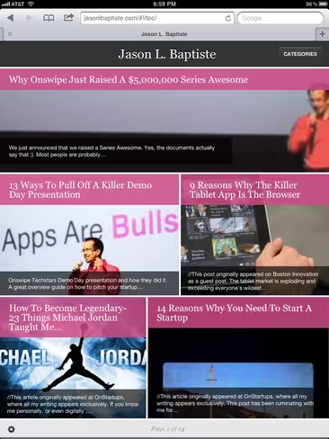
Launching with comment support and triple the amount of layouts, Onswipe version 2.0 is now available as a WordPress plugin. In under one minute, publishers of any size can now quickly build a custom tablet layout, greatly improving their tablet experience for free.
For those who haven’t heard, Onswipe is a platform that makes it easy for any publisher, from a blogger to the New York Times, to transform their content into an immersive experience on the iPad. It delivers a beautiful, app like experience on the web that’s completely built for the tablet, and now things just got way better.
With the new version, there are 11 different table of contents and 4 article layouts (plus more to come), along with options for accent colors, your logo, etc. All in all, it strikes a great balance between quality and customization. In other words, you can make it yours without screwing everything up.
We reported back in June that Onswipe raised $5 million in a “Series Awesome” round led by Spark Capital, Lightbank, Yuri Milner, Lerer Ventures, SVAngel, Betaworks, Morado, Eniac and Thrive Capital, bringing it to a total of $6 million in funding (at the time). Now, the TechStars grad is bringing its best work to the masses.
From Onswipe:
Onswipe started out as a simple WordPress plugin known as PadPressed. When we launched the Onswipe platform in June, tens of thousands of people still had our old WordPress plugin installed via their self hosted blogs and millions of people via their WordPress.com blogs.
Starting today we’re moving towards unifying the experience by releasing Version 2 of Onswipe for WordPress. You can provide the full Onswipe experience to your readers by tapping a few buttons to install the plugin. This is available to self hosted WordPress users only with WordPress.com coming at a later date.
➤ Onswipe 2 via WordPress.org
Get the TNW newsletter
Get the most important tech news in your inbox each week.


