You’ve got to love a new logo. Not only does it give your eyes something fresh to look at, it also gives me the opportunity to vomit out some word stew all over your mother’s finest table cloth of your… mind? Shit that metaphor really got away from me.
Anyway, now OnePlus’ new logo has been announced to the world, it’s time for some Serious Analysis. Strap in.
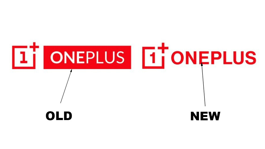
So, that logo. Bet you’d like to see it, right? Yeah, I bet you would. You’d like that, wouldn’t you, to see the logo? To filthy it up with your dirty eyes… oh, yeah. The header image.
Fine then. Here’s the old logo:

And… are you ready? Are heaven’s heralds, descended from on-high, pumping out some sorta religious-sounding trumpet jam? Great, then you’re prepared for OnePlus’ new logo:

[Read: The new PS5 logo is what it looks like when a company gives up]
There’s a lot to unpack here, but let’s start small. Does… anyone else read this logo as “one plus ONEPLUS?” With this in mind, wouldn’t it have been easier to simply call the company “Two?”
I’ll answer for you: Yes.
OnePlus’ new logo has also made me seriously consider the company’s name for the first time. There’s something strange that happens to your brain when you’re confronted with a name of anything again and again. The critical part of your mind just turns off.
I call this The Beatles effect.
Everyone knows the band, but how many have actually thought about how terrible their name is? It’s a shitty pun combining an insect and the rhythmic part of music. But you never think about that because the group’s so ubiquitous.
Anyway, a similar thing happened with OnePlus. I actually thought about. And realized the company’s name is just it saying “anything we can do, we can do better.”
But anyone who’s ever been a child knows that that this is a shitty way to one-up someone. No, if OnePlus really wanted to take this approach to its logical extreme, it should change its name to Plus Infinity.
Don’t worry, I just threw up in my mouth a little bit too, that’s normal.
Enough of that — it’s time for the sticky, hot analysis of OnePlus’ new logo that we’ve all been waiting for. Let’s go through its four major changes.
The box around the ‘1+’ is thicker in OnePlus’ new logo
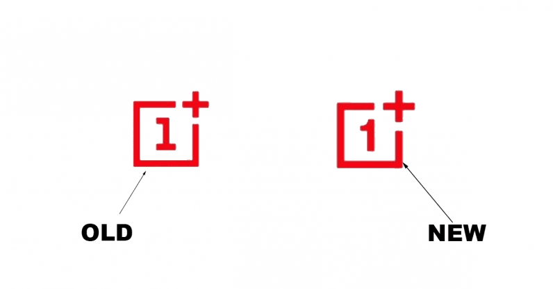
What can we learn from this thicker box? Does it mean the number 1 a prisoner? Has it tried to escape, is that why the bars are thicker? Why is the number 1 even imprisoned? What did it do? It must’ve been awful. Is the number 1 a pedophille?
We may never know the answers to these questions, but we know one thing for sure: That box is thicker. In these troubled times, that should be enough.
The ‘1’ inside the box is now… “curvilinear”
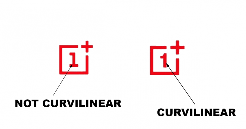
Google defines curvilinear as “contained by or consisting of a curved line or lines,” which, oddly, is just like your mom.
The ‘plus sign’ outside the box is bigger and thicker
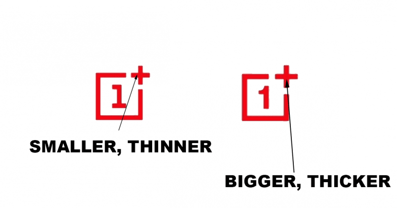
This makes sense, you’ve got to keep that questionable number 1 contained after all.
Anyhow, OnePlus’ logo is saying something more than this. Something bigger, thicker. Something profound. Something that means we should write the company’s name as OnePLUS from now on.
From today, whenever you have to say OnePLUS, ensure you scream the “PLUS” part so folks know just how bigger and thicker it is now; so big and thick that you can’t even think about that oversized, mathematical symbol without shrieking out its name wherever you are and getting forcibly removed from the premises — but don’t worry, that’s okay, because the bigger, thicker OnePLUS logo will never abandon you, it’ll never leave you, it won’t let that happen, ever, for now it is bigger, thicker, bigger and thicker than anyone believed to be possible.
OnePLUS’ new logo doesn’t have a box around the text. Oh, and its font is bolder
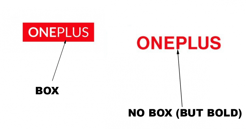
I can only hope this is what happened.
It’s the third solid day of meetings. A group of balding middle aged men are sweating in their expensive suits. This, friends, is their Somme. They’ve been going back and forth over these issues like their lives depended on it — and, in some way, they do. Desperation is setting in. Ties are loosened, harsh words are swapped, and then, out of this overpriced aftershave haze, a hero emerges.
He stands. The conversation around him shifts from shouts, to murmurs, and, finally, a vicious silence. They’re all staring, waiting, ready for him to fail. He slides off his blazer, unfastens his tie, and clears his mighty throat.
“We need,” he bellows, “to think OUTSIDE OF THE BOX.”
The meeting room goes wild. Yes, they cry in unison, yes. Tears stream. They chant outside the box. They scratch at their bloodshot eyes. Thinking outside the box, it’s a bold decision…
Fin.
Fuck, that last sentence shattered the illusion, didn’t it? Oh well, too late to delete now, this piece has got to hit the printing presses any second now, those fat cats on Wall Street won’t wait any longer.
Anyway, that’s everything you need to know about OnePLUS’ new logo. I think we can safely agree we all learned something today, thanks for attending.
Get the TNW newsletter
Get the most important tech news in your inbox each week.

